

HTS
Hopper Technology Solutions is a travel agency, fintech provider and modern e-commerce platform.
Originally called Hopper Cloud, the B2B (business-to-business) part of Hopper was rebranded into Hopper Technology Solutions. Defining this new brand with the wider leadership team was one of the last projects I worked on at Hopper.
I oversaw the brand, helped create the logo, defined the illustration style and designed the marketing website. All of the things.
LOGO
Plain and simple
The brief from on high for the new brand was to keep things plain and simple (almost boring even), to seperate it as much as possible from Hopper and its cute bunnies. This is what was landed on.


Myself and Jen Tarrant, the Principal Brand Designer, worked together on some initial concepts for the logo. To help echo the Hopper brand subtly, we decided to just use that brand's font, Proxima Nova, for the logotype. This stayed the same throughout the various concepts.
But we did play around with a fair few options for the logomark, some of which are below and some of which should never see the light of day.
Originally, it was still going to be called Hopper Cloud, so I played around with some incredibly silly cloud / bunny logomarks. Along with some location pins, for reasons I can no longer remember.


In the end as you can see, a cascading trio of rectangles won out. I did propose a more rounded option, which felt modern and a bit more approachable. But the hard edges were a better fit for the corporate direction they wanted to go in.

Colour
Hopper evolved
The final colour palette was influenced by Hopper. For instance, the red used is just a darker shade of Hopper's primary coral colour. The rest of the colours were pretty much used in the illustrations. As for design-related work, the colour combinations were kept super simple, with just red and the slate palette.

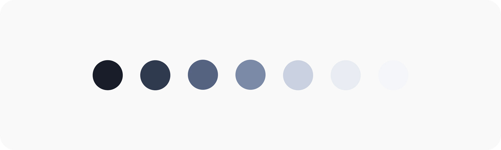
One of the main features of the brand's colour palette are the gradients, which are used on the website, in print and ads. I did two versions — light and dark, so there's a bit of flexibility for future use.

Illustration
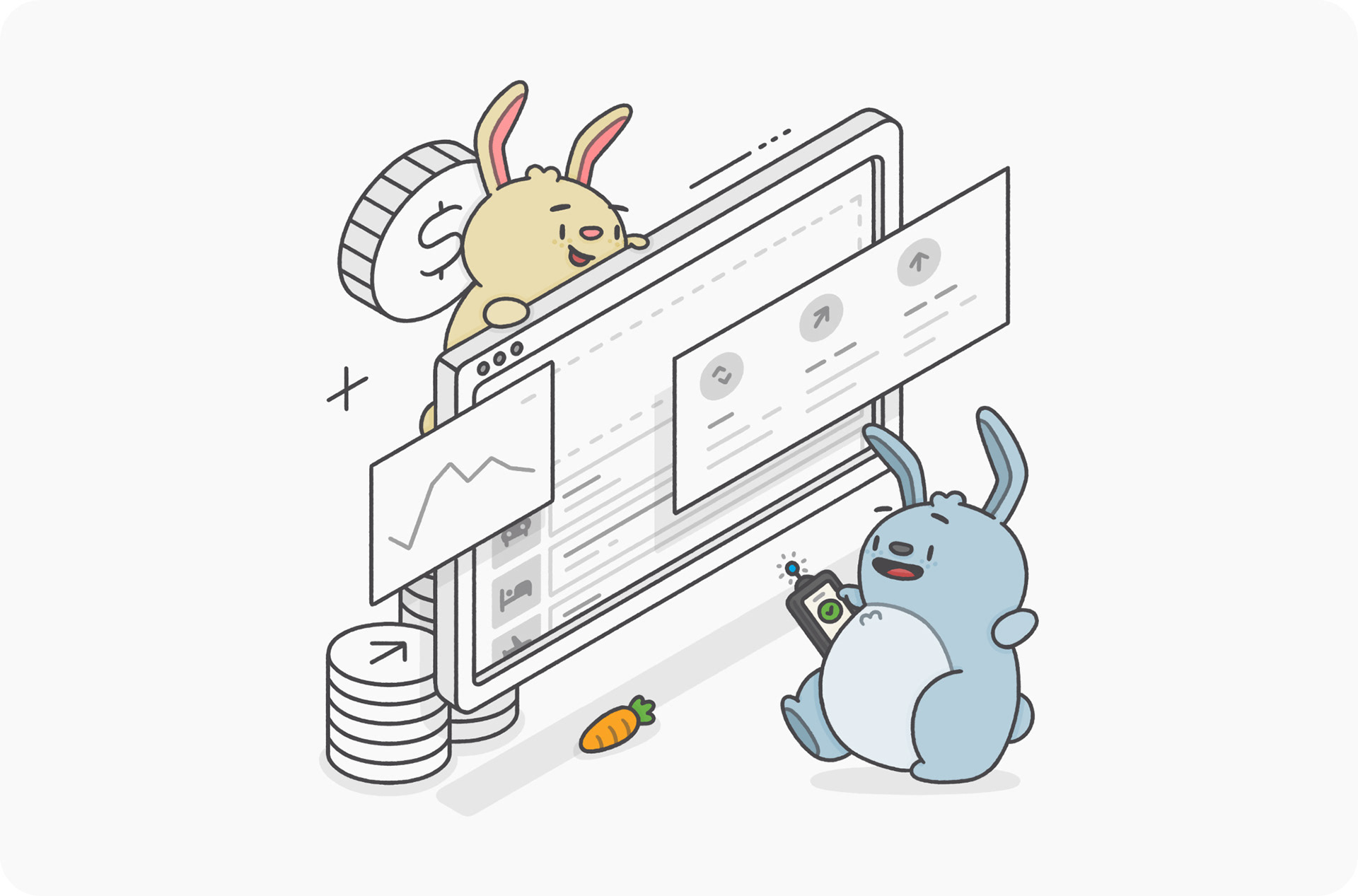
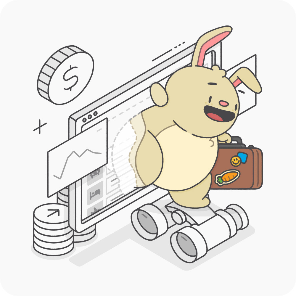
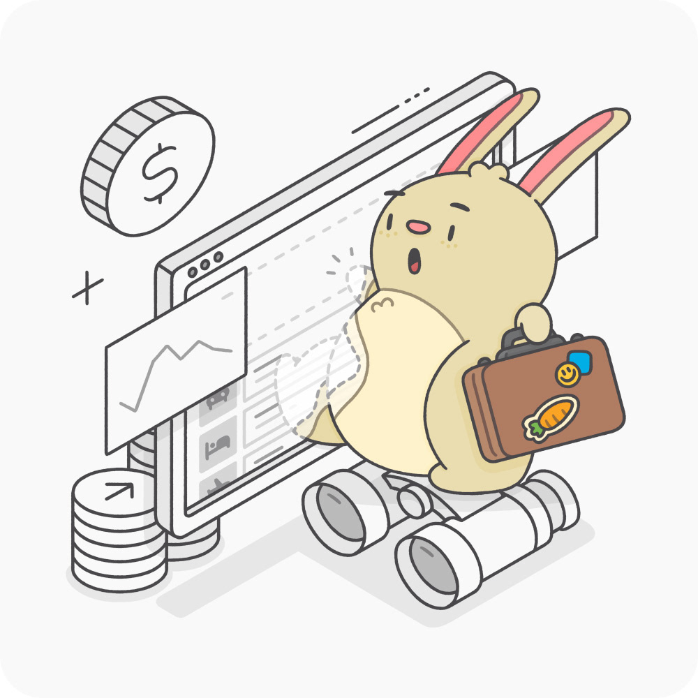
Products exemplifed
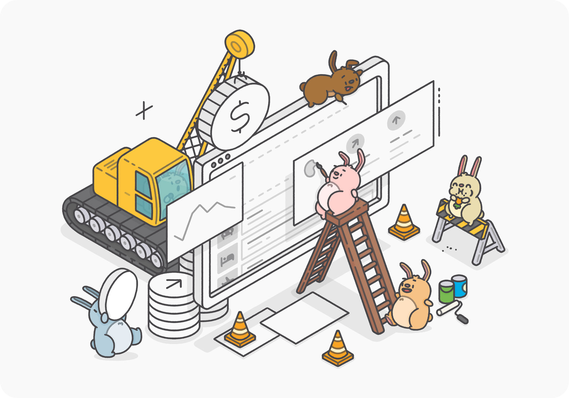
As with Hopper, I did all the illustrations for HTS. Because of the slanted nature of the logomark, I immediately suggested doing isometric illustrations. One, it matches conceptually to the logomark. Two, it further separates the brand from Hopper and feels a little more corporate, which is what the higher ups wanted.
Below are the main set of illustrations, where we have one to represent each product offered. I kept them consistent by having a screen in the same spot in each illustration, with objects and modals around it to showcase what the product is.


I put together a few concepts for the illustration style, but it was met with pretty positive feedback straight off the bat. So there wasn't much need to do any further exploration, which was nice.


Hopper + HTS
Better together
Even though HTS was positioned as a completely new brand at the start, there eventually was a need for an illustration that showed Hopper and HTS combined in some way. Initially, it was just used for presentation decks, but then eventually it became the main graphic for conferences and the website.
I ended up combining the two vastly different styles into one illustration, using the Price Prediction product illustration as a basis — making sure that both styles were balanced and not overpowering one another.

For the concept sketches, I did the bunnies (Hopper bits) in colour to help show that those bits will be in that brand's style. With the rest of the illustration then being in the isometric HTS style.
I also tried a few other ideas before landing on the above. The first pass had the bunny emerging (or entering) from (into) a HTS illustration — like stepping through a portal. It looked cool. But conceptually it didn't really make a lot of sense, seeing as HTS came out of Hopper, not the other way around.
So for the next pass, I sketched up this bigger scene of the bunnies constructing the Price Prediction illustration instead. Everyone felt this was a bit too playful though and lent into Hopper more than HTS, which was totally fair.
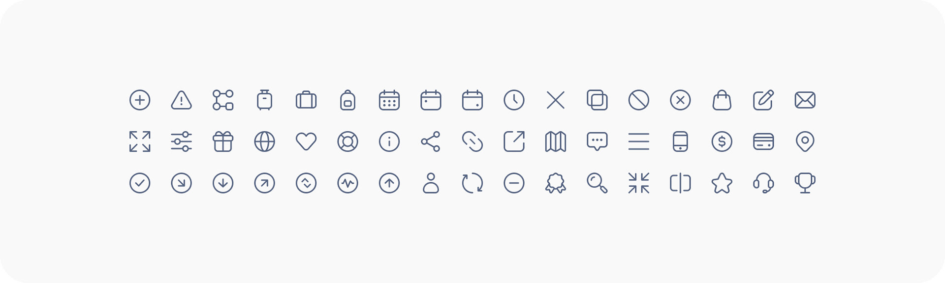
ICONOGRAPHY
Thin again
Again, as with Hopper, I also did all of the icons for HTS. Unfortunately, I was right in the middle of bringing across the Hopper icons (tweaking them to fit into the HTS brand) before the latest round of layoffs finally got me.
In terms of tweaking them to fit HTS, it involved giving them a thinner stroke, no solid variant and reducing the rounded corners to dial back the playfulness of the main Hopper set.
Just as with the product illustrations, I also created an icon to represent each one of them.

Lastly, I created this set for a partner's FAQ page. These icons needed to be a bit more flexible, as they had to be able to match a partner's branding. So I made an outlined and solid version, which the partner could then pick from, in addition to changing the colour.

WEBSITE
Selling it
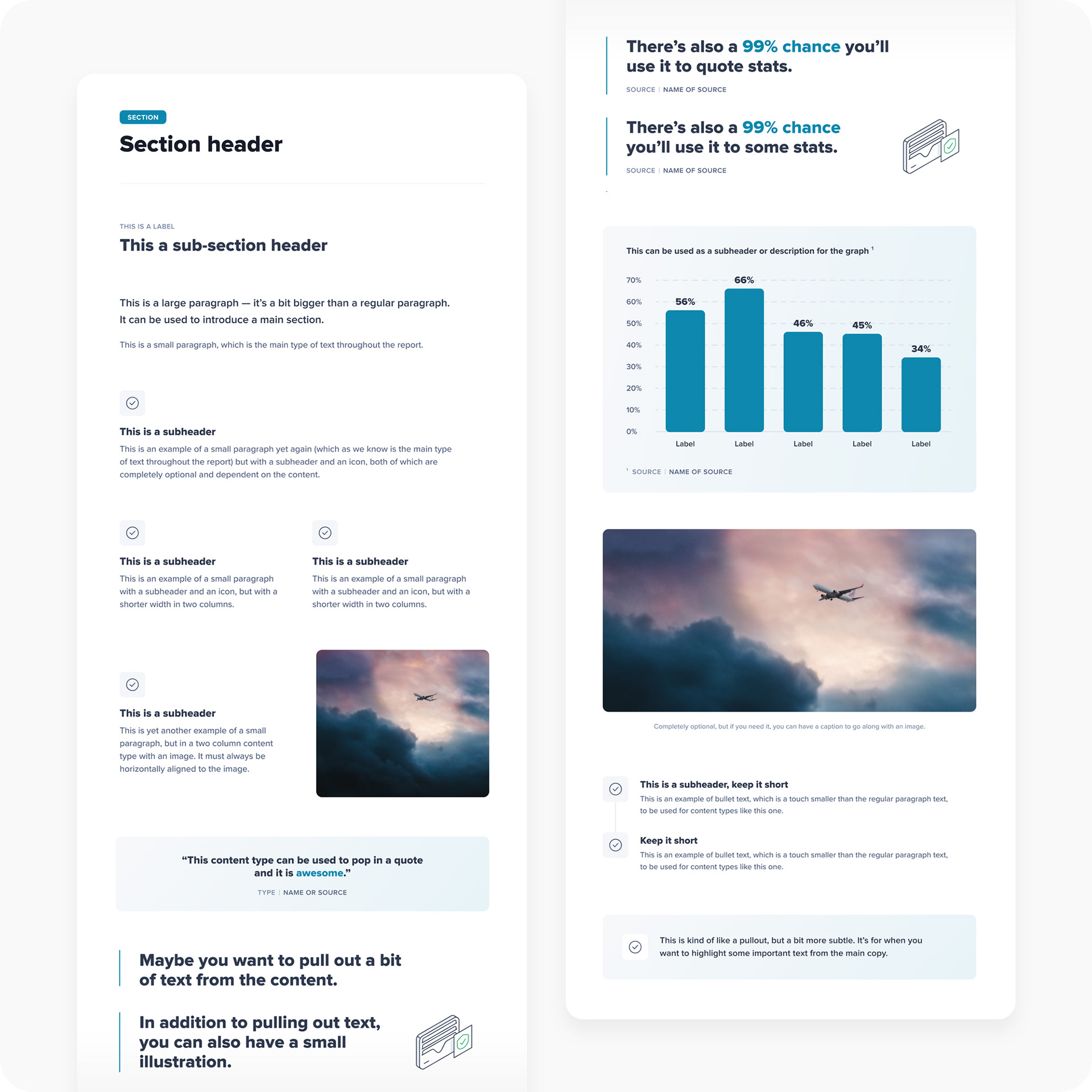
One of the last things I worked on for HTS was designing the marketing website. There was a fairly bare bones one pager up for a while, but I worked with the PR team to come up with a new information architecture for it, in addition to doing the visual design.
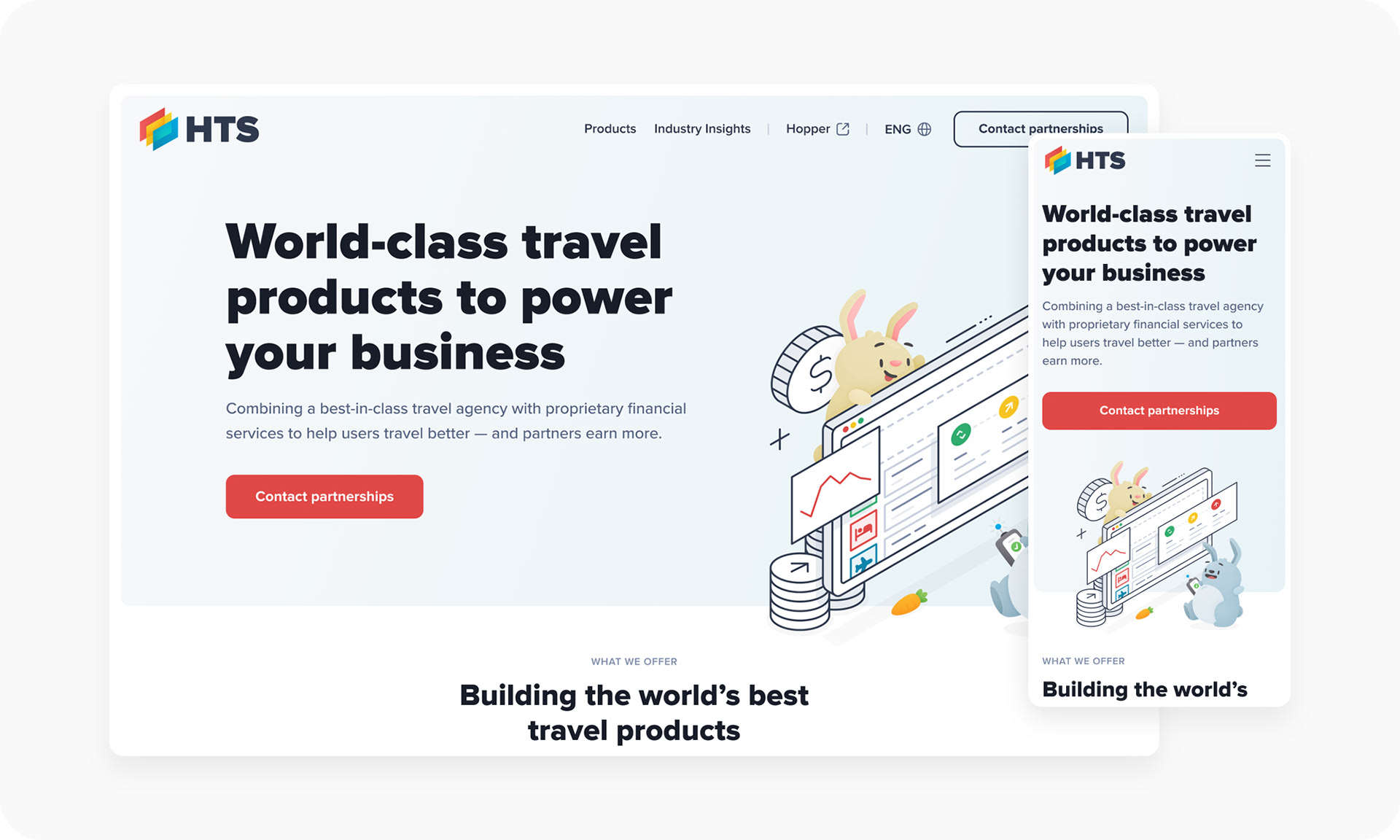
The main objective of the marketing site was to get potential customers to contact the team. So the contact button and form is a click away on every page of the site. Apart from that, one of the other main priorities was to give each product its own page. As well as giving users an easy way to view and reports, where I came up with content types for a template.
Check out the rest of the screens and read more about the project below.
EVENTS
Take me out
Hopper and HTS ran and attended a lot events. So we were always putting together booths, banners, pamphlets and things for these various conferences and events. Some of which you can see below.
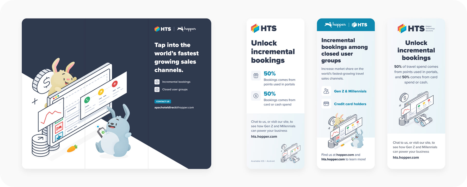
A big one that I worked on was for an annual event at the US Open for Hopper and HTS partners, which you can check out below.
That's it! Thanks for reading.
CREDITS
Role: Art Director + Brand & Visual Designer + Illustrator
Client: HTS (Hopper Technology Solutions)
Studio: Hopper
Brand Designer: Jen Tarrant
2024