

HTS
HTS Marketing
Hopper Technology Solutions is a travel agency, fintech provider and modern e-commerce platform. This is their marketing website.
In addition to defining the brand for HTS while at Hopper, I also designed the marketing website. The main goals were to clearly outline what HTS does, the products it offers and get potential businesses to contact the team.
After the release of the website, the partnership team saw more than double the number of inbounds leads reaching out via the contact form each month.
Research
Addressing the goals
To kick things off, myself and the PR team did some research, looking at similar B2B businesses along with other websites that caught our eye. We wrote up a basic information architecture, which lead into some simple wireframes that I sketched up.
Originally, we were planning on using a flow where we would funnel users into specific solutions to their area of interest — airlines, hotels or banks. But we decided to change this so products were surfaced straight away, as it added an unnecessary step to the flow.
Working through the IA and wireframes together as a team, helped us address the goals of the website. Theses goals were addressed by outlining the four categories of product on the home screen, surfacing the products straight away, along with supporting articles about said products and a case study for Capitol One, one of the bigger partners of HTS. With further reading at the bottom of the page and a final CTA to contact the team.
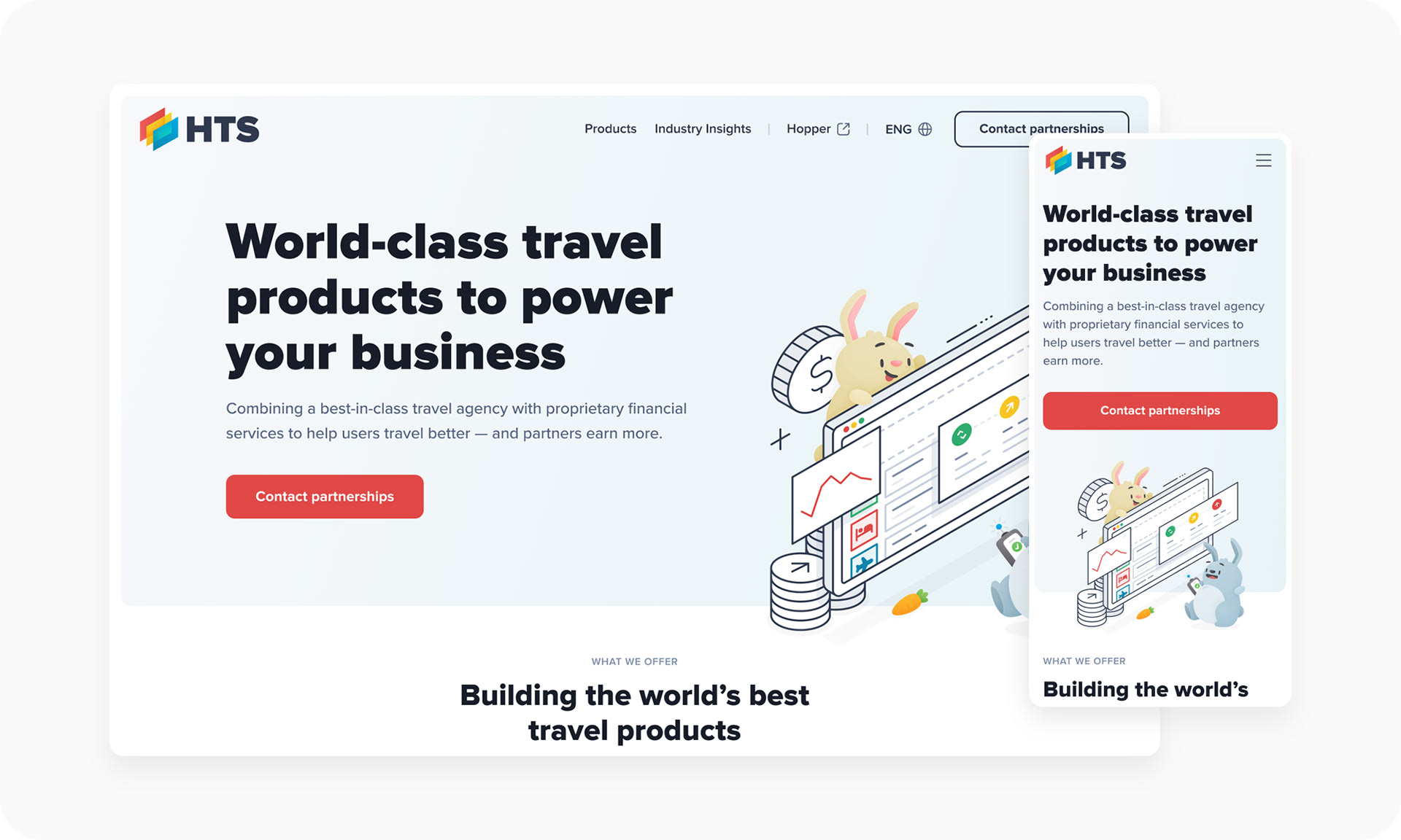
Home
Defining the style
Whilst designing the website, I also started to define the overall visual design for HTS, which was taken across to other collateral, like ads and signage. The first page I designed was the home page.
Products
Building the best products
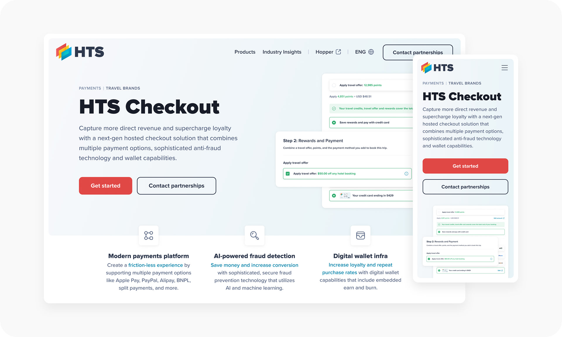
One of the main sections and goals of the website, was to showcase all of the products on offer. To help future-proof these pages, I created a template made up of a few key sections. This way, it would be super quick and easy to add new products as they're created.
The first section included a hero, with a description and screenshot of the product, along with three key features.
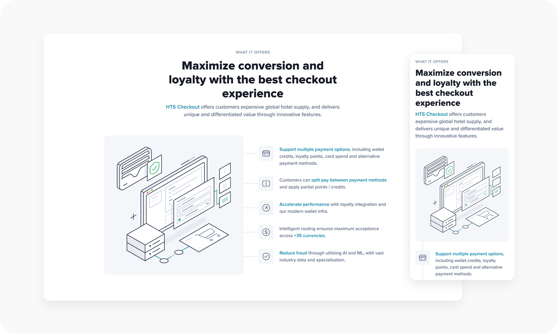
The next section used the product's illustration, along with icons and bullets listing out the main offerings.
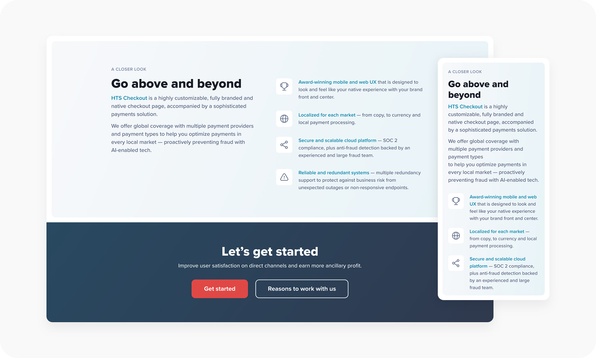
The final section goes in for a closer look, providing some more detailed information, along with a CTA to contact the partnerships team.
In the above screens I've used HTS Checkout as an example. But the user can also access any product, at any time through the navigation, which on hover shows them the four main categories that the products sit under.
As with Hopper, I created all of the illustrations and icons for HTS. The bulk of the illustration work was creating a custom illustration and icon to represent each product, which you can see below.
Case study
Travel portals
The website has one key case study, which is for Capital One. Desptie this first one only having one case study, I approached this the same at the product template, in case more case studies are added, for instance ahving one ties to each product.
Contact
Get in touch
The main goal of the website was to get potential businesses to partner with HTS. A huge part of that is obviously the selling points listed out in each product, but they all lead to the contact page, which we kept clean and simple. Leading to a double in increase in contact form submissions.
Industry insights
Standardised template
Another goal of the website was to include a more standardised approach to the quarterly reports on the Industry Insights page. These reports are made up of travel research from the HTS team, backed by in-depth consumer insights.
After the launch of the website there was an increase in the amount of people viewing and download the reports, which was great.
I created a bunch of different content types, creating a template, to help build out these reports as a webpage. So instead of a custom designed PDF for each report, they're more consistent and standardised, and can be viewed as either a webpage or downloaded as a PDF.
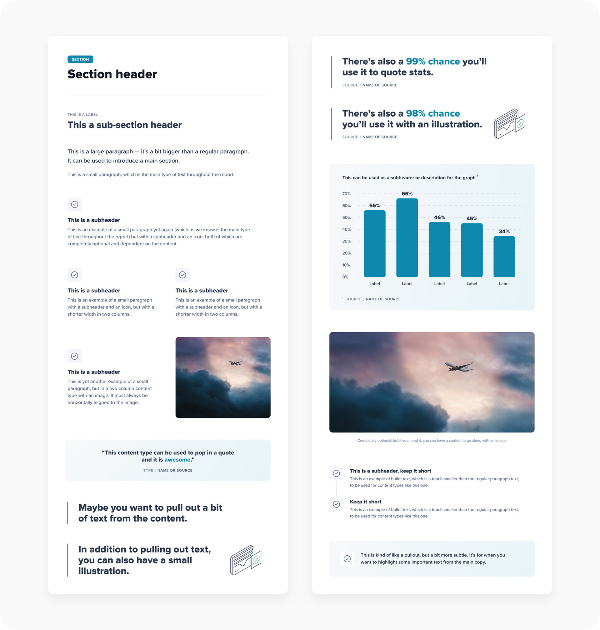
Below is an example of a report using the above content types.
I also added in a sticky navigation that would follow the user down the page, showing them what section of the report they're on and giving them the ability to jump to other sections easily, along with a link to download it as a PDF.
For mobile, the navigation sits at the top of the screen at all times, so the user still has easy access to the other sections.
If you haven't had enough of HTS you can check out the full case study here of the branding, illustration and design direction that I worked on.
Credits
Roles: Designer (UI + UX) + Illustrator
Client: HTS (Hopper Technology Solutions)
Studio: Hopper
Client: HTS (Hopper Technology Solutions)
Studio: Hopper
2024