Tribuo
Making a big change, with some small change.
Giving is very much an emotional thing. You can feel immense gratitude for a perfectly poured beer and a good chat. Or you just want to do something nice, like donate to a charity, because times are tough and every little bit helps.
That's where Tribuo comes in — an honest cashless tipping and donating platform from right here in Australia. I worked on the overall branding and product design for the tipping flow, along with some illustrations.
It’s fun, bold and colourful, with a playful vibe and big smiles.
LOGOTYPE
Clean and friendly
The logotype uses Cartridge as a foundation, but with slightly rounded corners and wells to help give it some more character. Having it in lowercase also makes it feel friendlier and approachable. As such, it’s clean and a bit playful, but at the same time it feels nice and professional.
LOGOmark
Giving and sharing
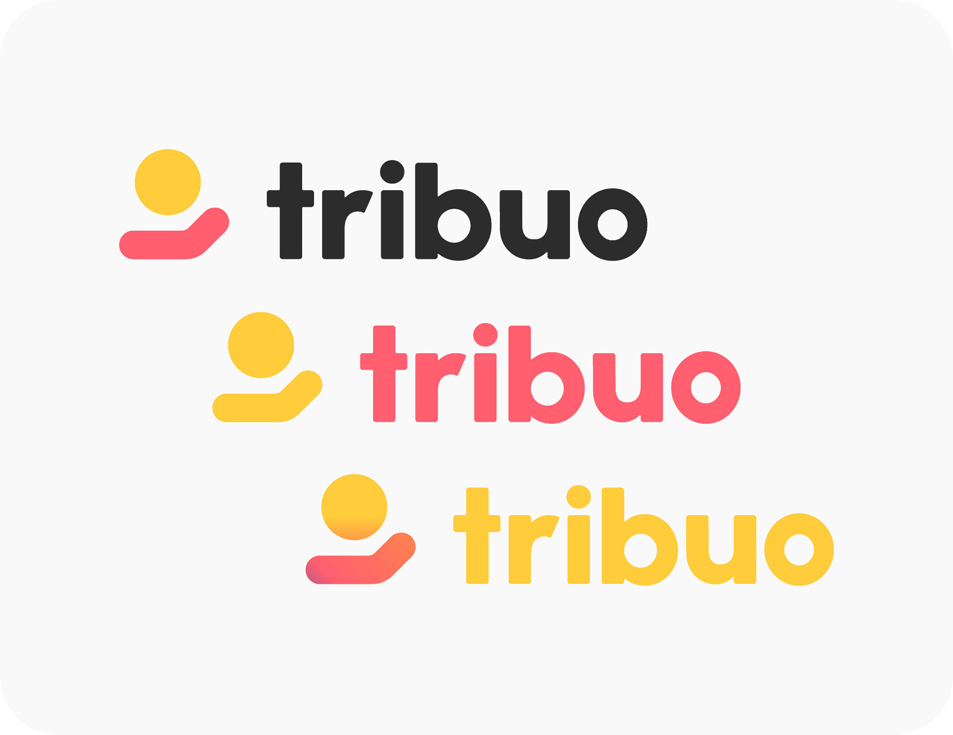
For the logomark, the idea of giving and sharing came to mind. So I took the “giving / receiving hand” symbol as a basis, with it getting further abstracted with each subsequent version.
When it came to applying colour to the logomark, we decided on two versions — a solid version for smaller placements and a gradient version for larger placements. As the gradient can get a bit lost at smaller sizes.
Better together
Fun and playful
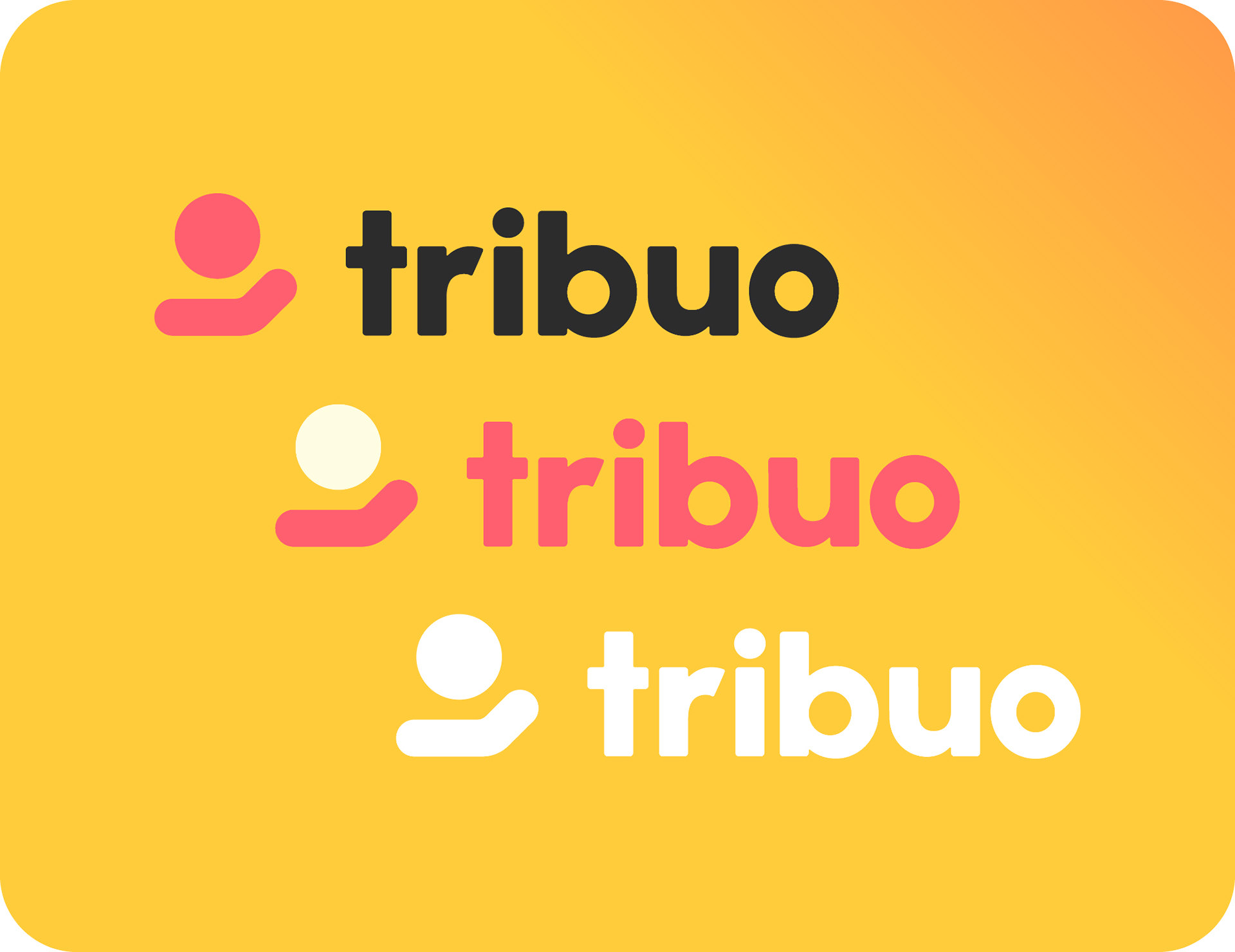
To keep things playful, the logotype and logomark can be used in a variety of different colour combinations. This depends on where it’s used, such as a particular venue and what background colour, or gradient, it’s on.
Typography
One font
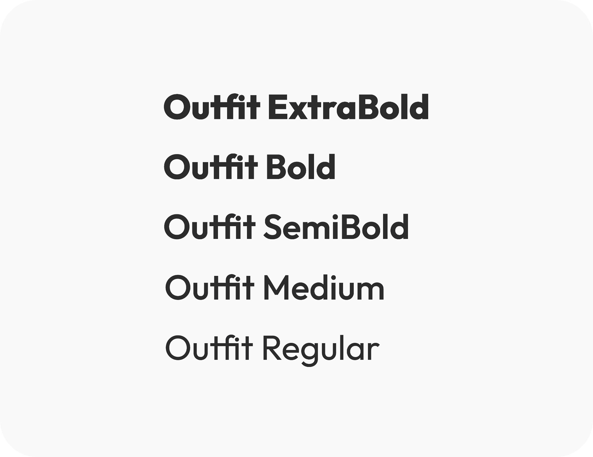
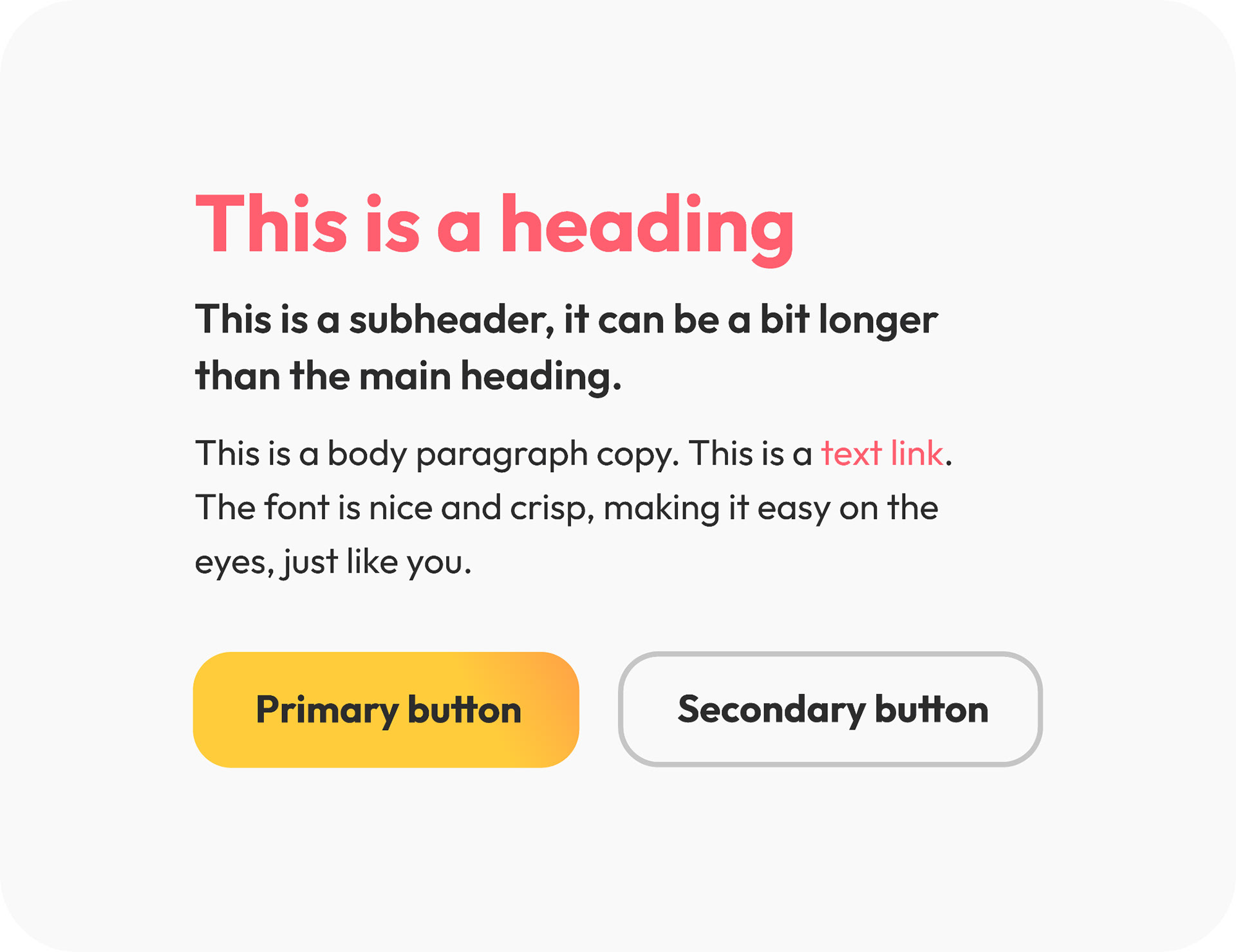
To help keep things nice and simple the brand consists of one font, Outfit, in varying weights. It has some similar visual quirks to the logotype that helps make the brand feel cohesive. It’s also free to use from Google Fonts, which is always a plus.
Colour
All of the colours
The primary colours for the brand are yellow and red. Yellow, or rather gold, has long signified something being special or representing money. Red, being a warmer colour, is stimulating and attention grabbing. Perfect colours to represent tipping.
In addition to the two primary colours, there are a whole range of secondary colours that can be used as accents, backgrounds and for illustrations. All of which mesh nicely with the primary colours.
The colours are also presented as gradients, which are a big part of the brand’s visuals, by mixing them together in various combinations. They act as an easy way to add a lot of personality and character to the brand, seeing as there isn't a huge library of visual assets.
Illustration
The joys of giving
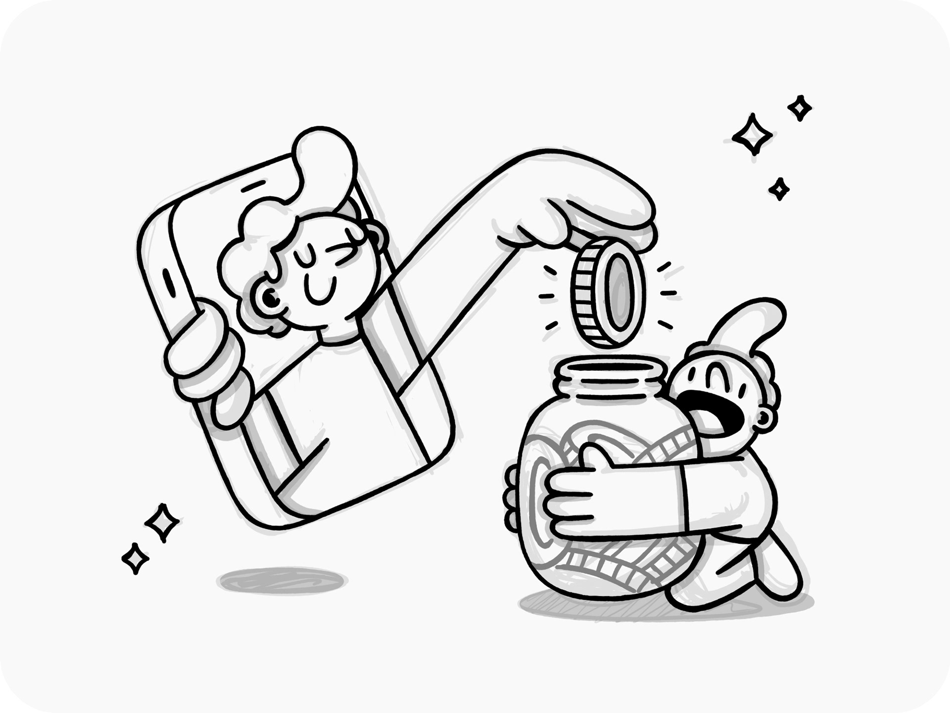
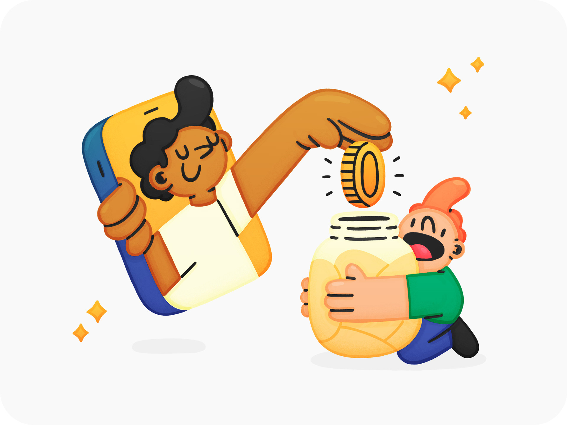
In the end, just one illustration was done to help show the act of tipping or donating. In terms of usage, it was done in a way where it could be used as a main hero on the website or signage, and then broken up for use elsewhere.
The style itself is clean and bold, but also cute and playful. Using colours from the primary and secondary colour palettes helps keep everything nice and consistent too.
As a first step, I did a rough sketch and also a colour pass.
Smileys
More money, more happies
To help tie into the emotional aspect of tipping or donating, smileys are used in the UI that get happier the larger the amount. This also helps further integrate illustrations as part of the brand, setting it apart from other similar platforms.
Tipping UI
Payment flow
Below are the various flows in the app. It's pretty simple. Basically, you would just scan a QR code at the venue, or event, that would then take you to their own page. You can read more about how it all works here.
Below is the flow for adding a custom card with a preset amount.
This flow is for adding a custom amount, but using Apple Pay or an equivalent.
Signage
Brand in play
Lastly, I mocked up a bunch of ways the brand could work in venues. Such as, beer coasters, small posters on tables, or even in bathrooms.
A lot of fun can be had with the copy depending on where it’s placed. Window decals are even a nice way to bring attention to the brand, by letting people know what venues are supported by Tribuo and also that it's a local business.
In the end we settled on these small signs to put on tables, or the bar.
Time for a beer. Cheers!
