The Walking Dead
Rick and the fam travel to the Hilltop with an ailing Maggie, leading to a daunting and life-changing confrontation.
Season 6 of The Walking Dead finished with an absolute cliffhanger, little did I know at the time that I would get to do a promo site for the next season's opener. FX wanted an engaging way to promote the return of the series, along with a competition, where fans could vote on who they think Negan has knocked off.
I am a massive Walking Dead fan. I adore the comics, absolutely love the Telltale Games (one of the first games that made me sob uncontrollably) and the show is great. So this was a dream project. Let's dig in
CONCEPT
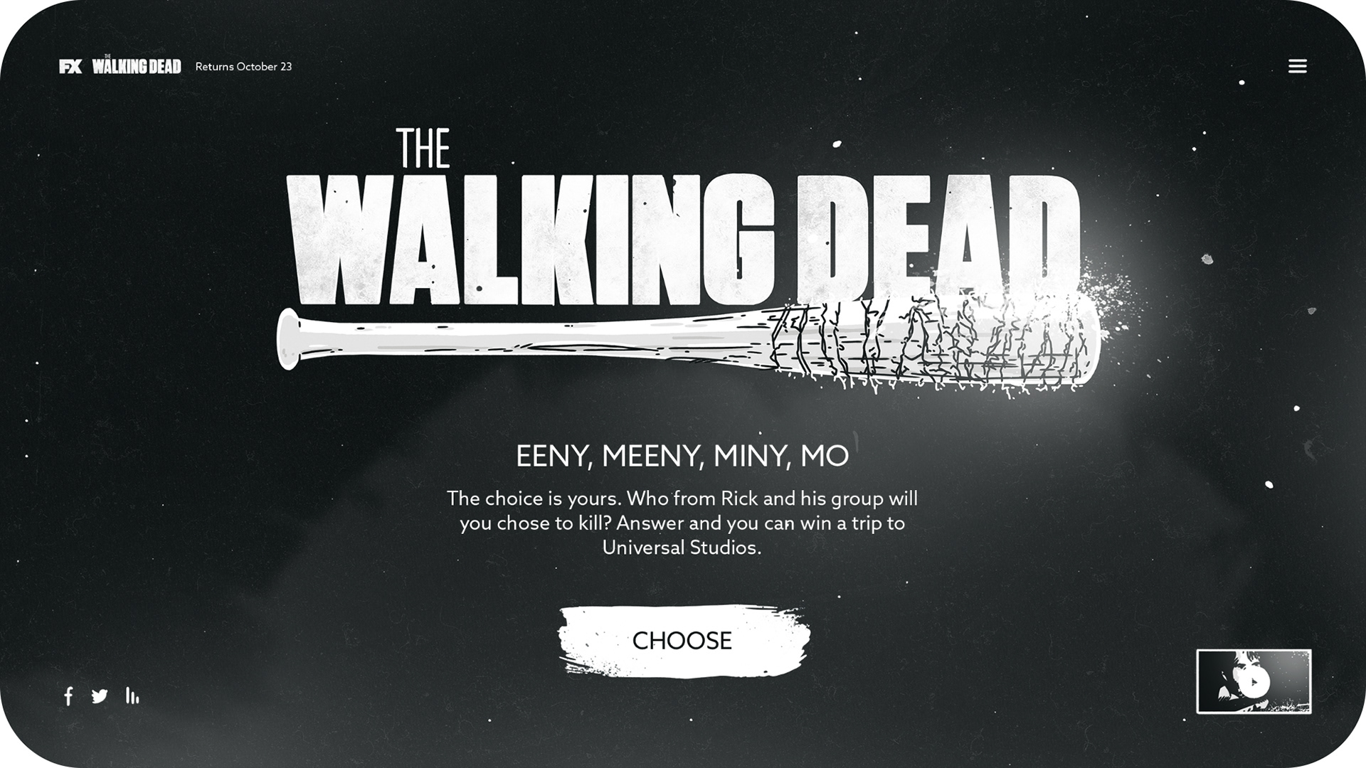
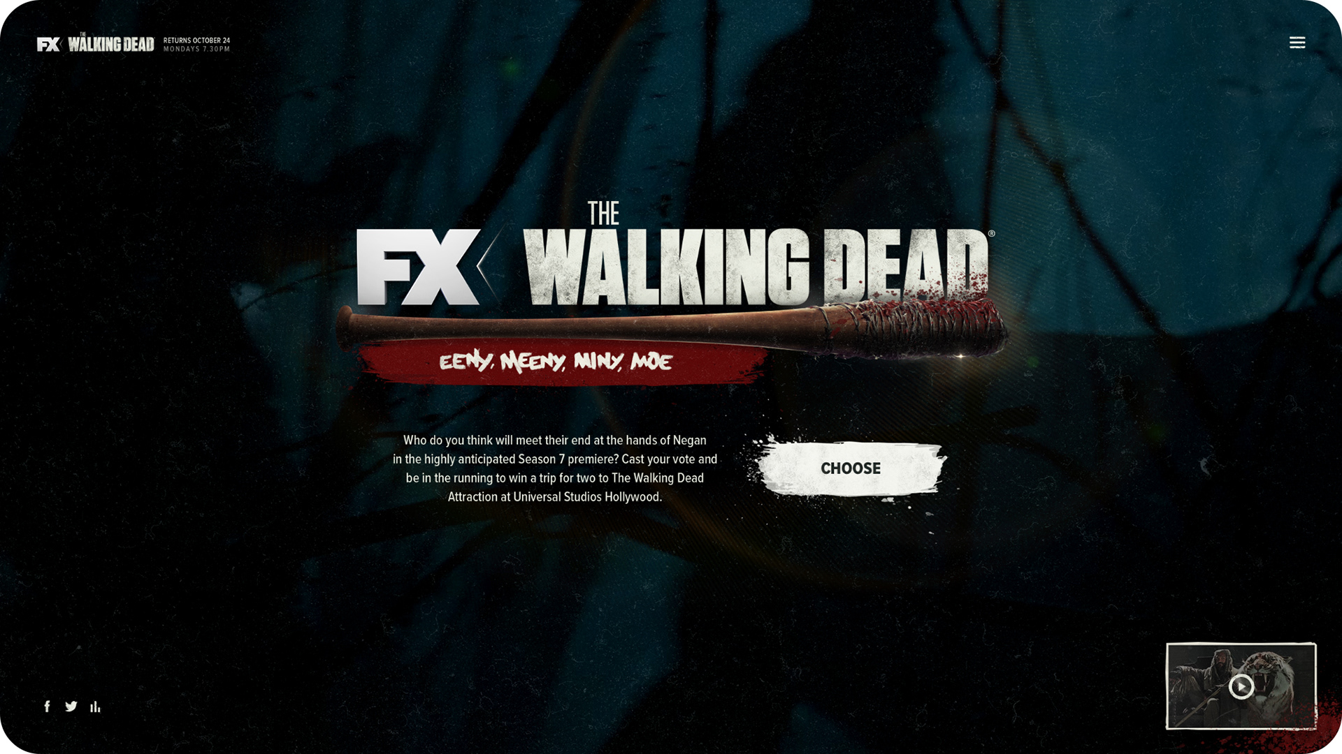
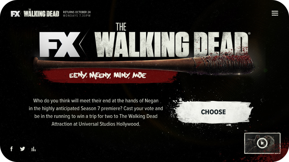
Eeny, meeny, miny, moe
As a first step for this project I decided to sketch out and storyboard the entire experience, to really help sell the concept to the client. Plus, it gave me a fairly valid excuse to try and draw all of the characters in the style from the comics.
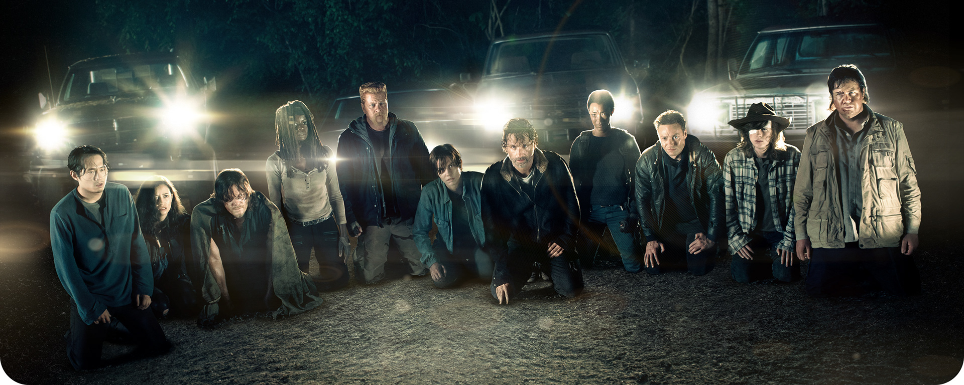
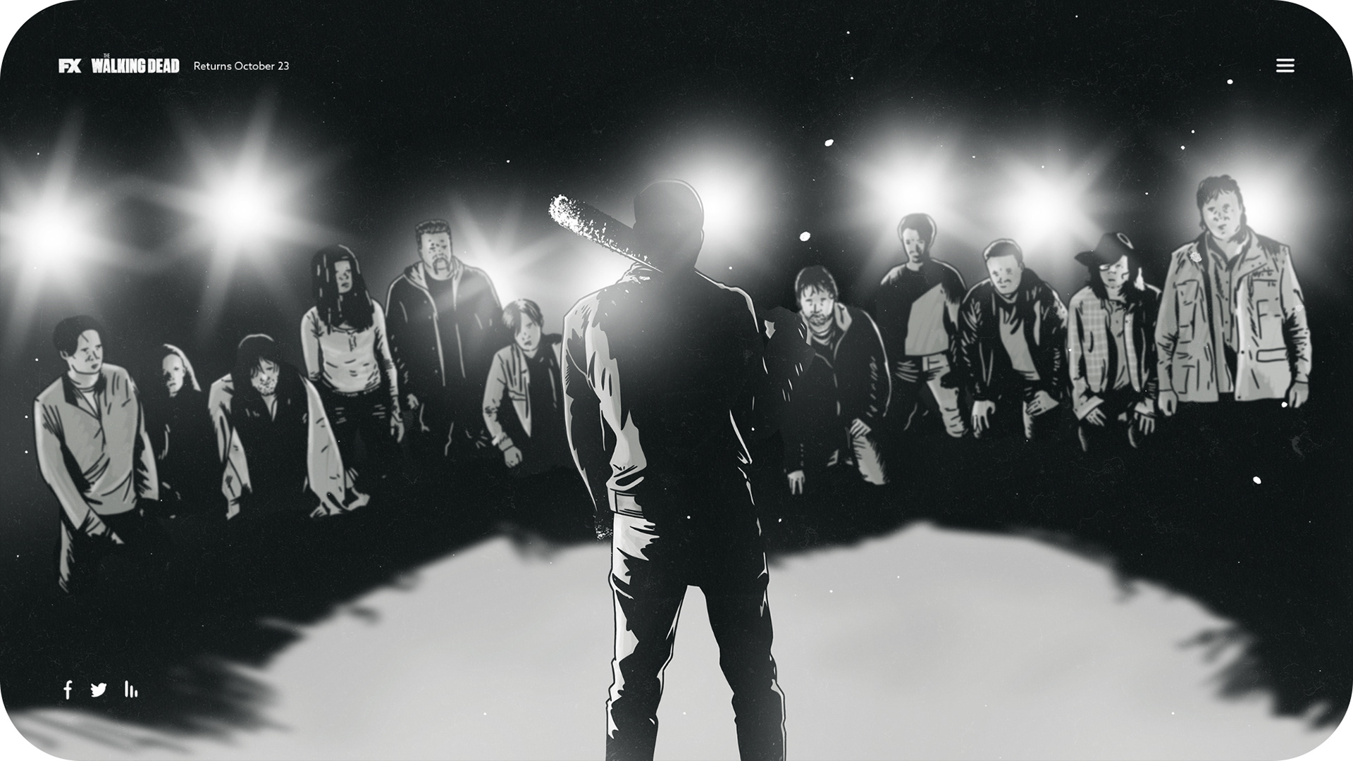
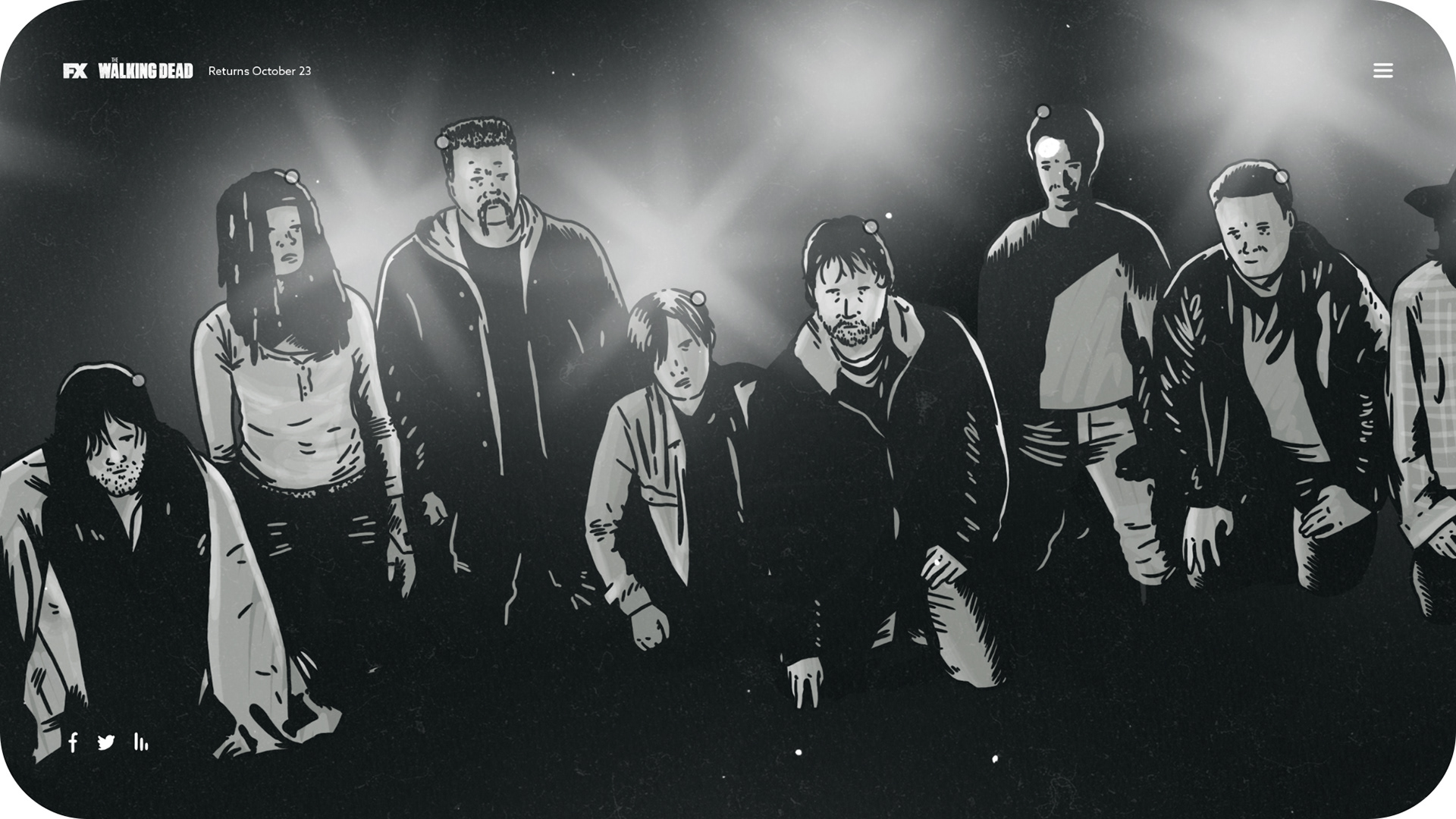
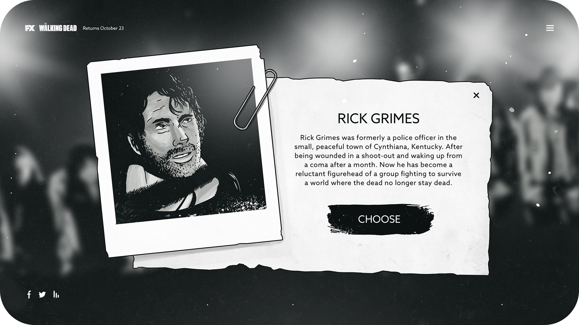
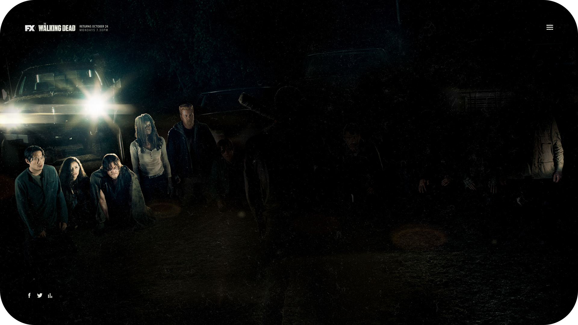
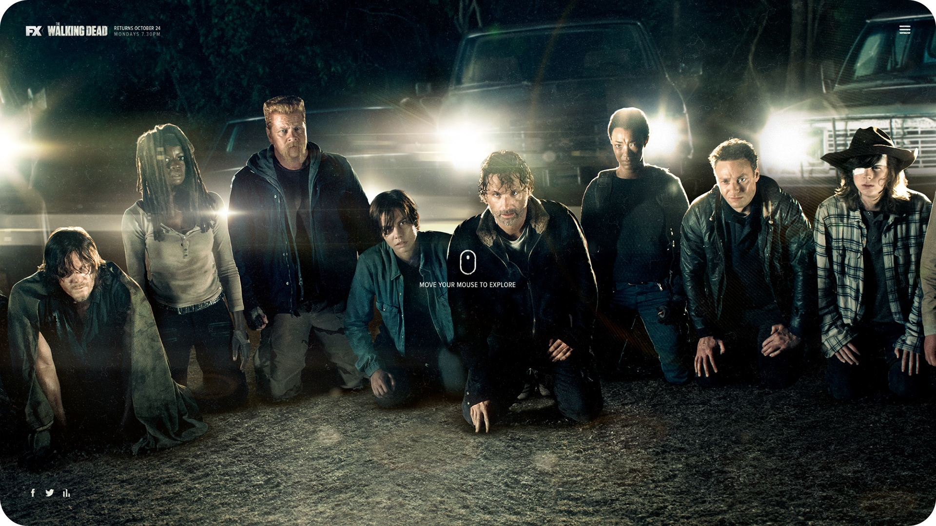
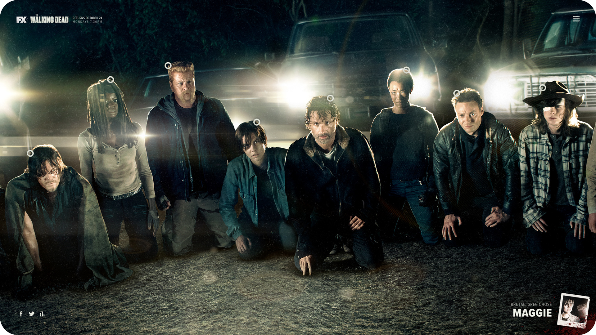
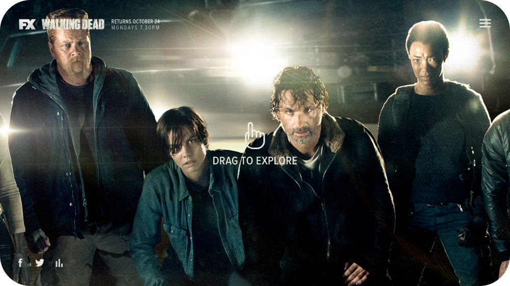
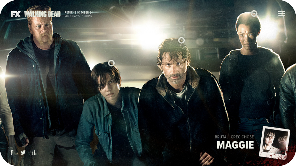
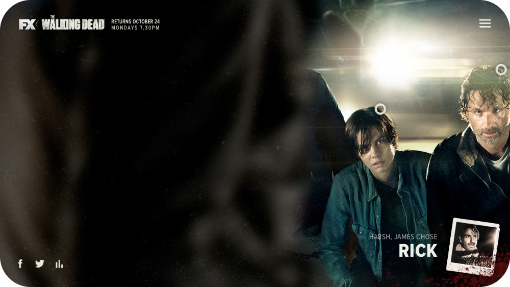
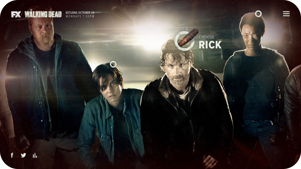
We decided to call the site "Eeny, meeny, miny, moe" — after the nursery rhyme that Negan recites in front of the group. The site opens on the line up scene, where the user could zoom in, pan around and select a character.
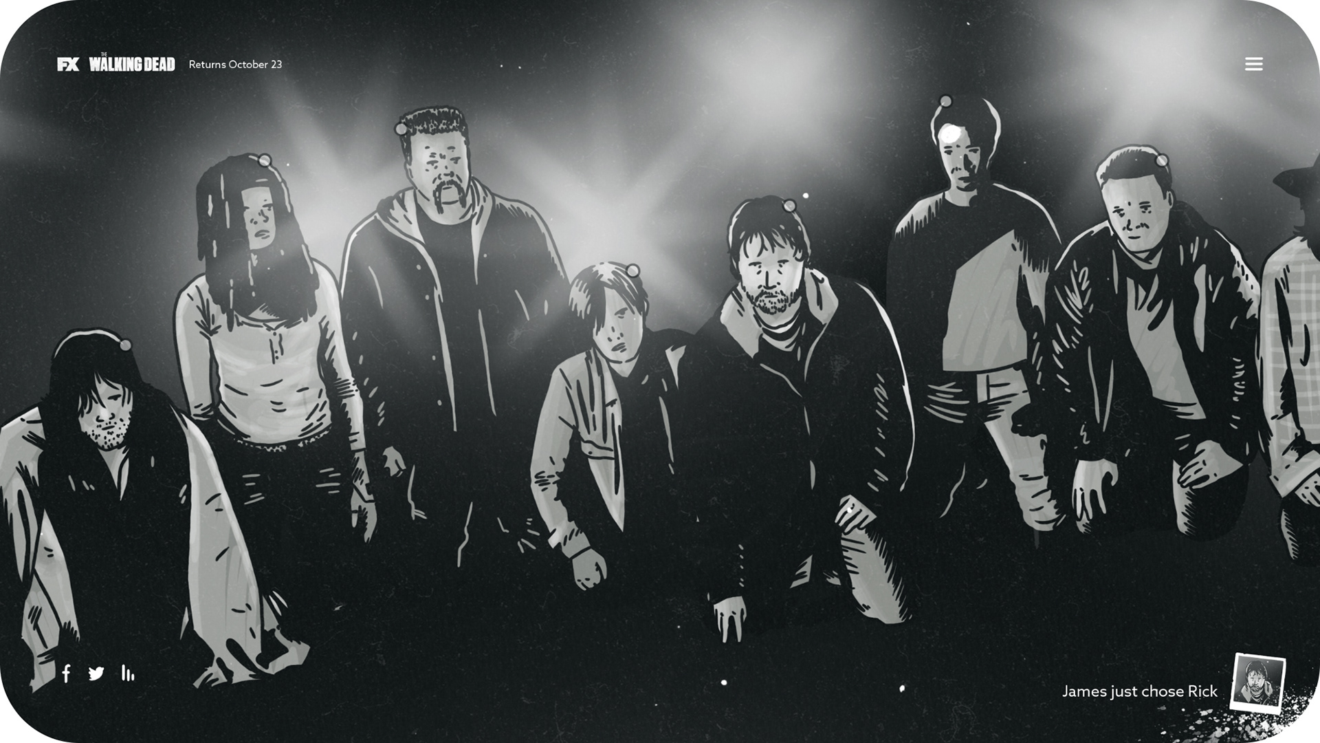
We thought it could be a cool idea to have Negan walk back and forth every now and again. Just as a bit of a stressful reminder that he's there. As well as having little popups in the bottom right corner when another user has made a decision.
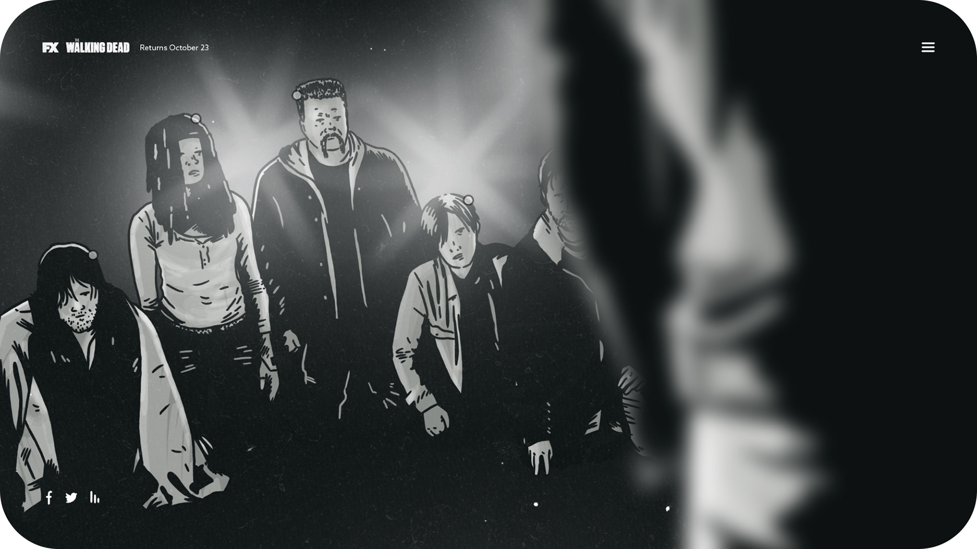
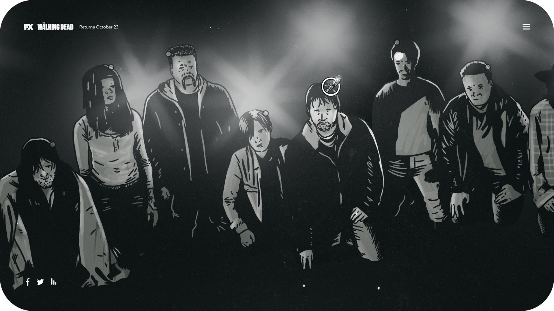
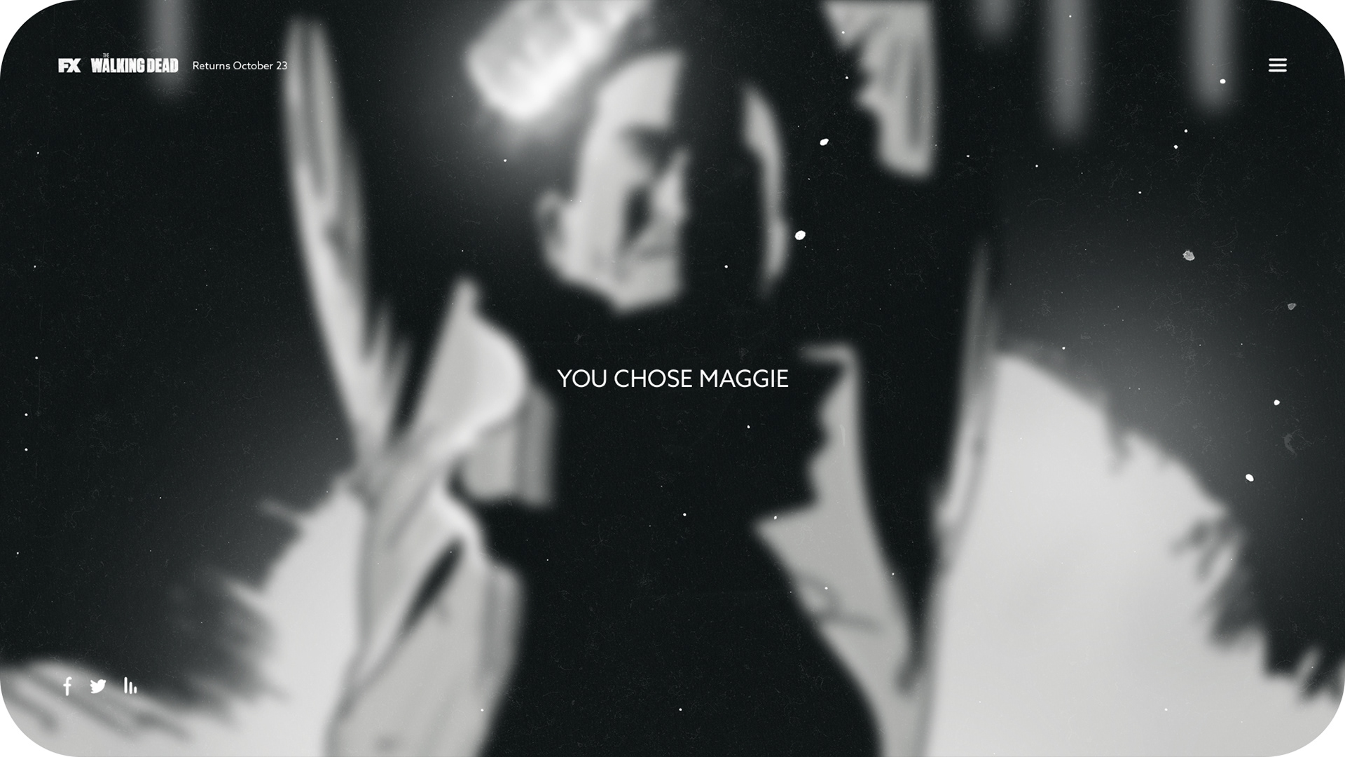
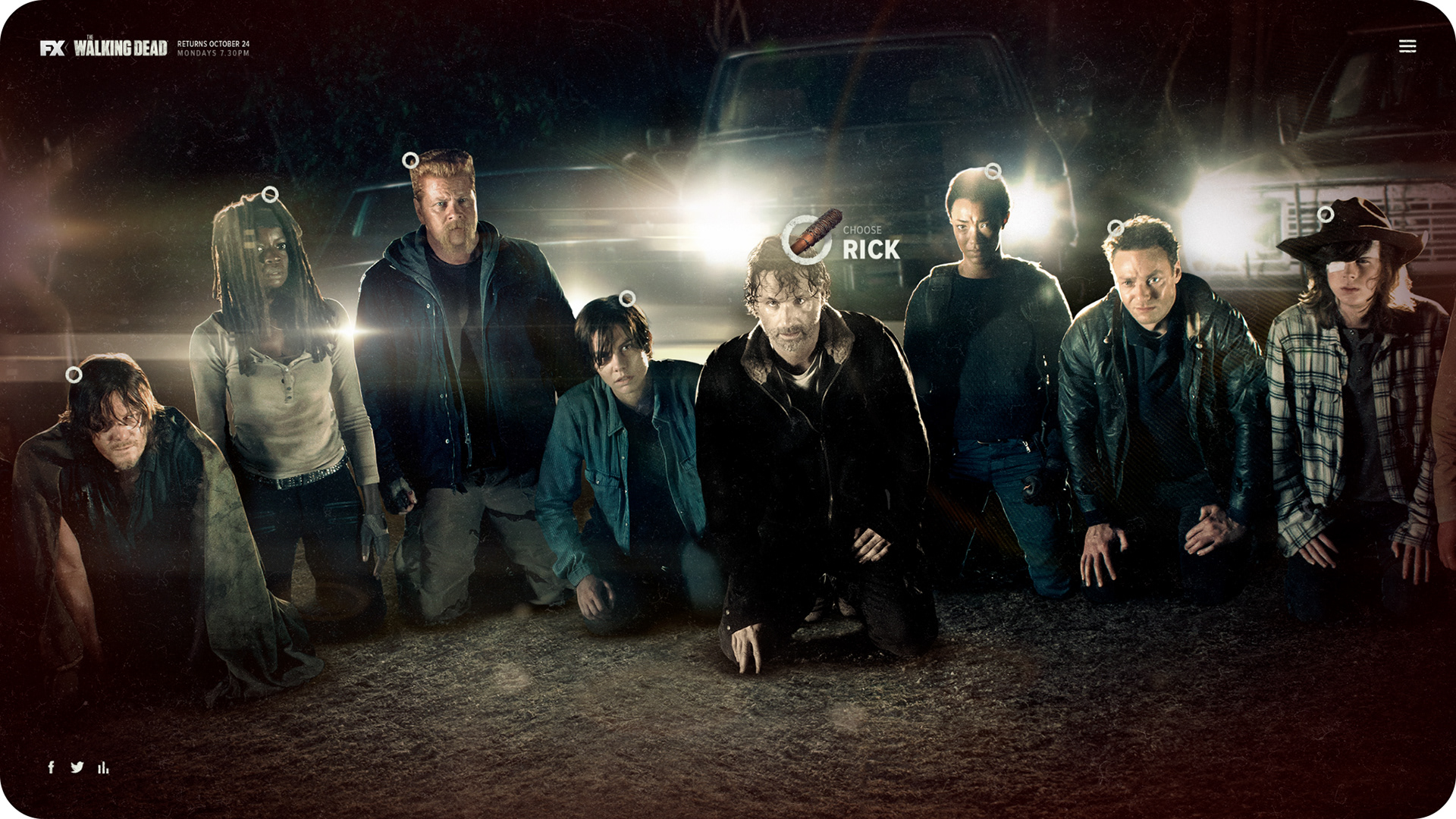
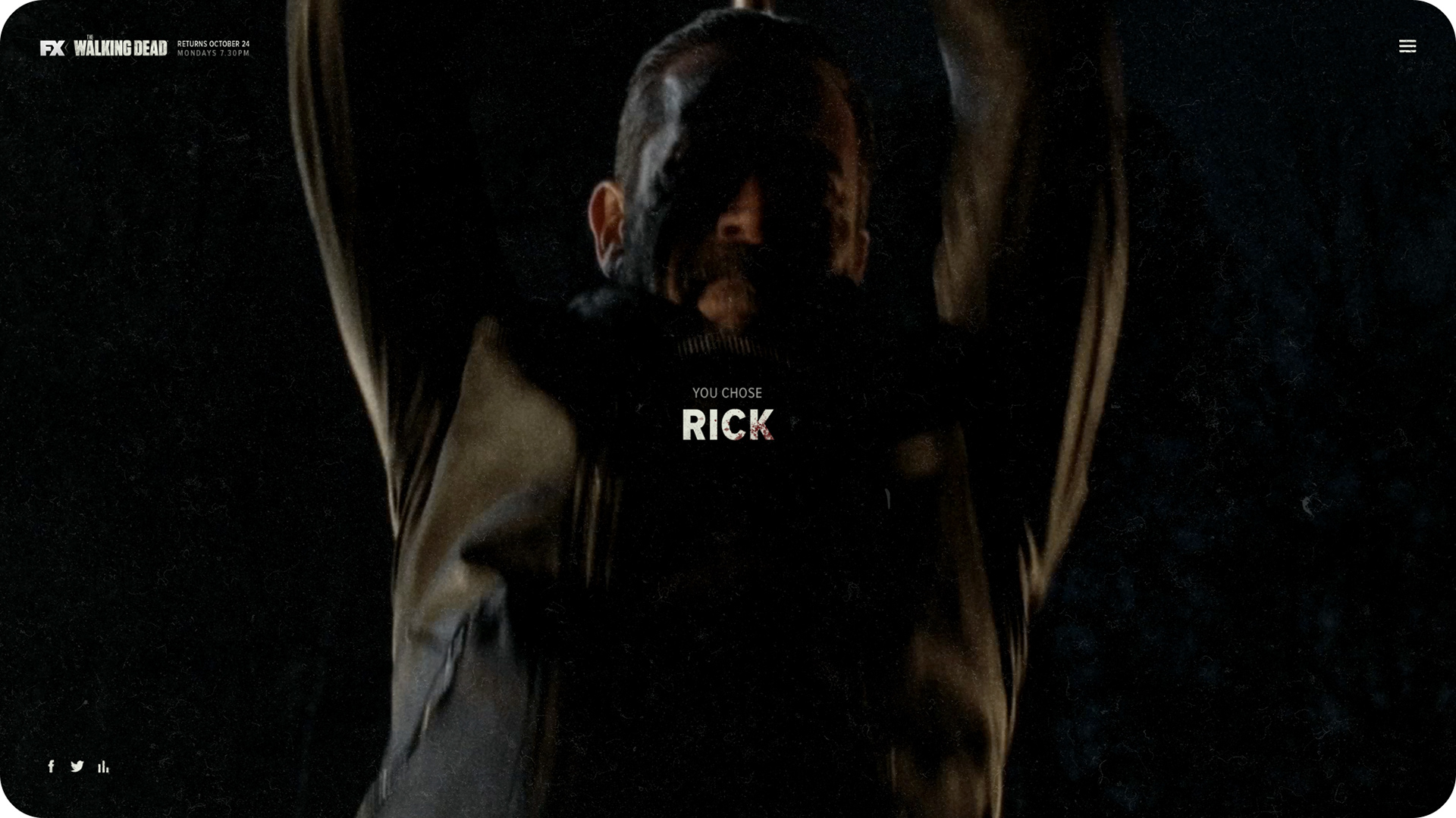
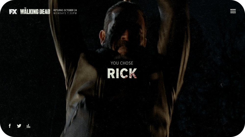
Once the user has decided who they think will kark it, they would click on that character and hit choose. Then Negan goes to town on them with his weapon of choice, Lucille. Each character also had a little bio to give you some backstory and inform the user's decision.
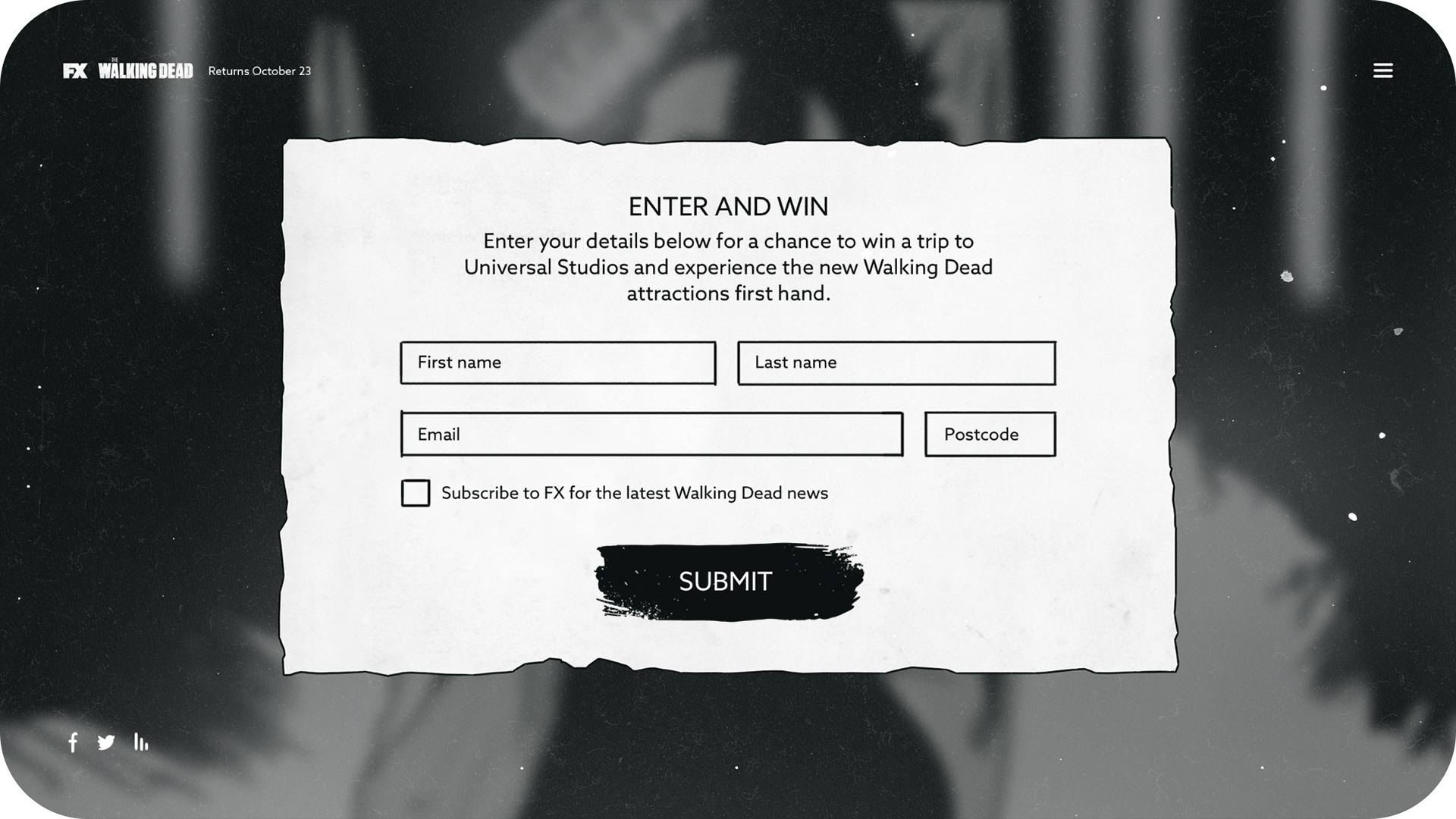
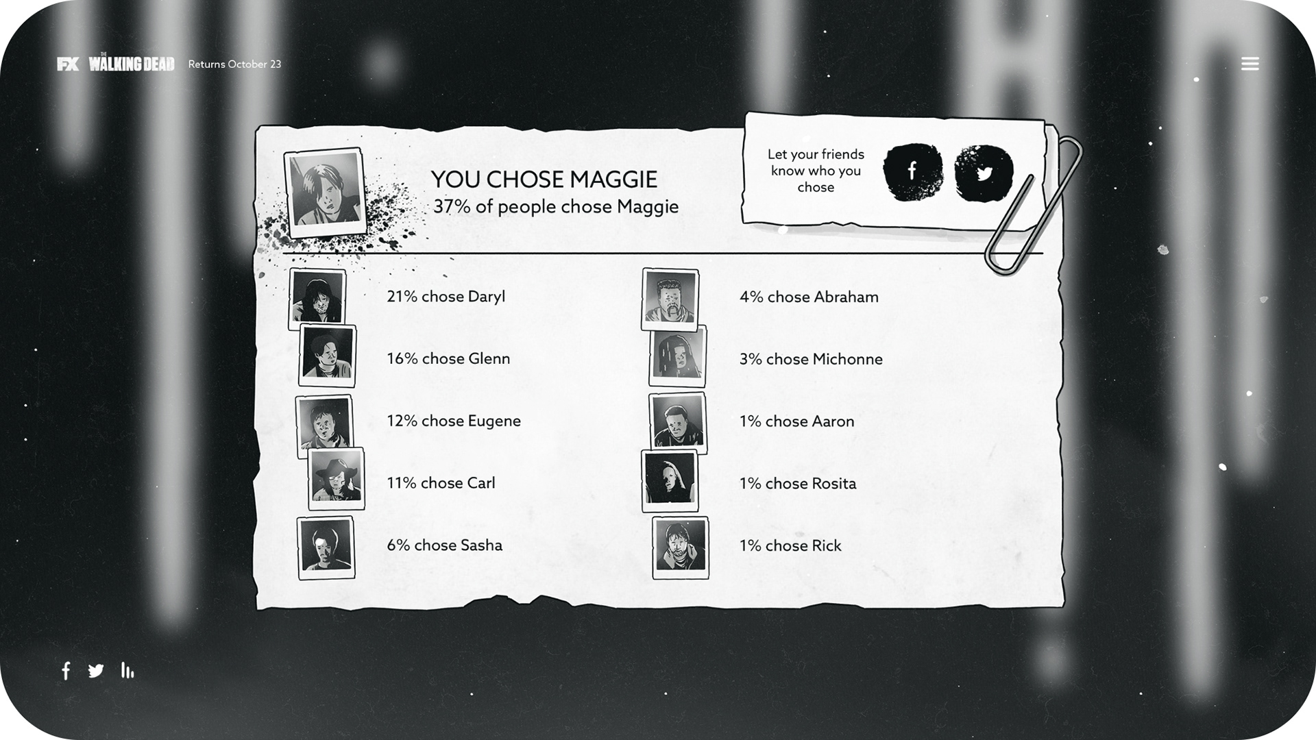
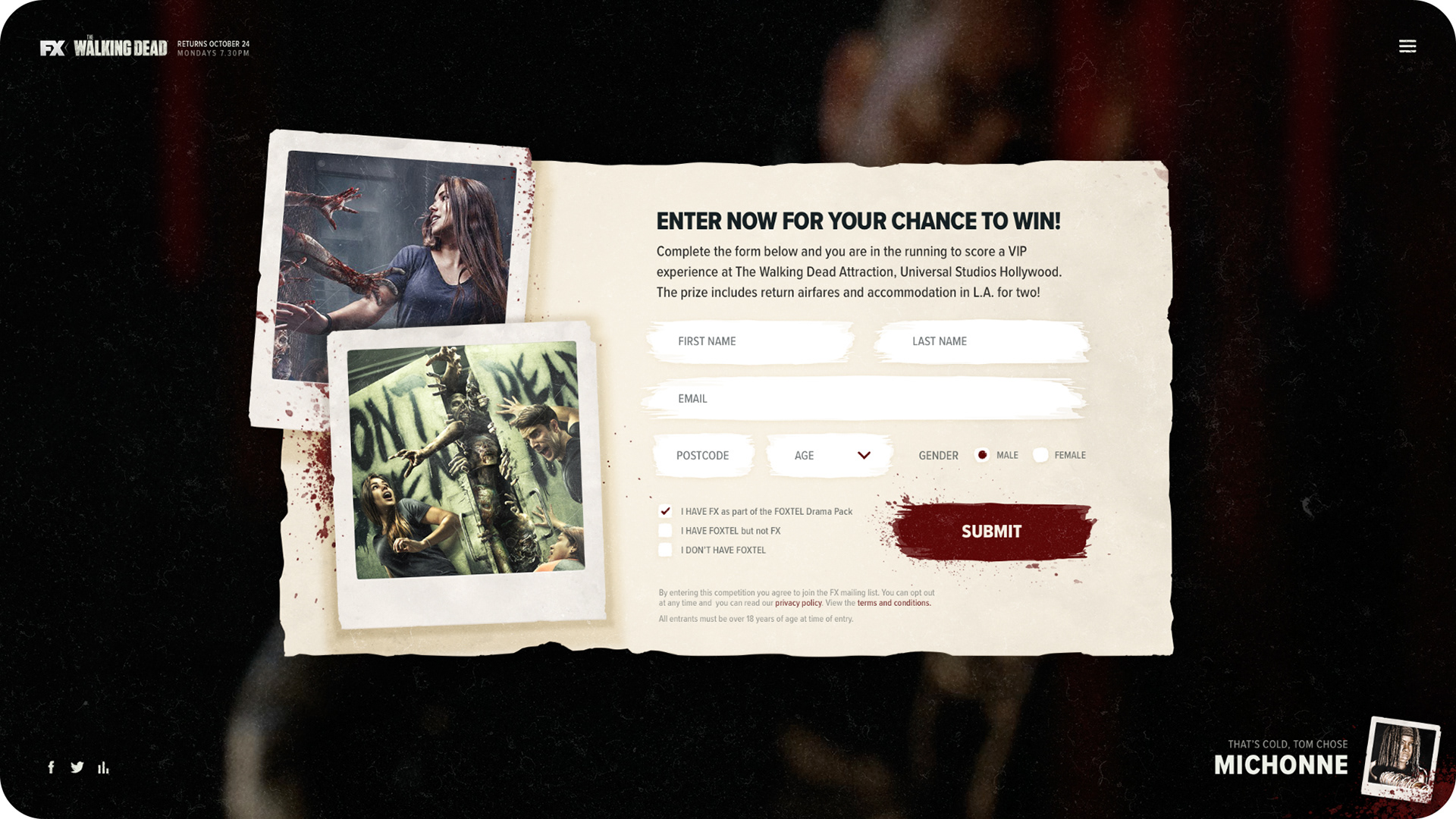
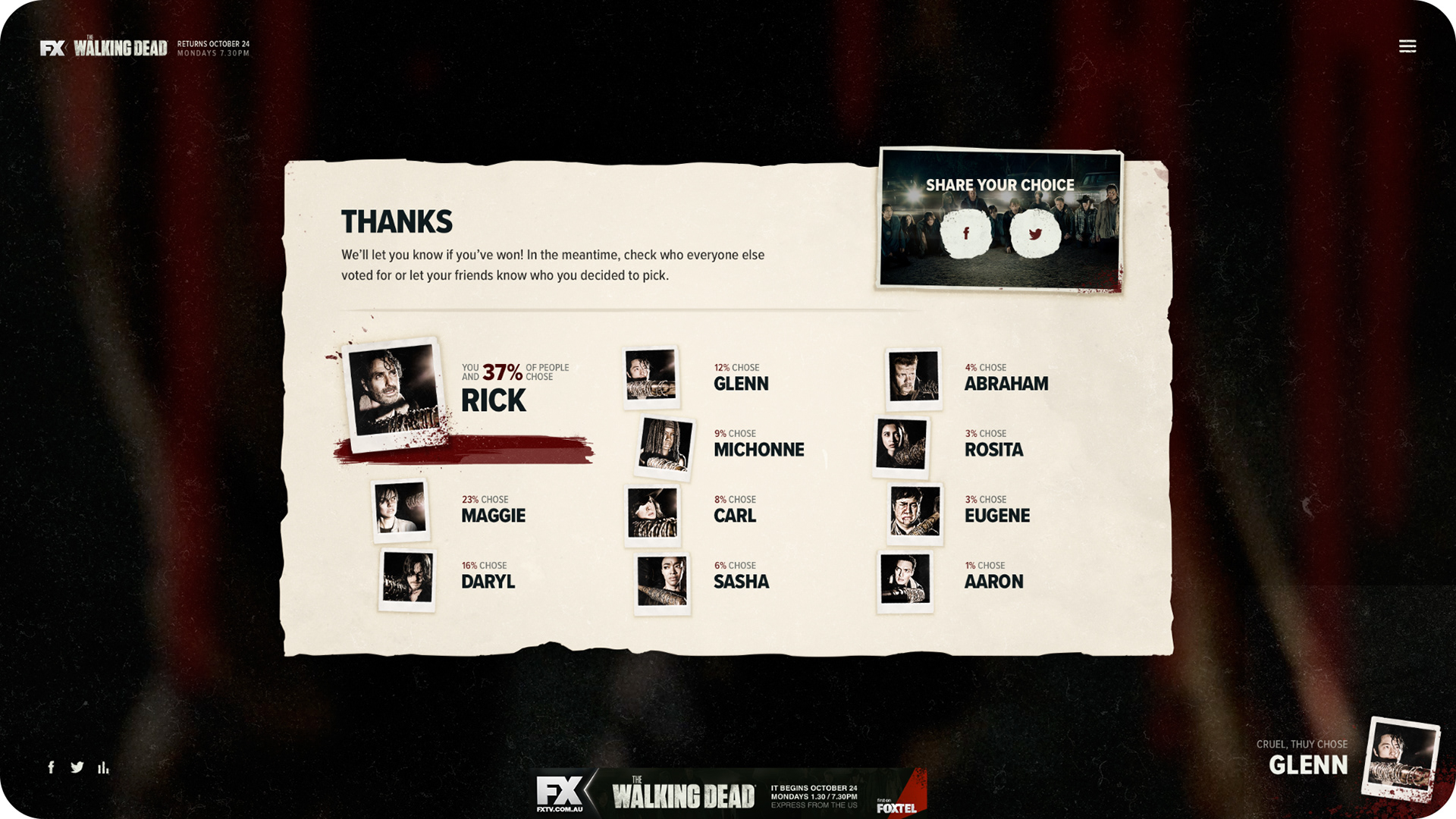
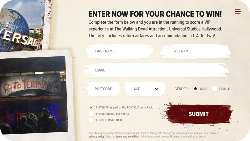
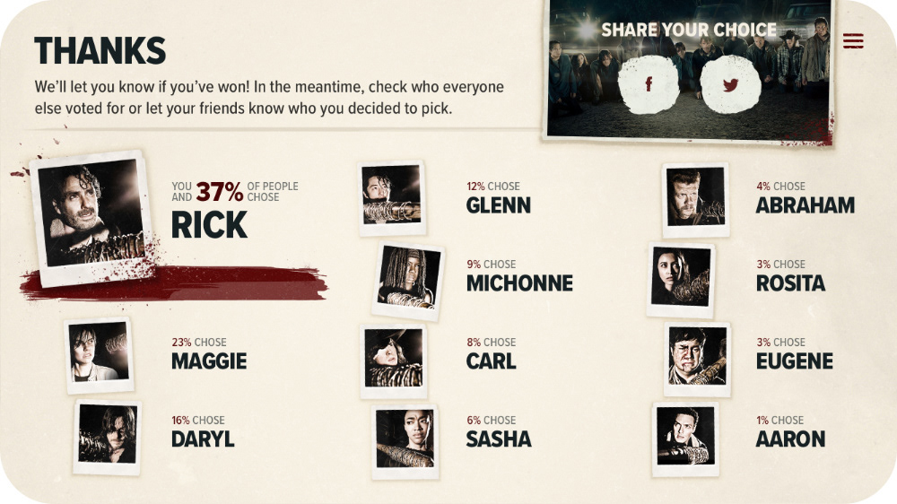
Once that's over, the user was then presented with a form to enter the competition (a trip to Universal Studios Hollywood, which was pretty sick) and a results screen, so they can see who other people have voted for. I was inspired by the end screen you get with Telltale's games, where at the end of each episode you can see what other players chose to do at pivotal points in the story.
Design
Final screens
Here are the final designs in all their zombie blood soaked glory. Not much changed from concept to final, which was great, just some copy and imagery.
After the main menu, we thought it'd be a cool intro to have the car headlights turn on with their engines revving to reveal the line up.
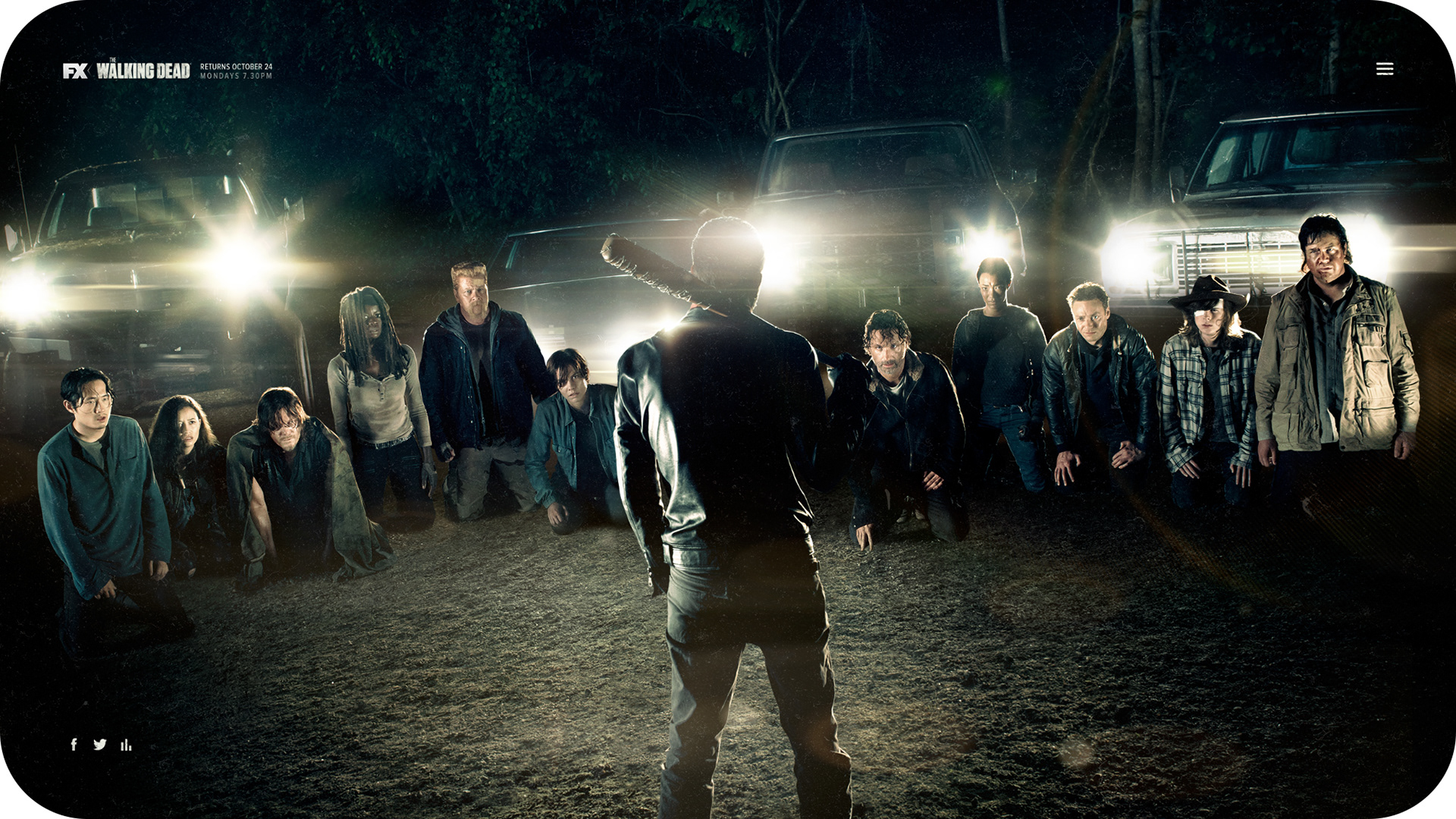
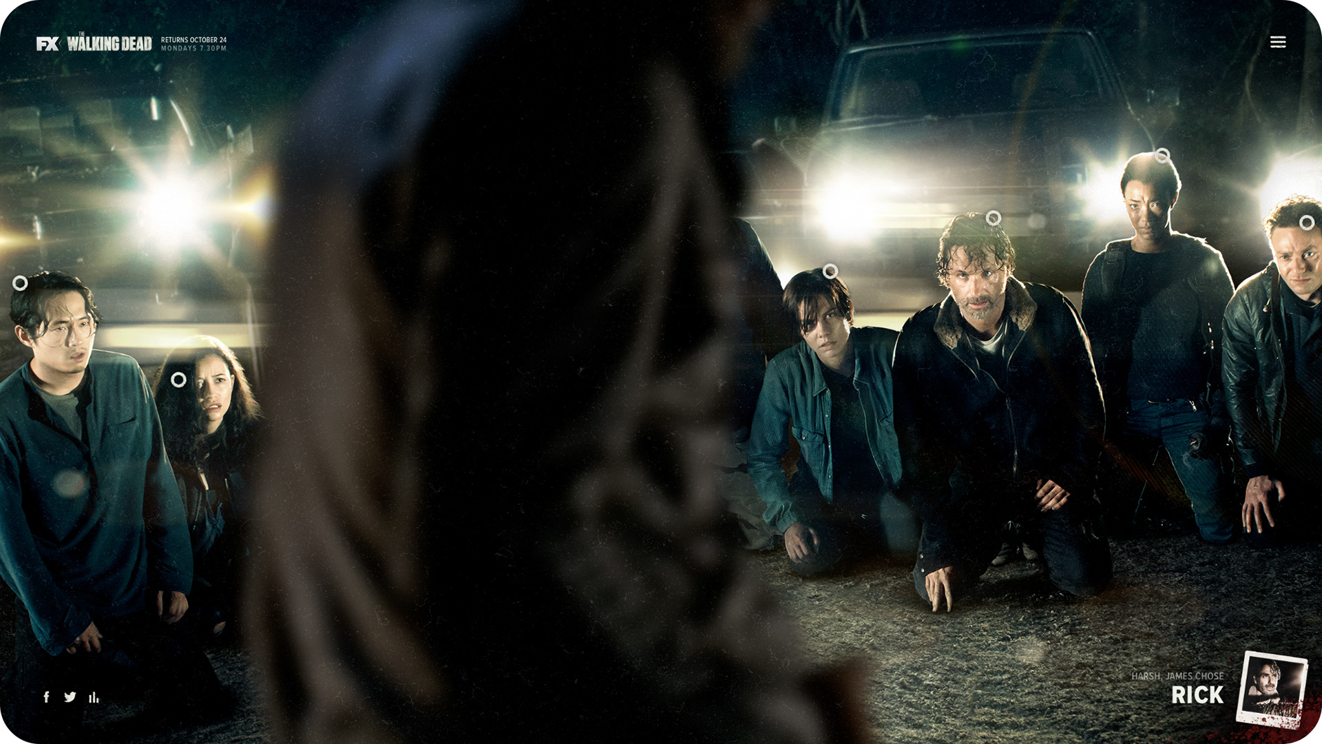
Below are the main experience screens. When you hover over a character it would start to zoom in ever so slightly, with a red vignette and foreboding music. I had to deep etch all of the characters out of the flat photo, so we could do all of the various hover states and parallax.
Super subtle, but we also had bloody streaks slowly oozing down during the form and results screens. Yummy.
It was very much a desktop-first experience, but we made sure that it worked well on mobile also.
I had so much fun working on this project. I should really finish watching the rest of the series and reading the comic, but here we are.
Credits
Role: UX / UI Designer + Illustrator
Client: FX
Studio: Chook
2016