
Recycle Right
Wyndham City Council is committed to a sustainable future, improving recycling knowledge to help divert significant waste from landfill.
Through analysis of data collected from community recycling bins, Wyndham identified that they had very poor household recycling rates — over a quarter of what is put in the recycling bin is wrong. This campaign, Recycle Right, sought to improve recycling knowledge and help divert significant waste from landfill.
I created a whole cast of illustrated characters that represent key household waste items, to help tell the story of recycling. Why it’s important and what to keep in and out of the bin.
Objectives
Knowledge and practice
The key objectives of the campaign was to help improve overall recycling knowledge and improve recycling practice. Leading to a better understanding of what can and can’t be recycled, and to emphasise the key recycling types and the wide variety of items that sit under those types.
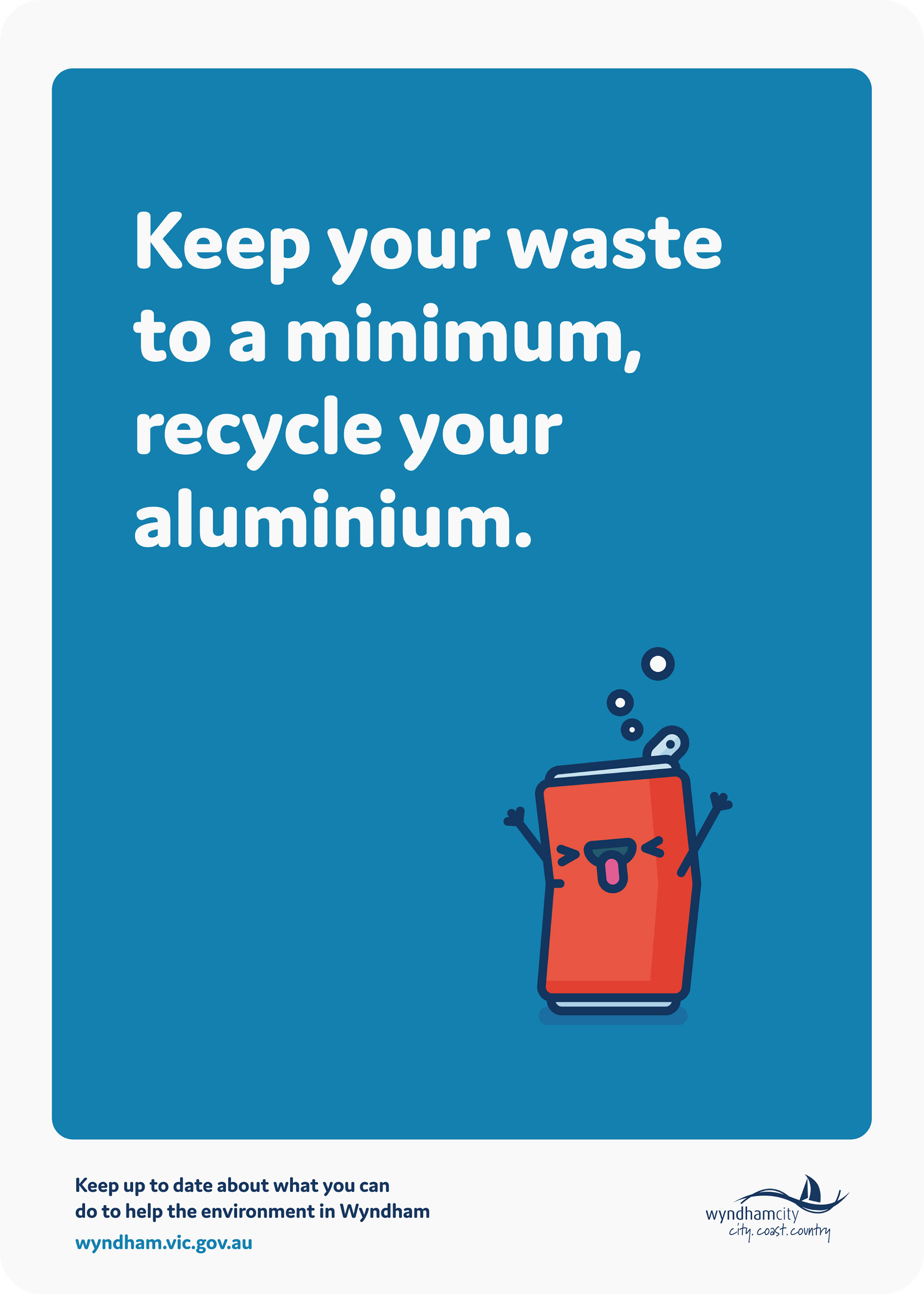
For instance, with aluminium, most people think of cans, but don’t realise foil and even oven trays can be recycled.
Concepts
Look and feel
The main direction from the client was that the characters should be playful and have a lot of personality. So to kick things off, I sketched up a few different items and then took one of them (the garbage bag) and rendered it out in a couple of different styles.


The client decided to move forward with the second option, which was simpler with outlines and no shading. This direction stayed much the same with the final ones, with the only differences being a consistent stroke colour, instead of a darker shade and a bit of shading.
Colour
Consistent palette
I created a colour palette to be used for these illustrations and the overall campaign, so everything was consistent across all of the collateral.

I also gave the character sets a background colour that applies to them. For instance, blues and yellows for the recycling items, as Wyndham’s recycling lids are blue and across Australia they're mostly yellow. The non-recycling items, such as garbage are red.
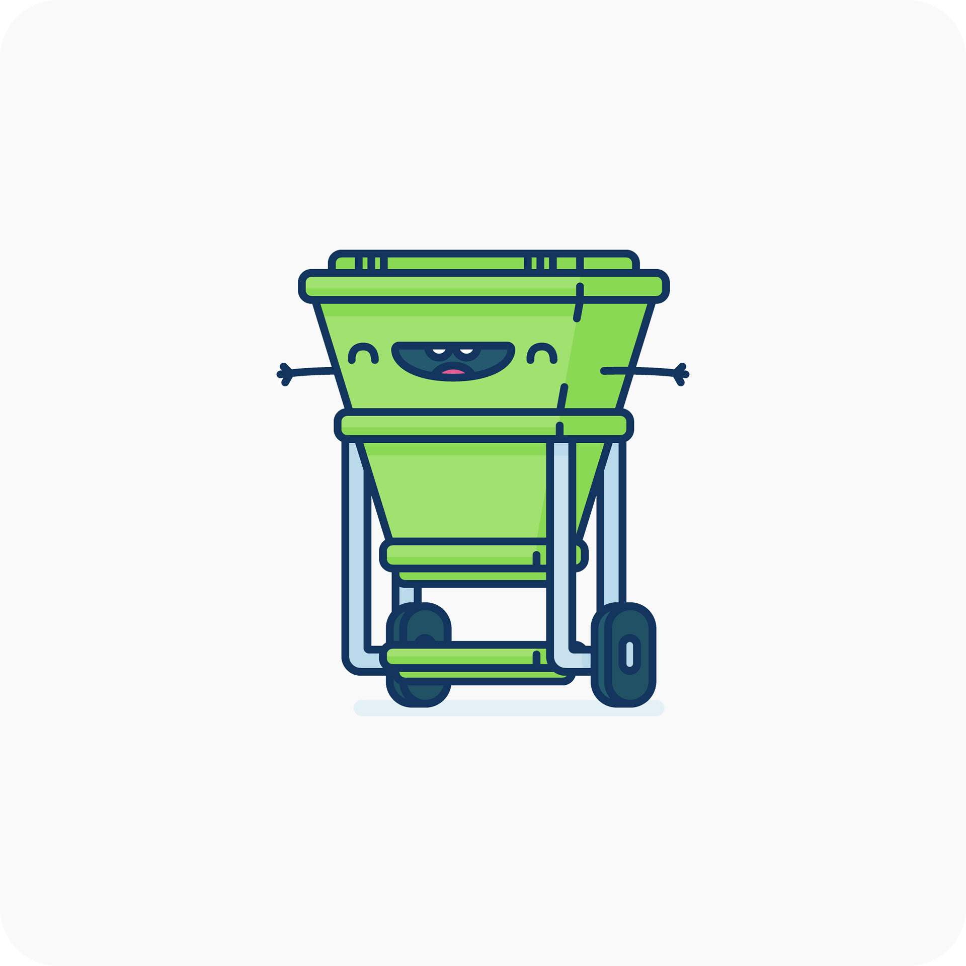
Characters
Items and groups
The client provided an extensive list of items that they would like, which were separated into categories, such as plastic, garbage or electrical waste. Just as you would seperate these items at home.
For each group, I illustrated the items on their own and then also put them all together as a larger composition interacting with each other.
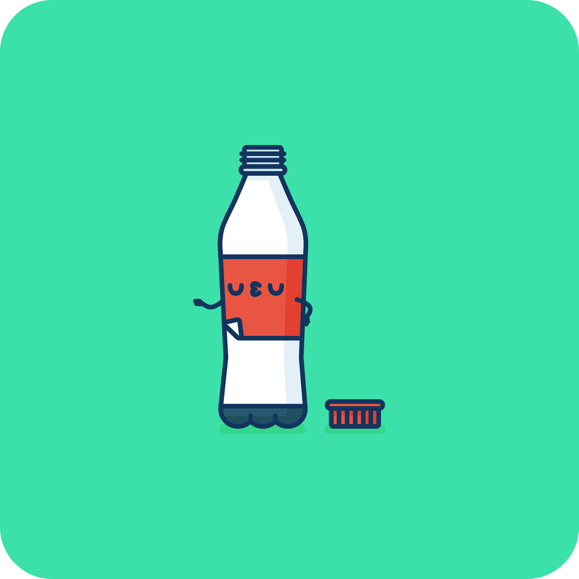
Plastic
The first group was made up of plastic, containing things like bottles, containers and even toys.


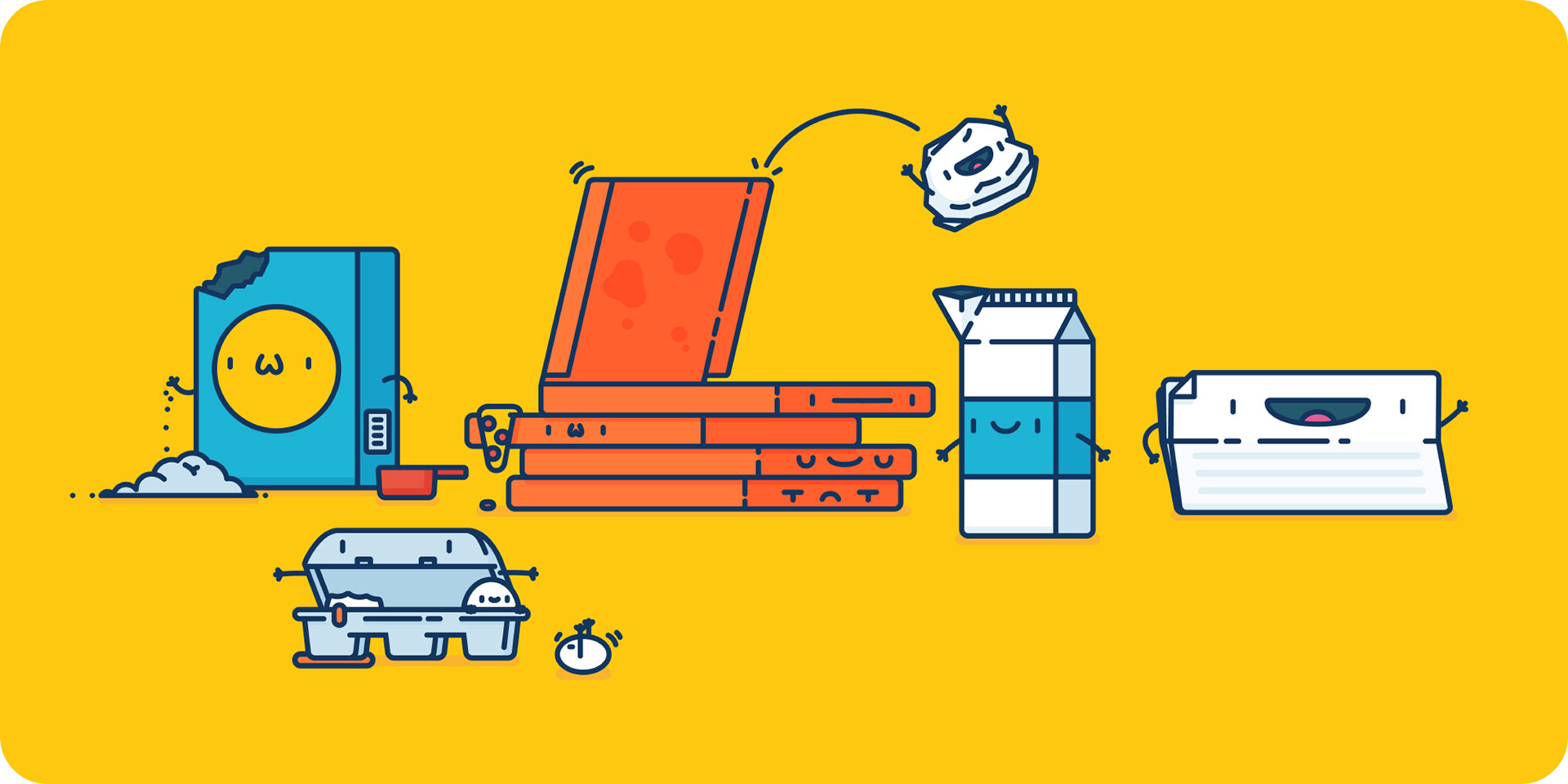
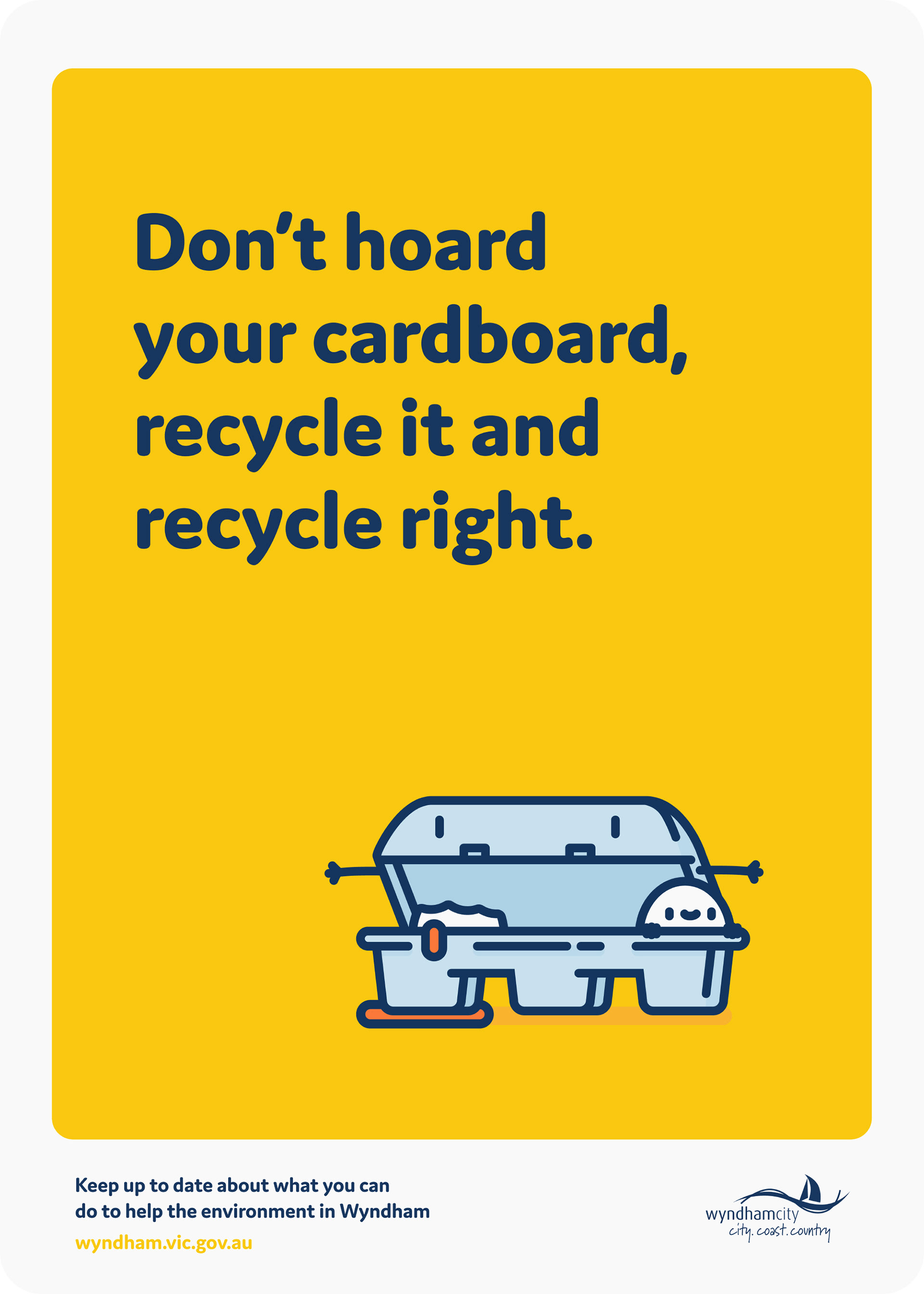
Cardboard + Paper
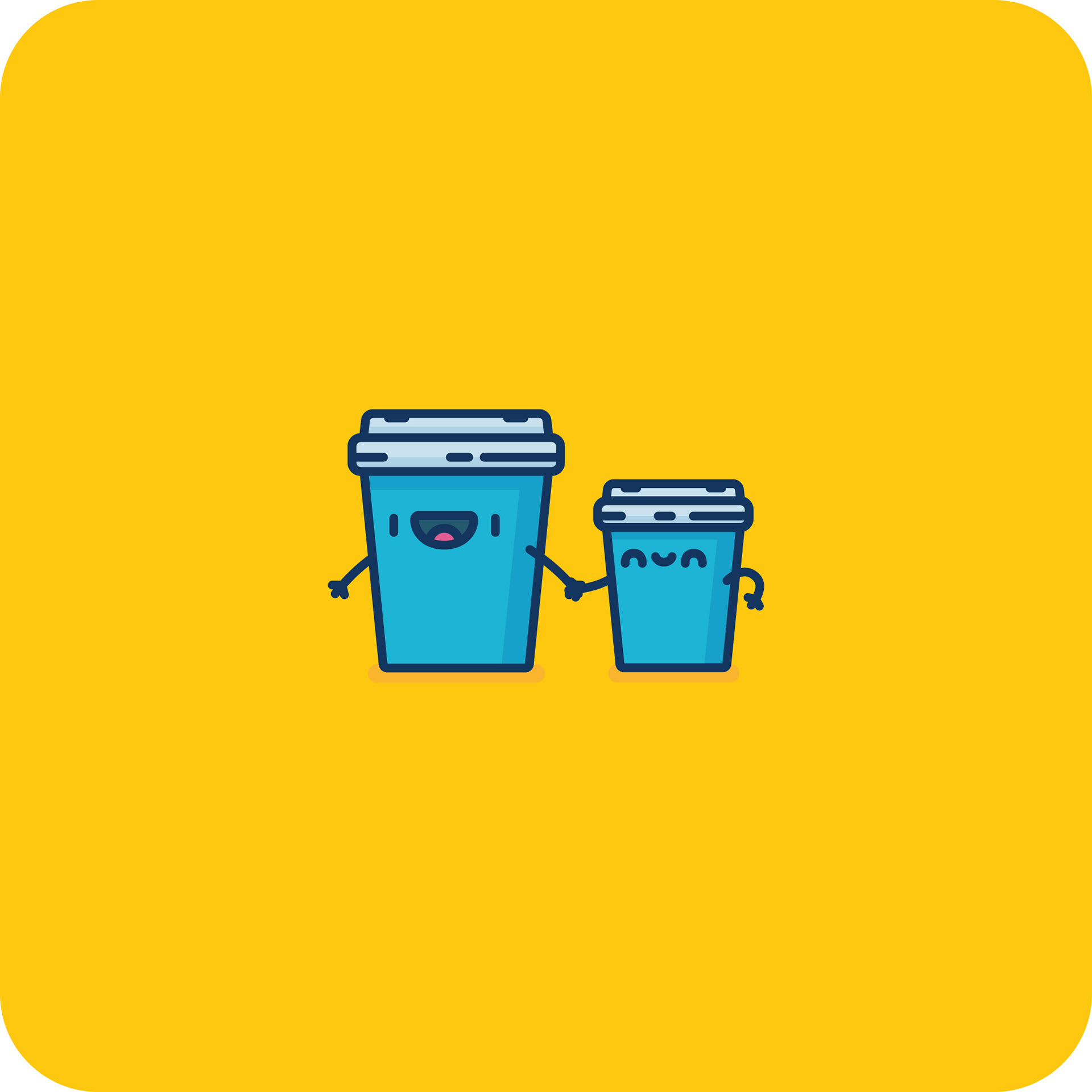
Apart from plastic, cardboard and paper is what you would mostly find in a suburban recycling bin. This group was made up of cardboard boxes and cartons, along with used paper.


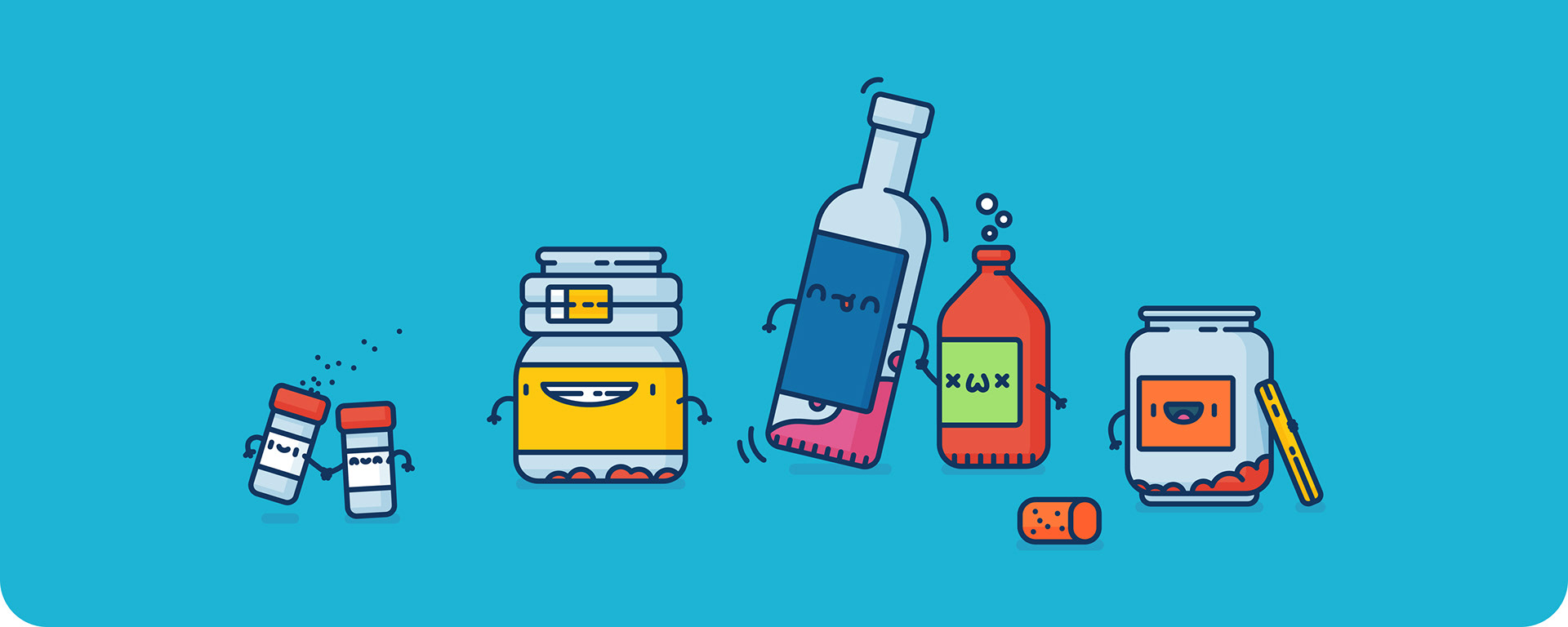
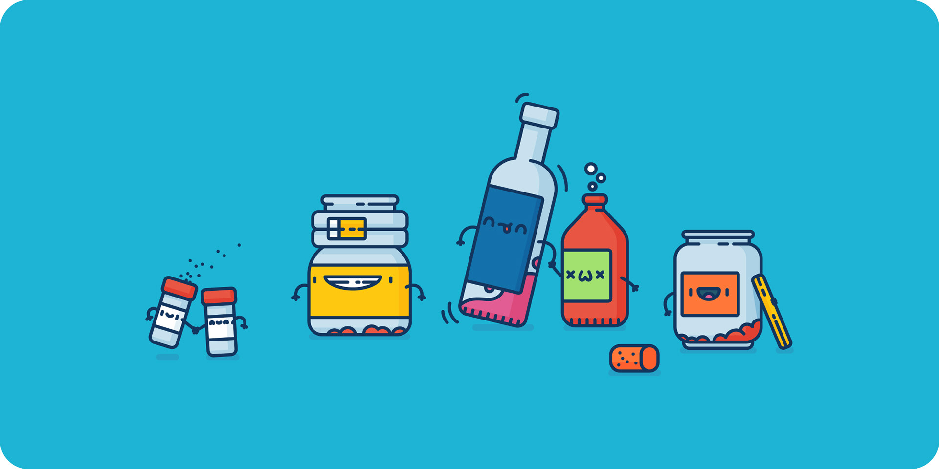
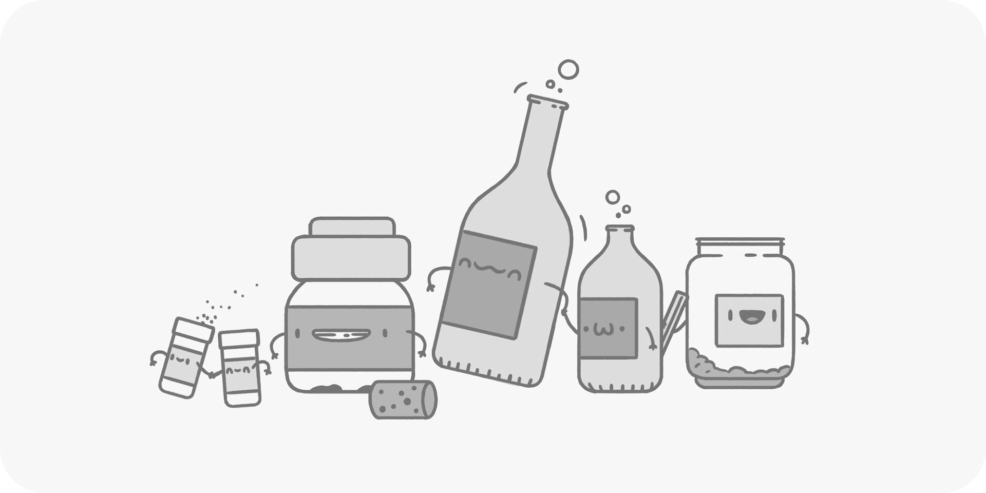
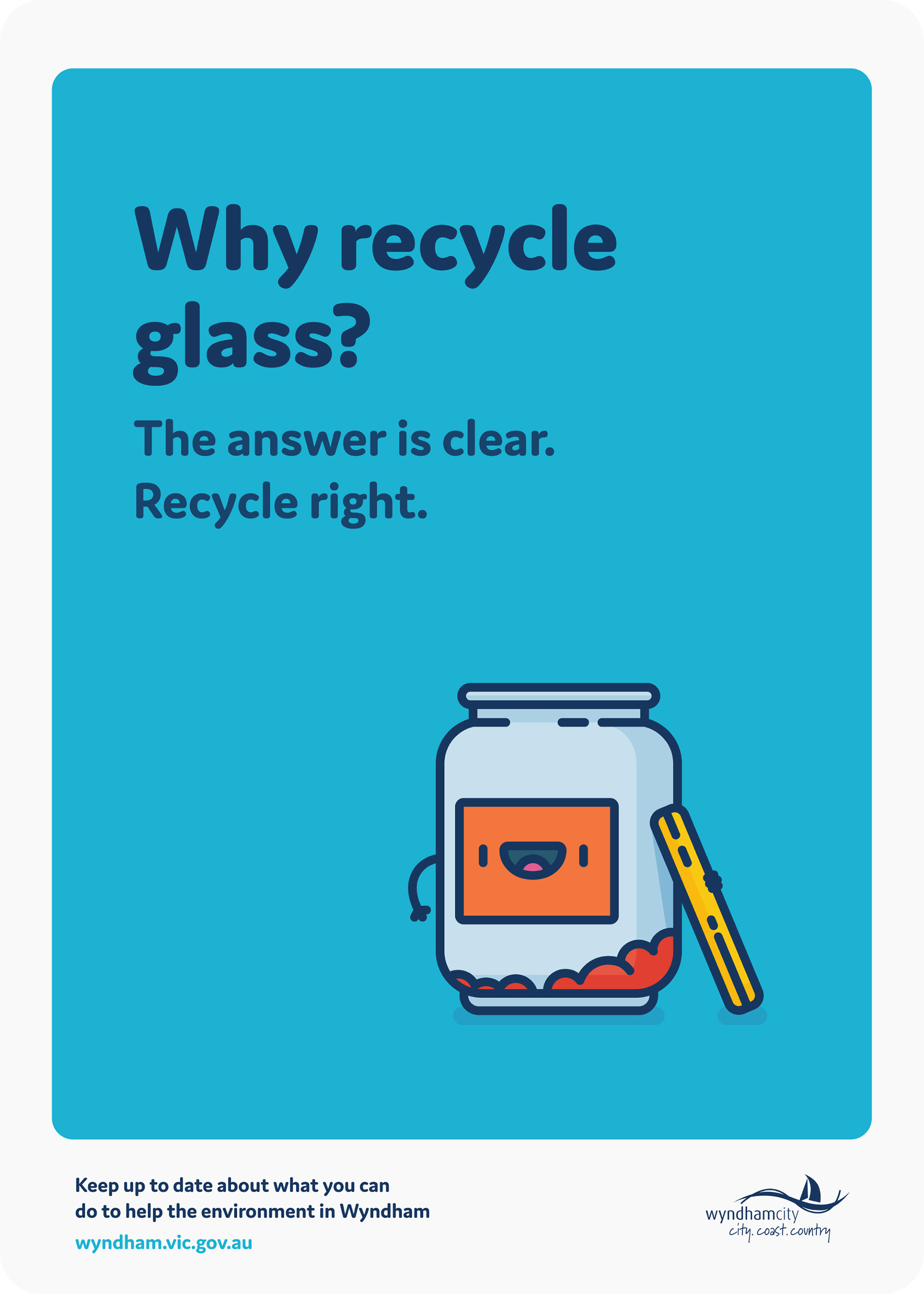
Glass
This group was made up of glass jars, plus beer or wine bottles. Lots of beer and wine bottles.
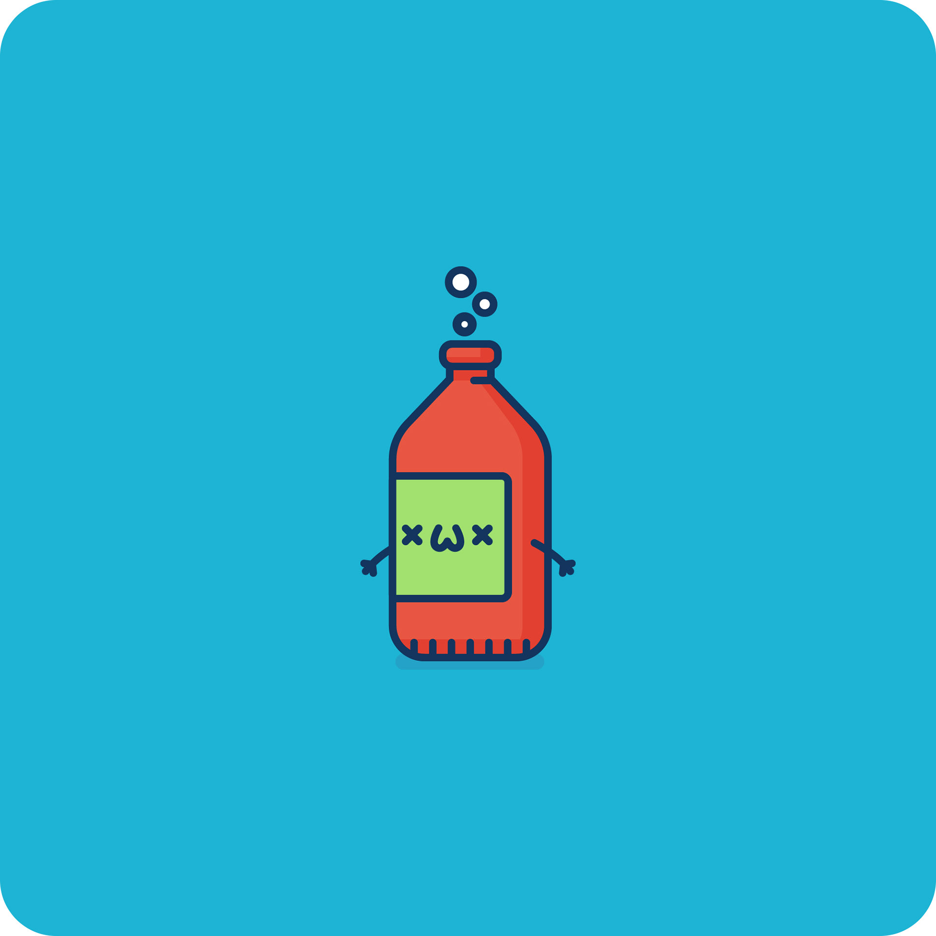


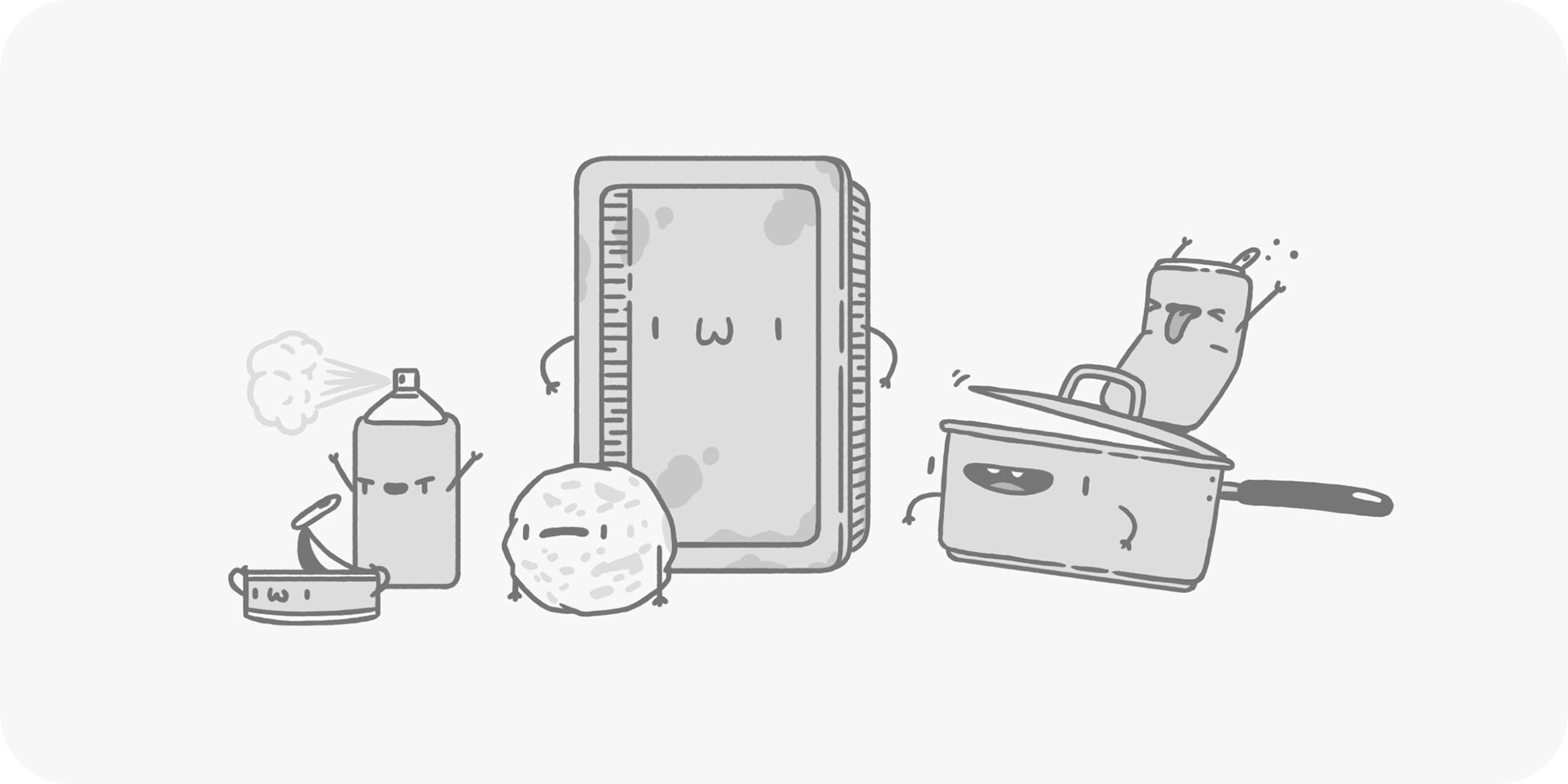
Metal
This group was made up of metal items, made out of aluminium and steel.


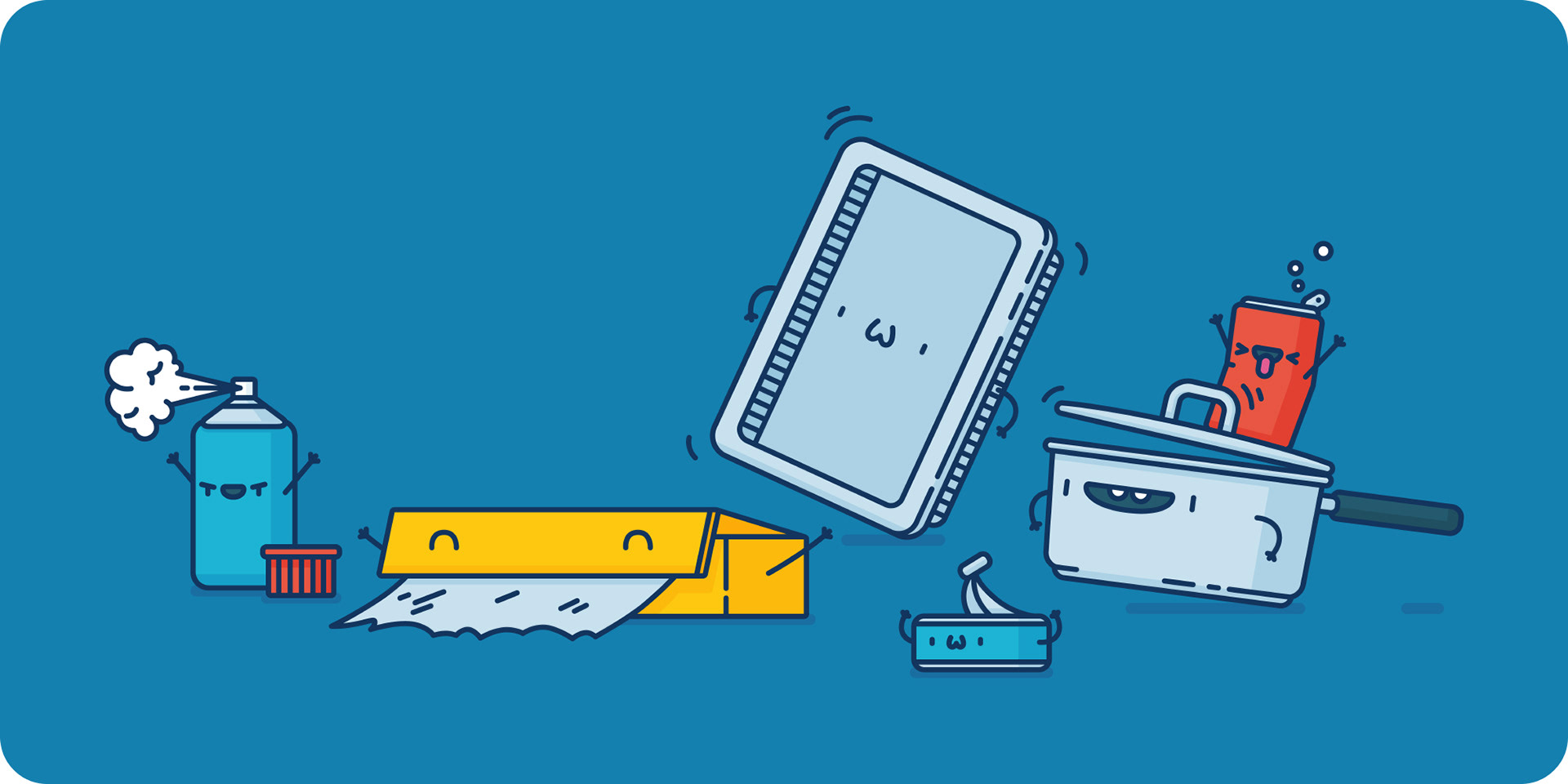
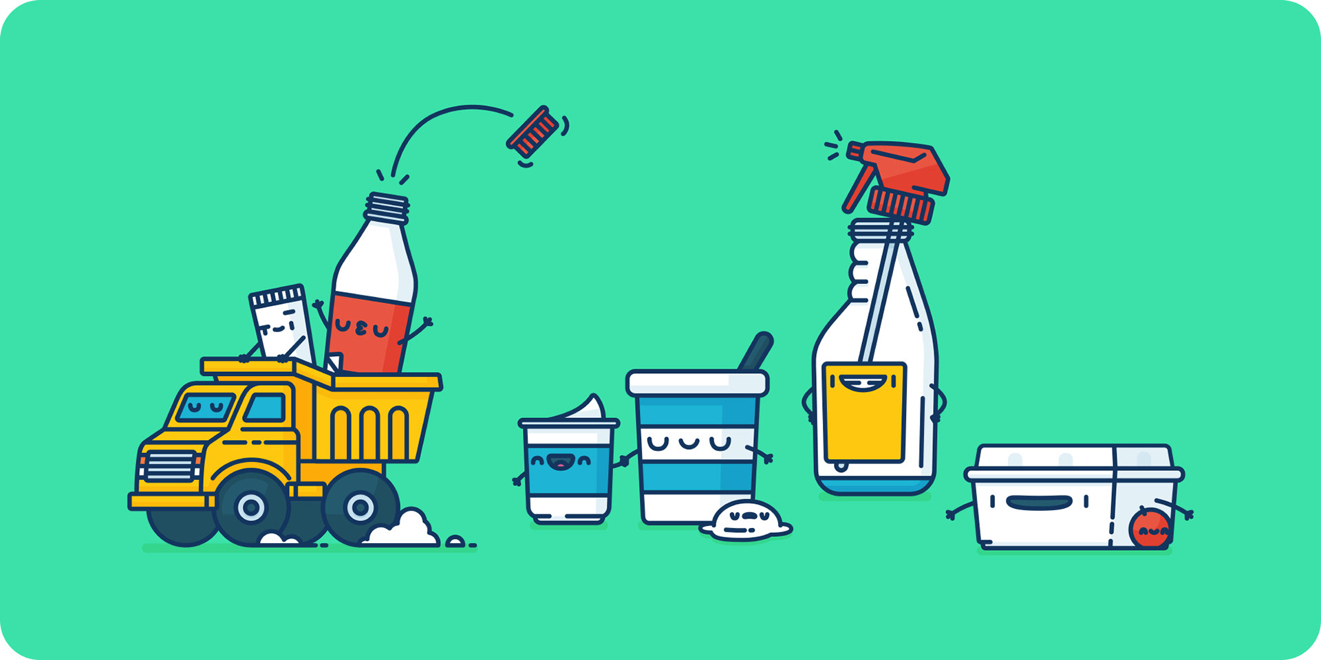
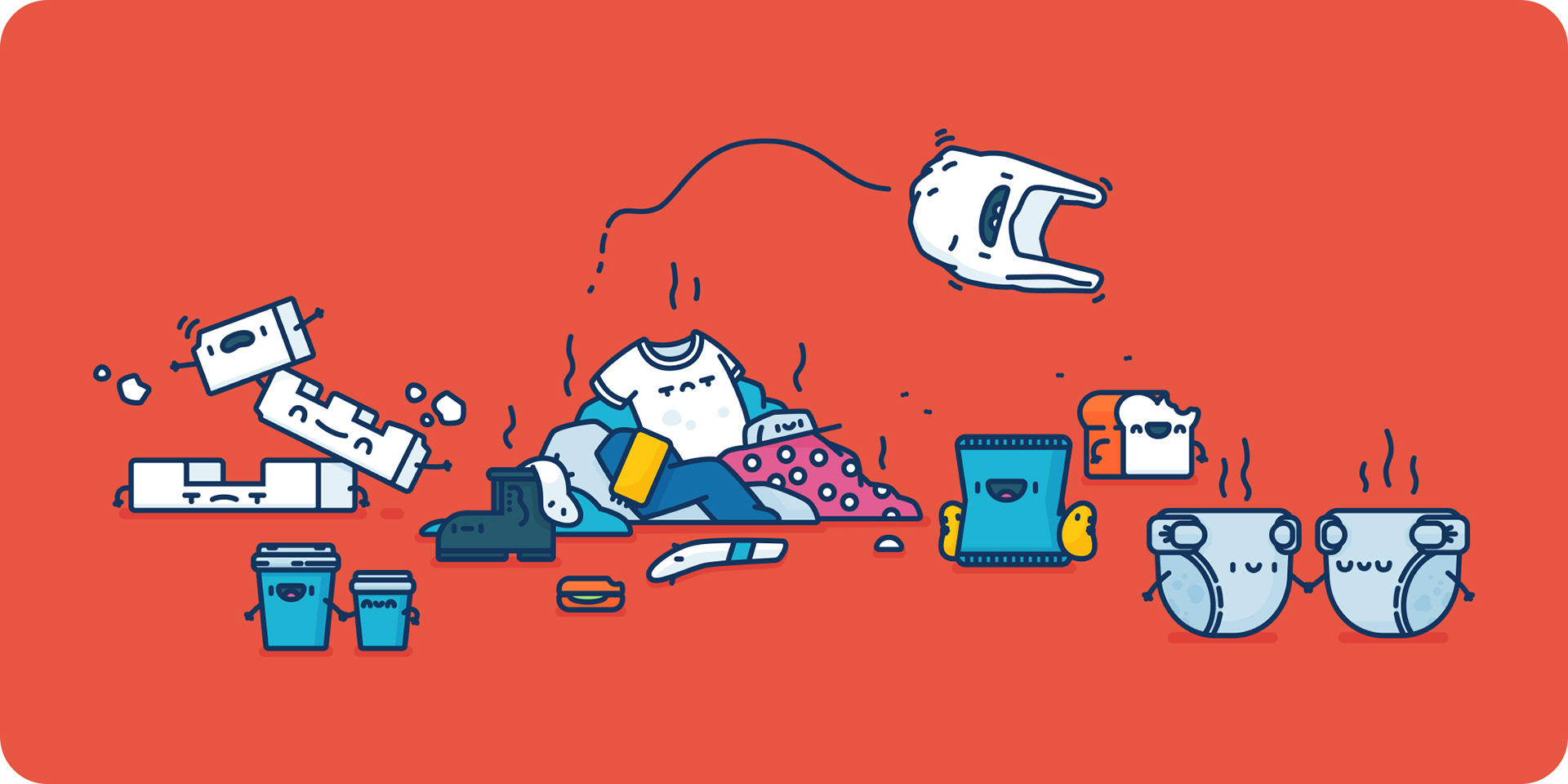
Garbage
Gross garbage, can't recycle this stuff.


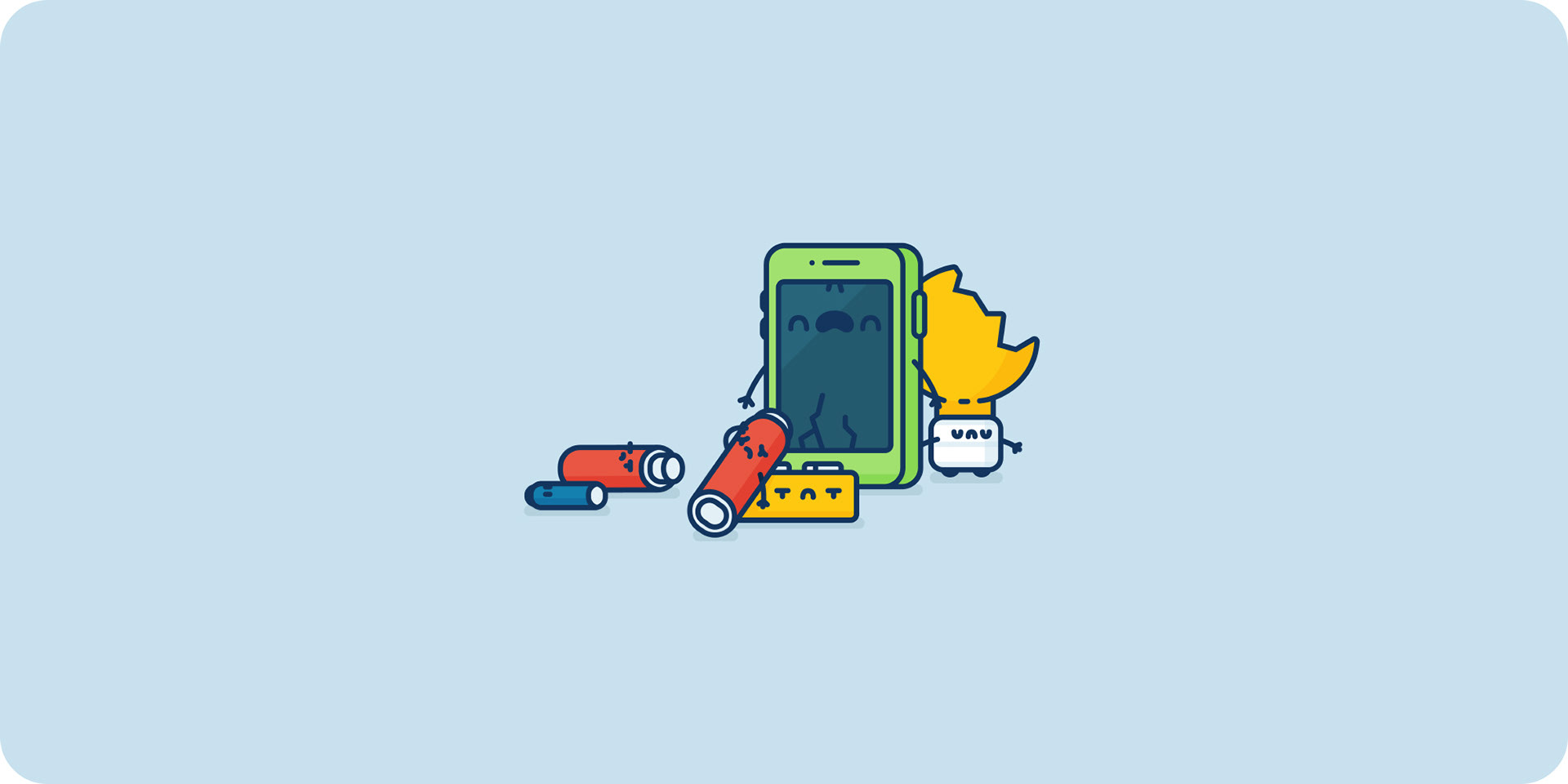
Electrical Waste
The final three groups were made up of various types of waste. The first was electrical, which needs to be dropped off at e-waste centres.


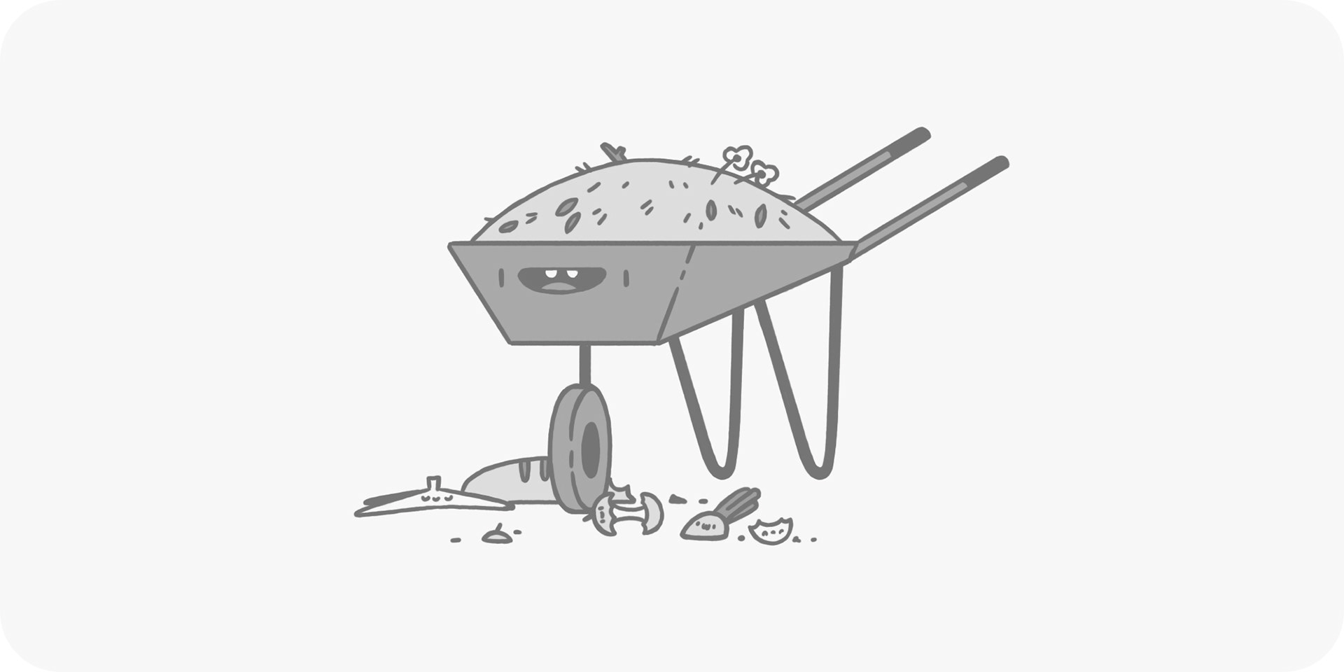
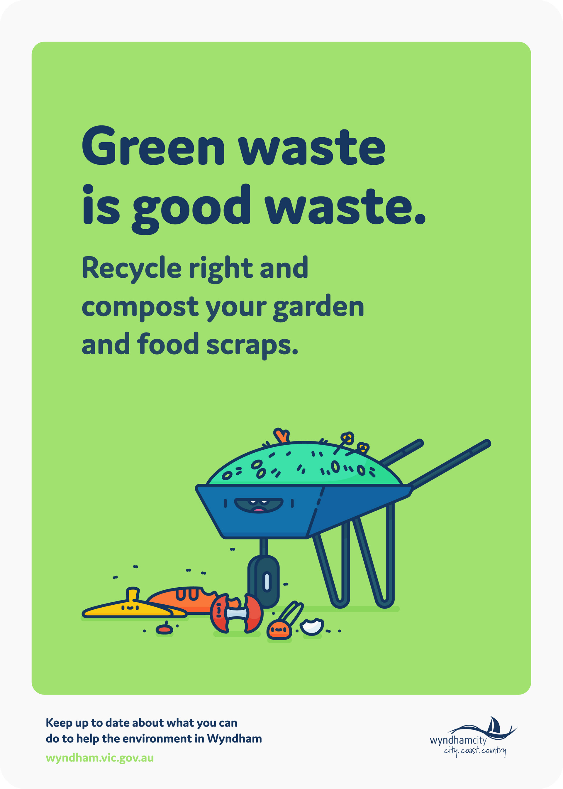
Green Waste
Most councils these days have green bins, which is where you would pop this waste, like food scraps and mowed grass.


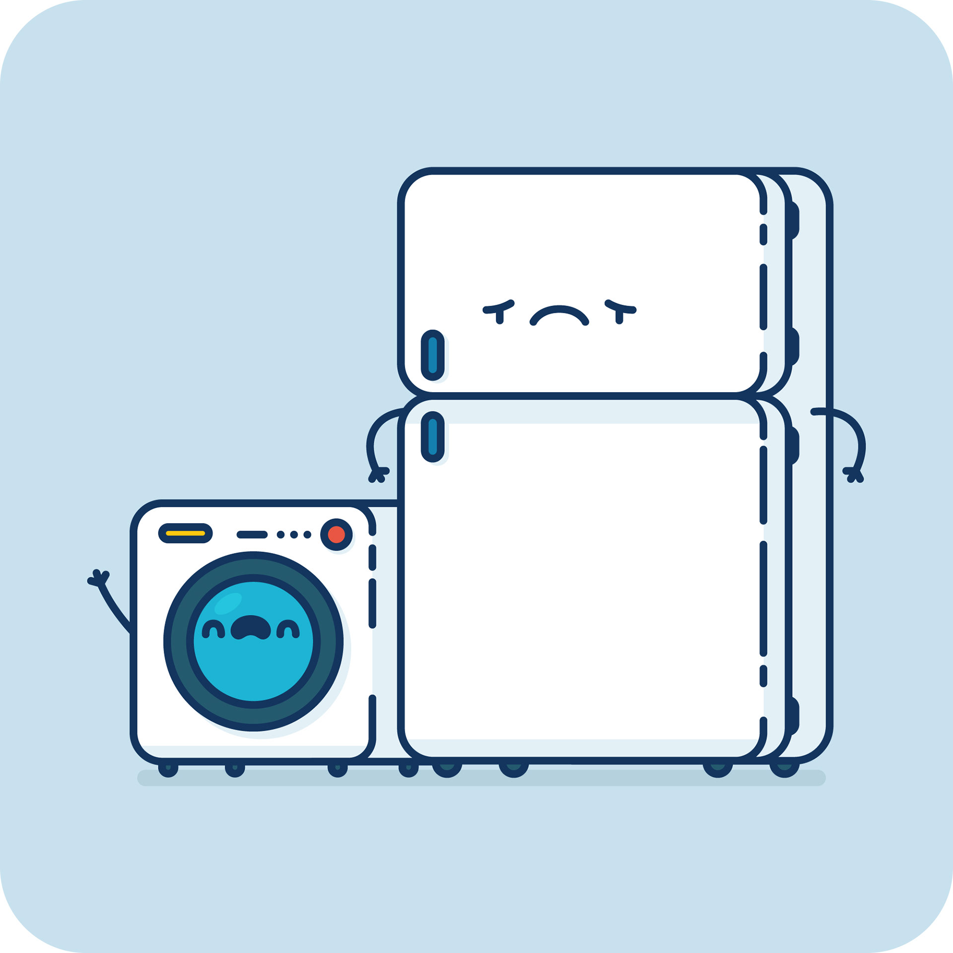
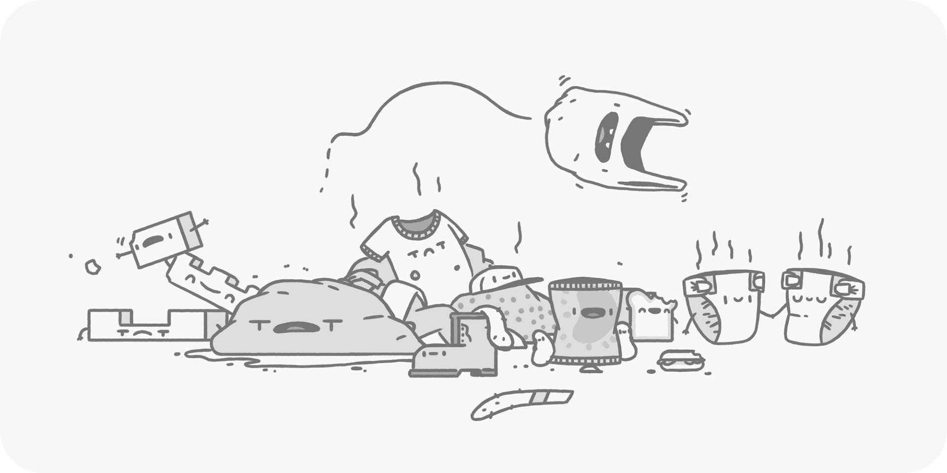
Hard Waste
This last group is made up of big things, like mattresses, broken fridges and furniture. The kind of stuff you need the council to come and pick up, or wait for a good old council cleanup — one person's waste is another's treasure.


I sketched up every single character, along with them all grouped together, which went through a few rounds of changes, but nothing major. Below are the sketches of the groups to give you a bit of an idea of the amount of work that went into these illustrations.


Posters
Bus stops
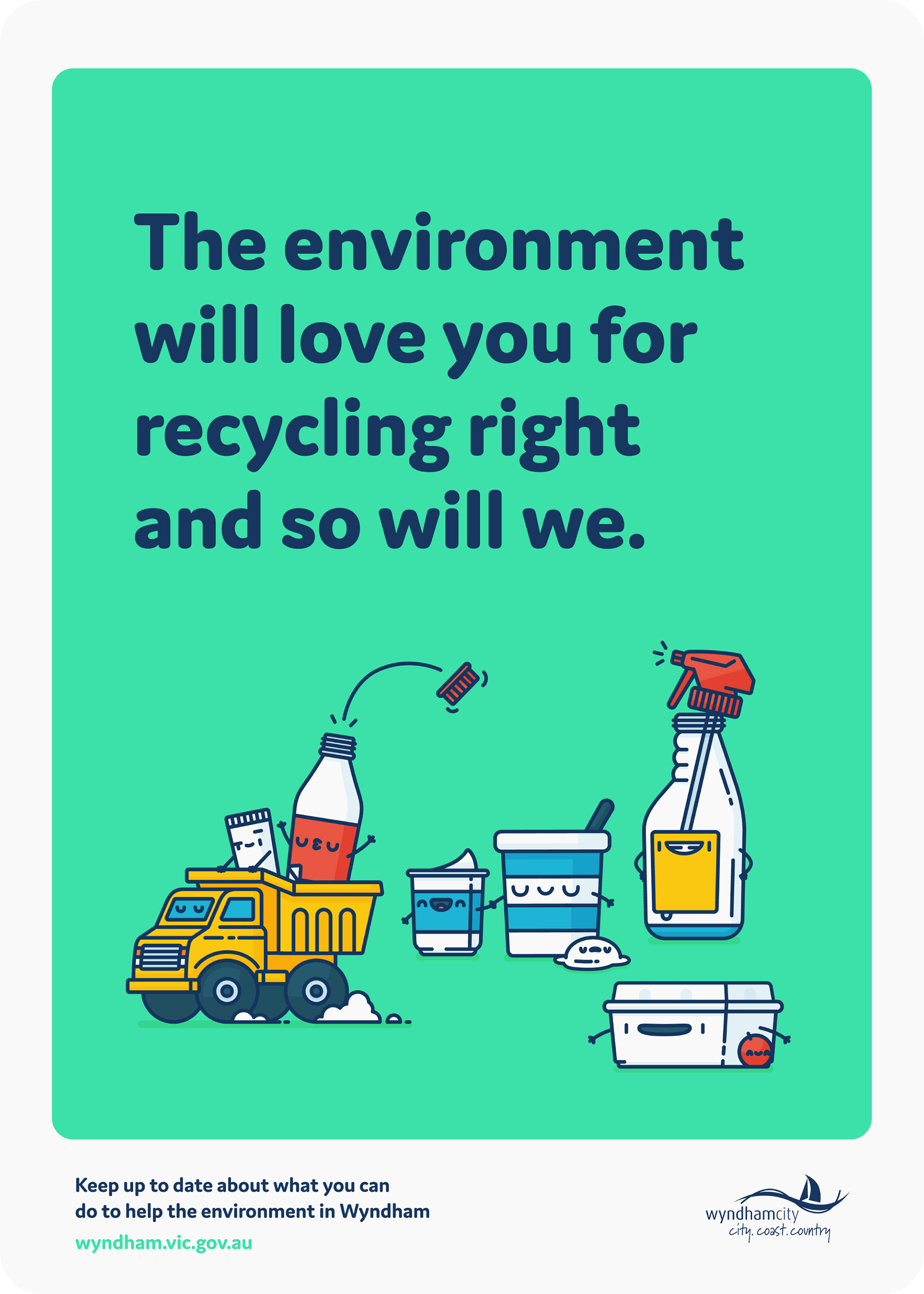
The primary use for the final illustrations were for were bus stops around the council area. I designed them, along with writing the copy, which was great fun.

Extra
More characters
A couple of years after the initial campaign, Wyndham reached back out for some more character illustrations. This time for e-waste recycling stations.


Plus home composting and worm farms.


Lastly, I'll leave you with an animated ad that Wyndham made using the illustrations I did. It's super cute. Remember to recycle right!
Credits
Role: Copywriter, Graphic Designer, Illustrator
Client: Wyndham City Council
Studio: Freelance
2017 - 2018