Pretty Green
Small batch, sustainable and yummy food, created by families for families, delivered straight to your door.
I worked on the initial banding for Pretty Green, which started off more as a bougie alternative to other food delivery apps, like Milkrun. But it eventually ended up being a gifting platform — where you could send curated, or custom, hampers of local handcrafted yummy things that you would likely find at a farmers market.
With that famers market vibe in mind, the brand is clean and warm, with friendly type, organic colours and a bit of character coming through small graphic elements, such as the icons and illustrations.
LOGOTYPE
Pretty clean
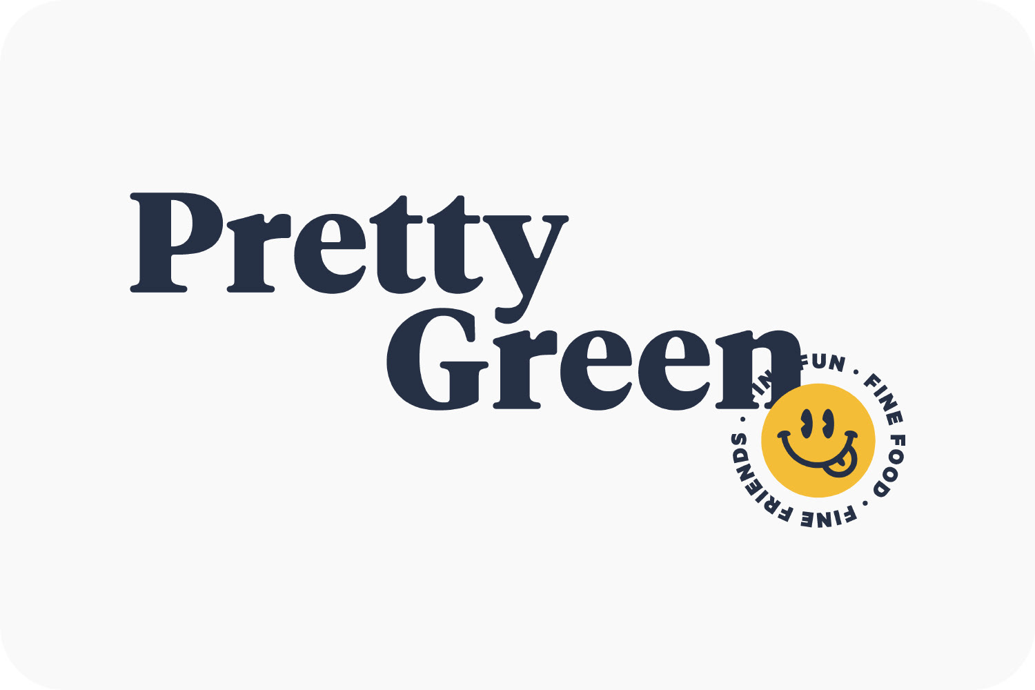
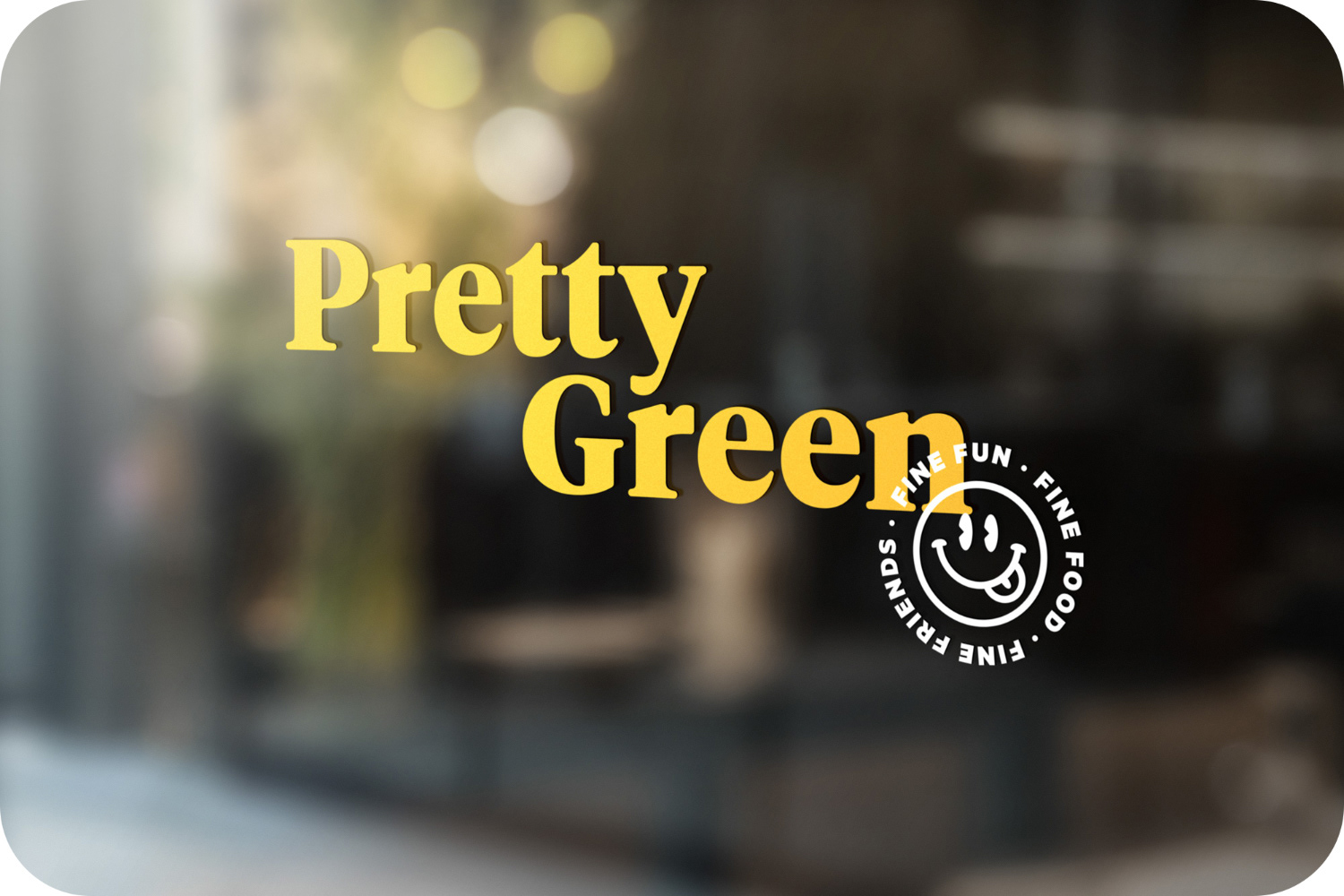
The logotype is based on Tiempos, and has been given rounded corners to make it more organic, friendly and approachable.
LOGOmark
Yummy in my tummy
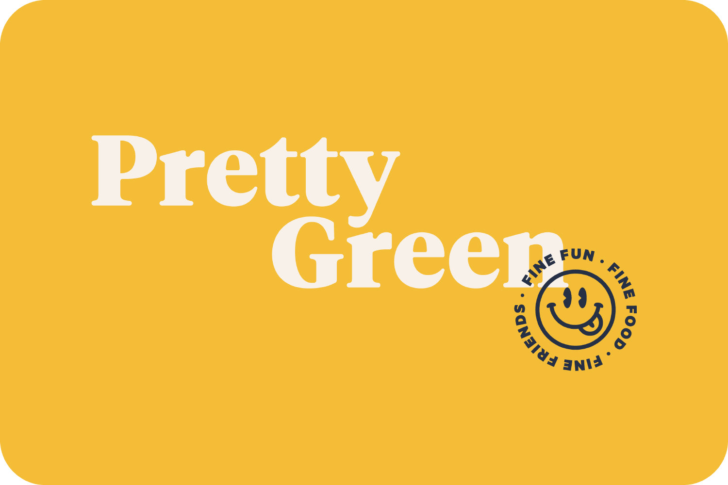
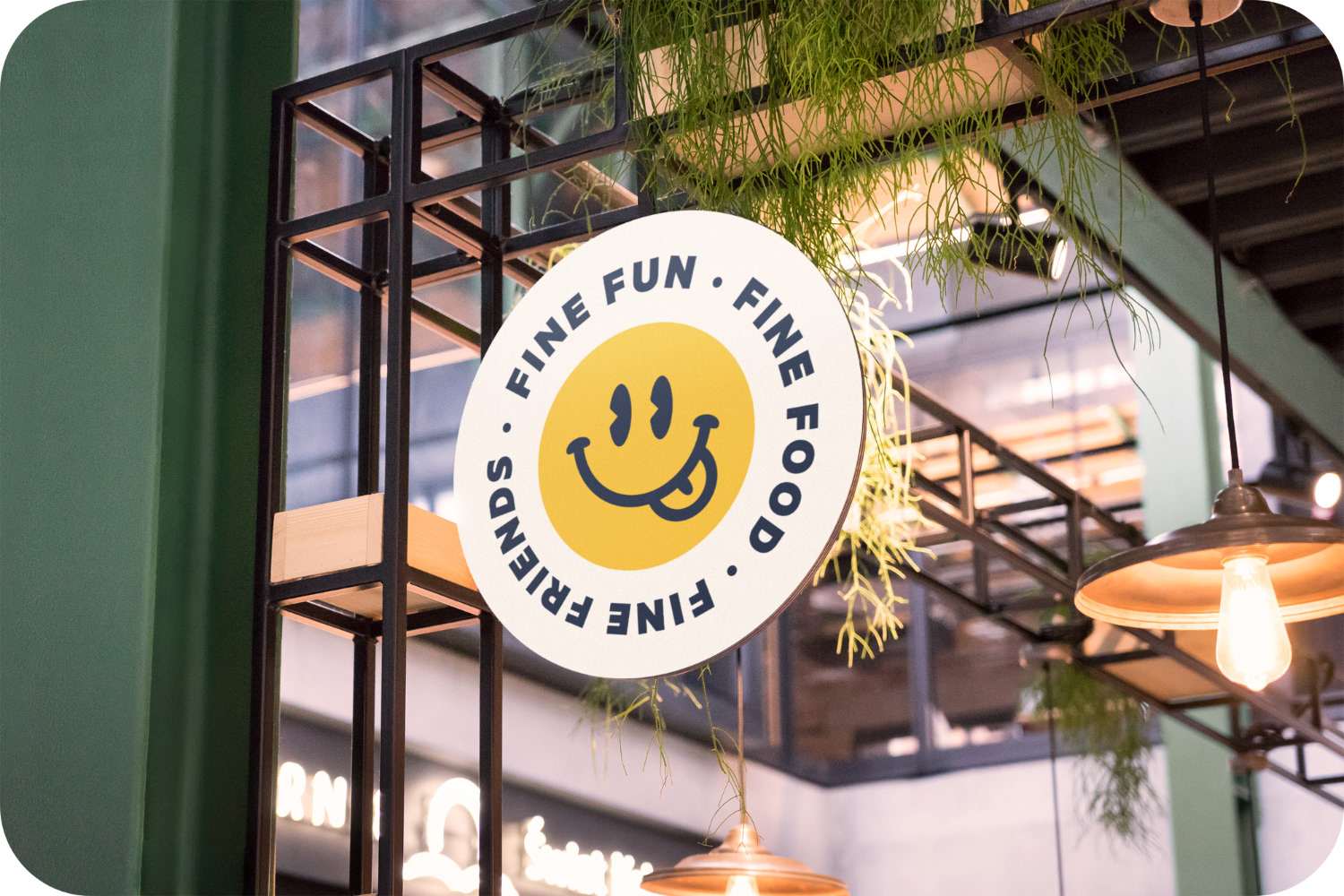
The logomark ended up becoming a huge part of the brand. It works like a stamp, so it can be used as an instantly recognisable mark on packaging or any other sort of collateral. There are two versions, one solid and and one outlined, depending on the size of its placement. The cheeky, friendly smiley is nice and welcoming, with some of the philosophy of the brand around it all times.
Note, it eventually got changed to "Sustainable, Obtainable, Affordable", which is a little less of a mouthful then what I initially proposed.
It also went through quite a few different iterations — starting off with a thinner stroke and focusing more on nature and produce. But we opted for something with a little more emotion and boldness. A few of these examples are below.
Better together
Stamp it
Some examples of the stacked version of the logotype, with the logomark positioned like a stamp over the text.
Typography
One font
To keep things nice and simple the typography just uses Metric. It draws inspiration from the street signs of West Berlin, which was a happy coincidence seeing as the client is originally from Germany.
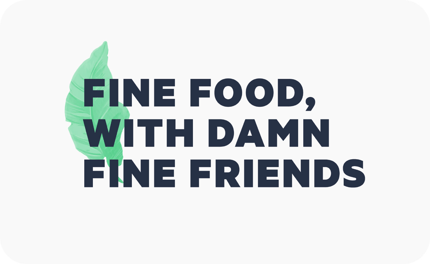
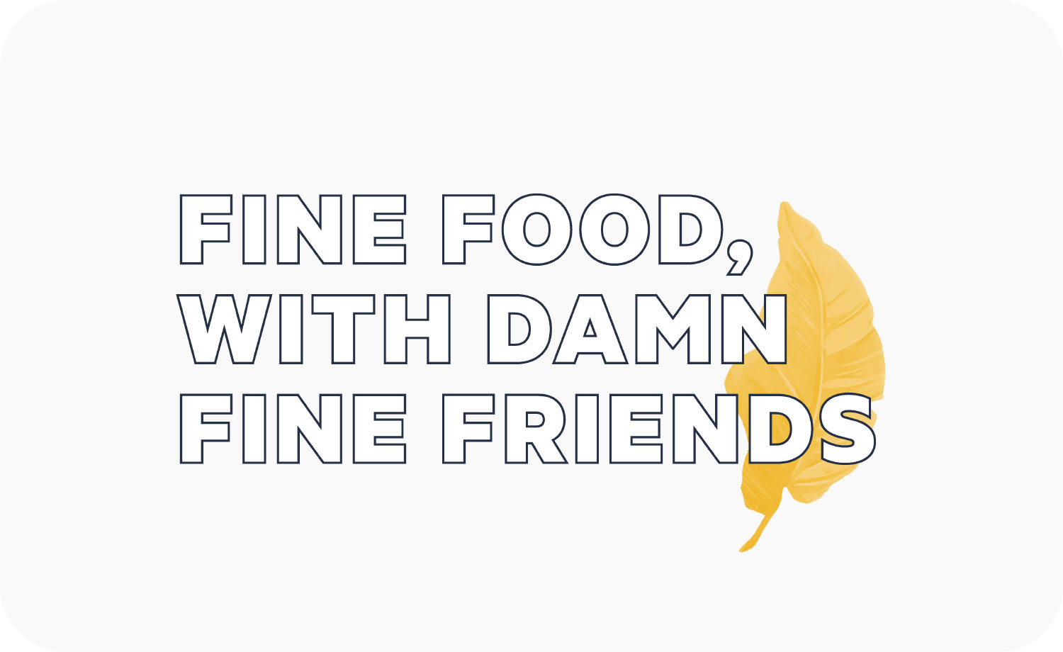
We originally had a palm leaf illustration for use with headers, as there was a nice contrast between that soft painterly illustration and the bold type. Eventually, this was discarded in favour of the icons, which you'll see further down.
Colour
Earthy & premium
The overall colour palette is drawn from natural and earthy tones. This helps reflect the organic and premium nature of the products. As well as, making the brand feel nice and warm.
Below is the primary palette. The charcoal-like colour is used for the logo and typography, with the yellow for links and accents. Backgrounds use the off-white, which helps keep things warm.
There are four secondary colours, which are used for graphic accents, such as icons, and the various character illustrations.
Iconography
Fruity icons
Before any full illustrations were done, we did a bunch of icons, which later informed the style of illustration, moving away from the palm tree.
Pattern
Pretty patterns
The icons, or the palm tree illustration, could be put together to make patterns. That can then be applied to packaging or as a subtle background.
I also did up the palm tree illustration in varying colours, drawing from the brands palette for some variety.
Packaging
Brand in play
A lot of the exploration with the patterns and icons led to these ideas for packaging. Pretty much all of this never happened. In the end, it was a simple box with the leaf pattern and logomark stamp. But there were some cool ideas in there, such as being able to repurpose the boxes into toys for kids.
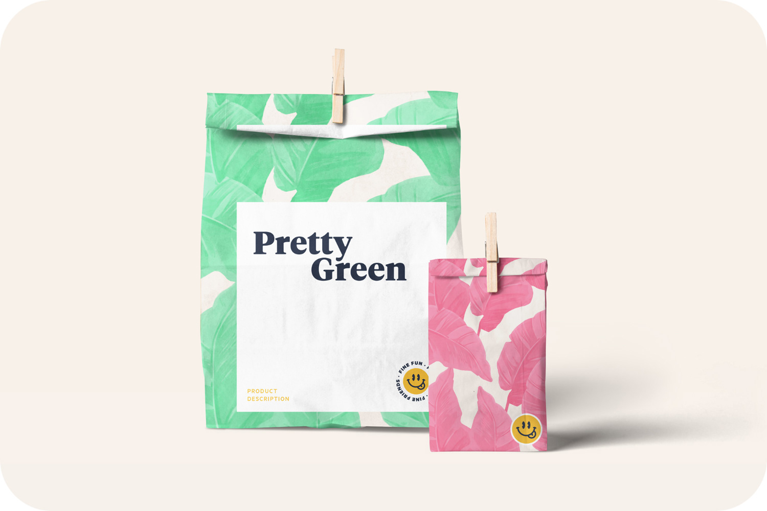
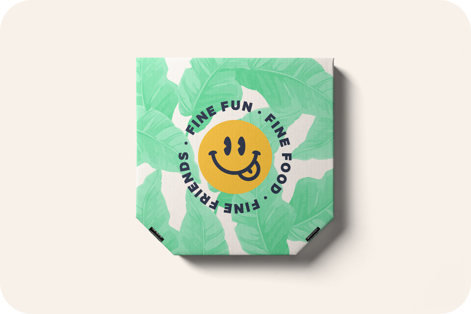
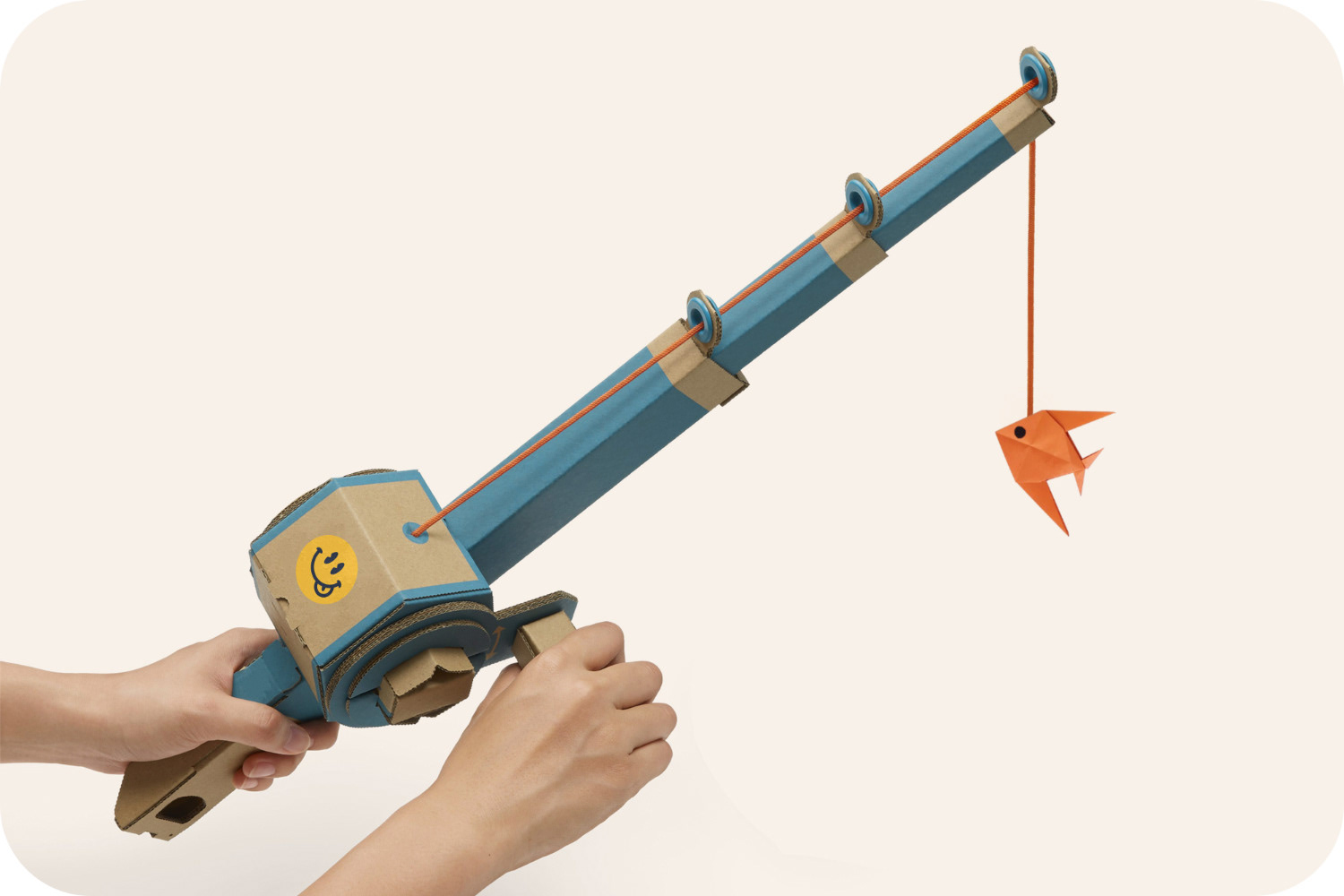
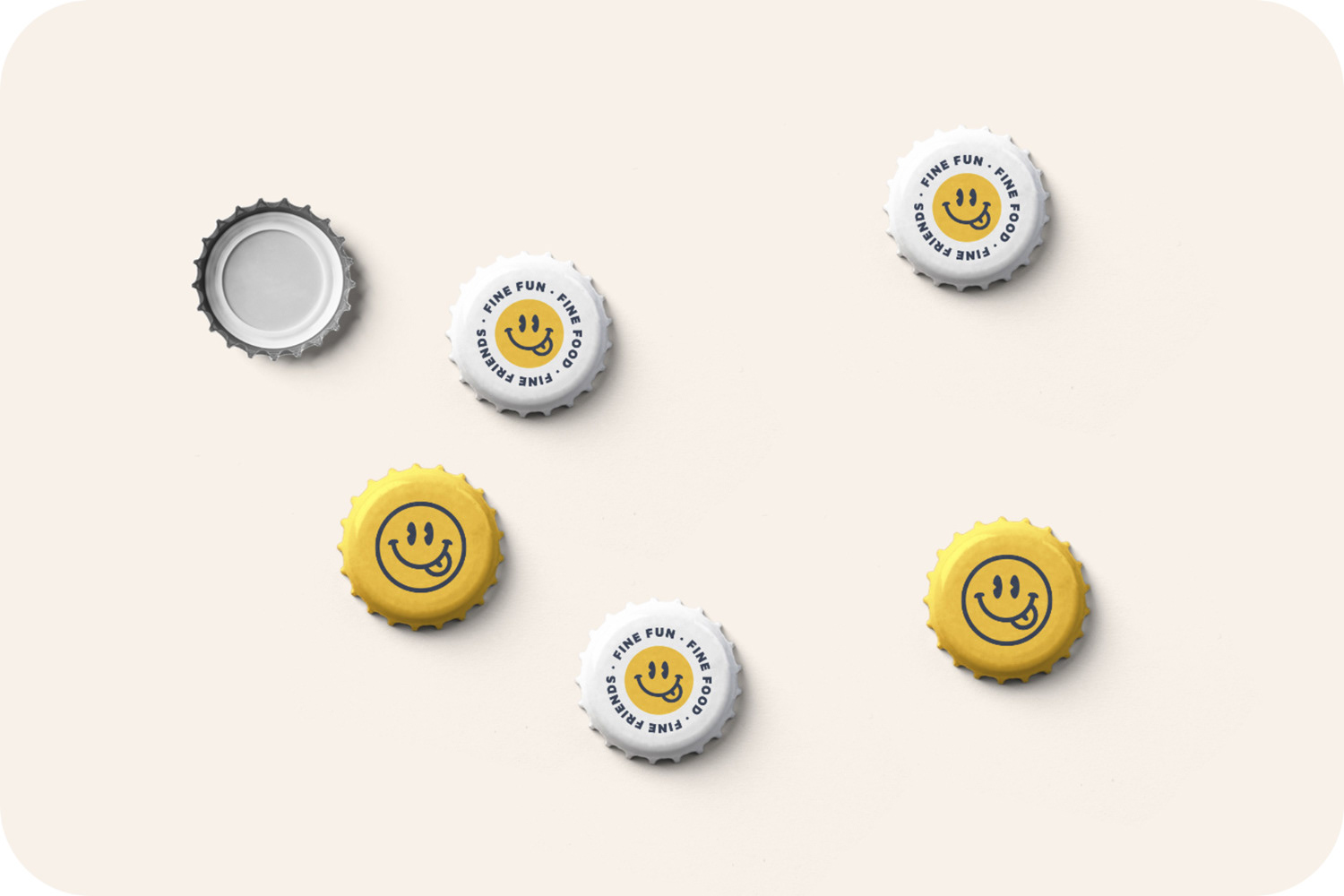
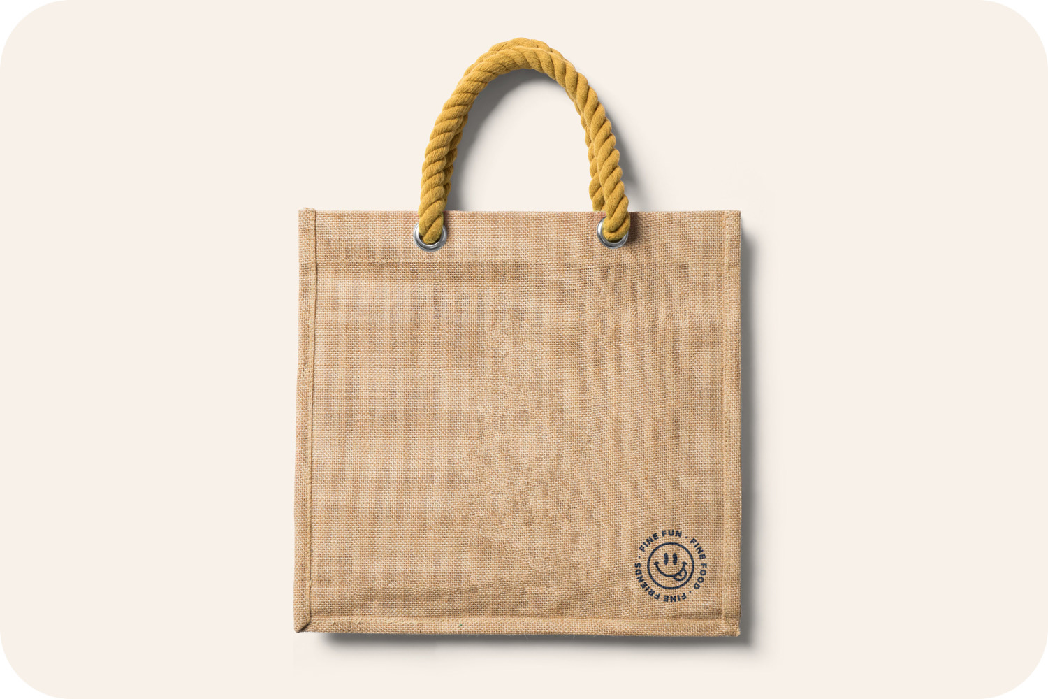
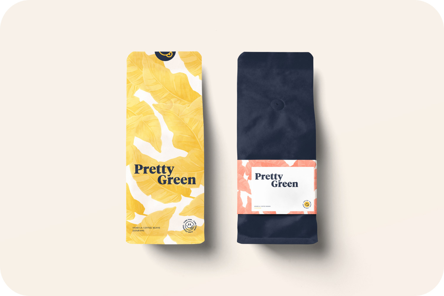
Some signage mocks also, in case it ever become a physical store.
Illustration
Fresh characters
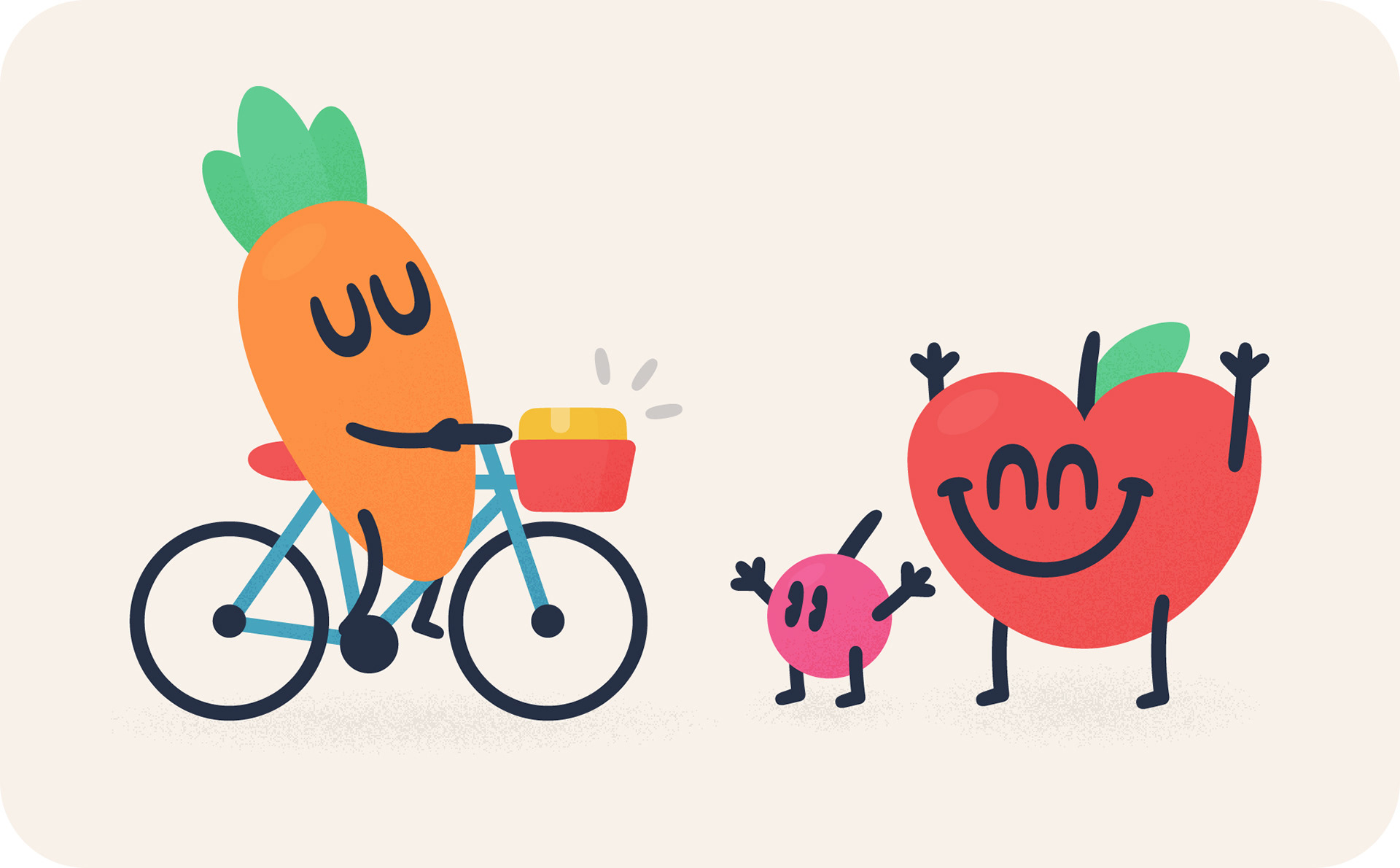
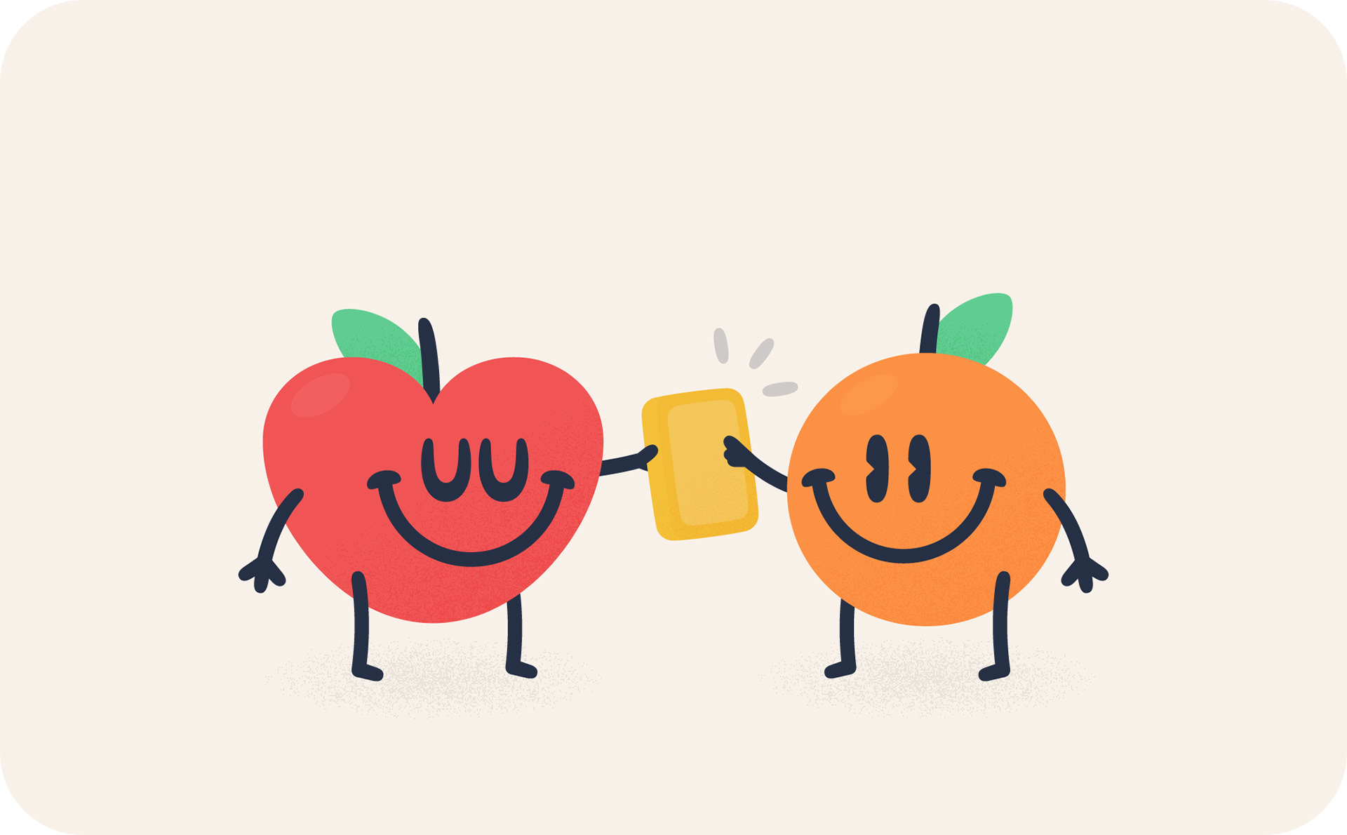
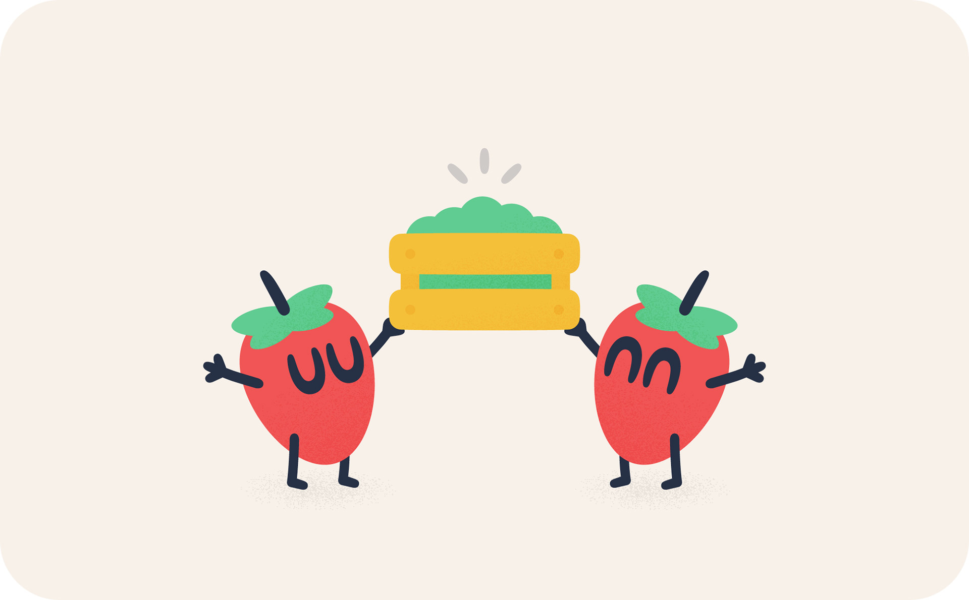
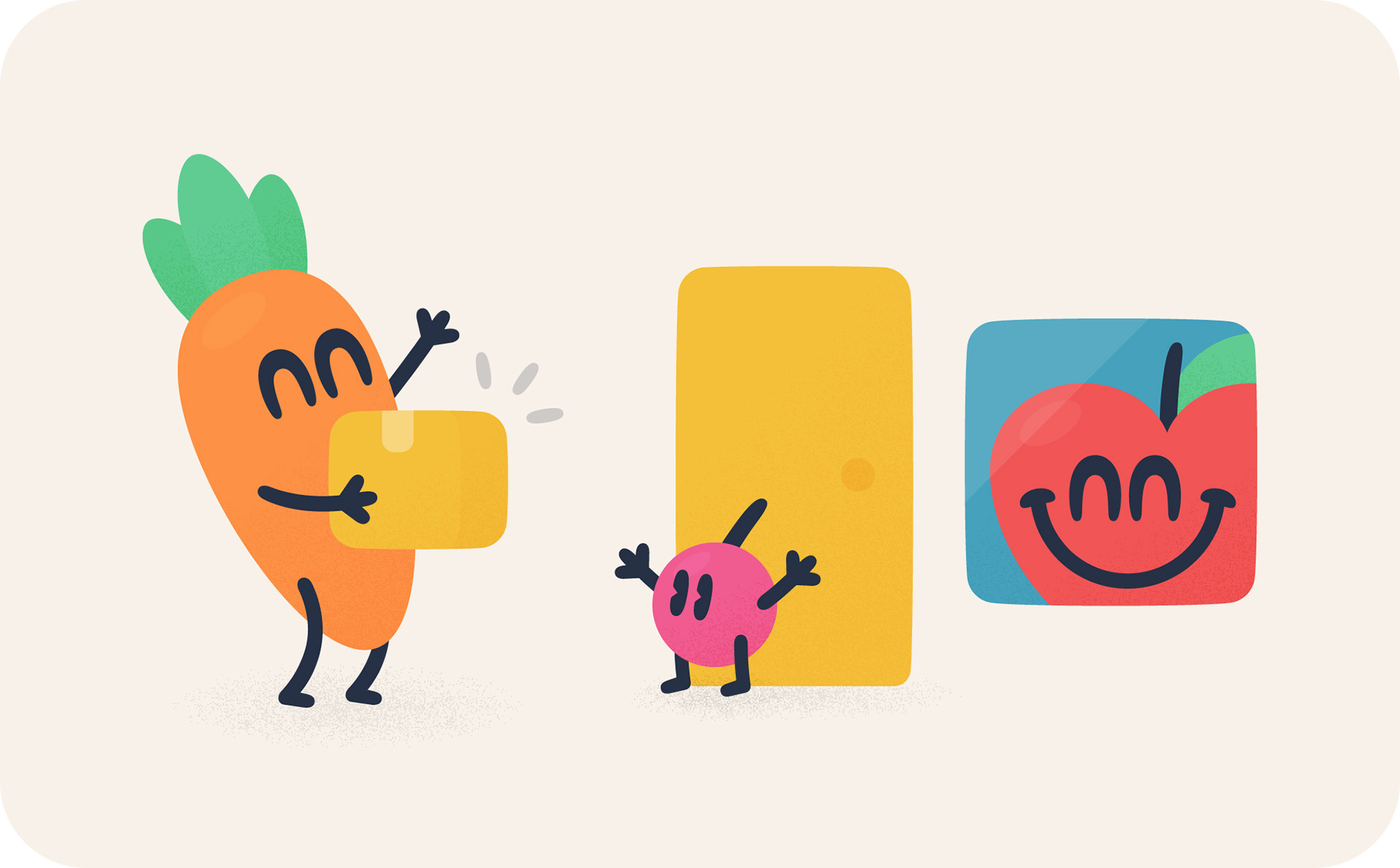
The brand's style of illustration went through a couple of iterations (the final result of which you can see at the end). Initially, I tried two styles with an apple character. The first was outlined, closely resembling the icons, and the second was solid and in colour, with a bit of shading and texture to give it that earthy, organic feel. I also opted to use mostly fresh fruit and vegetable characters to further tie it into that farmers market vibe.
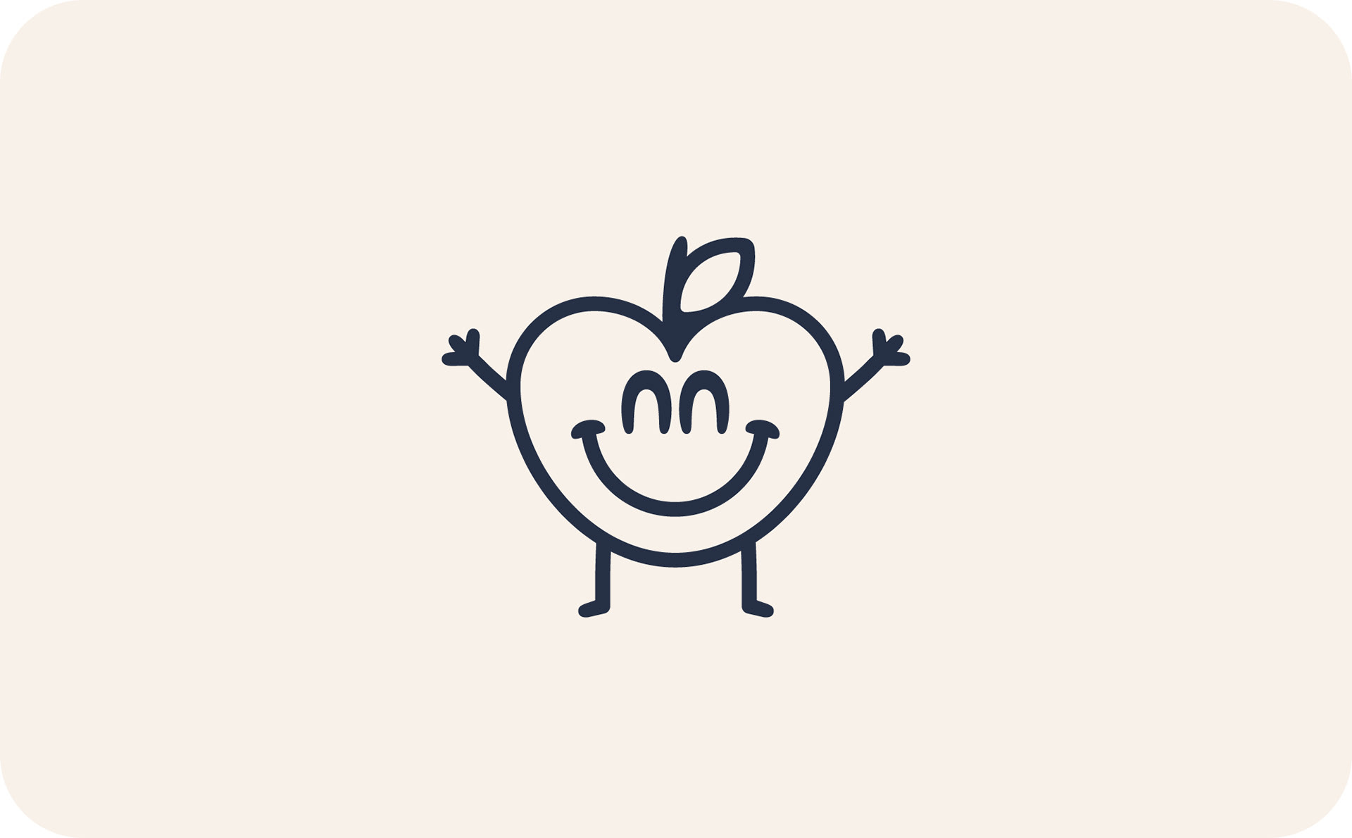
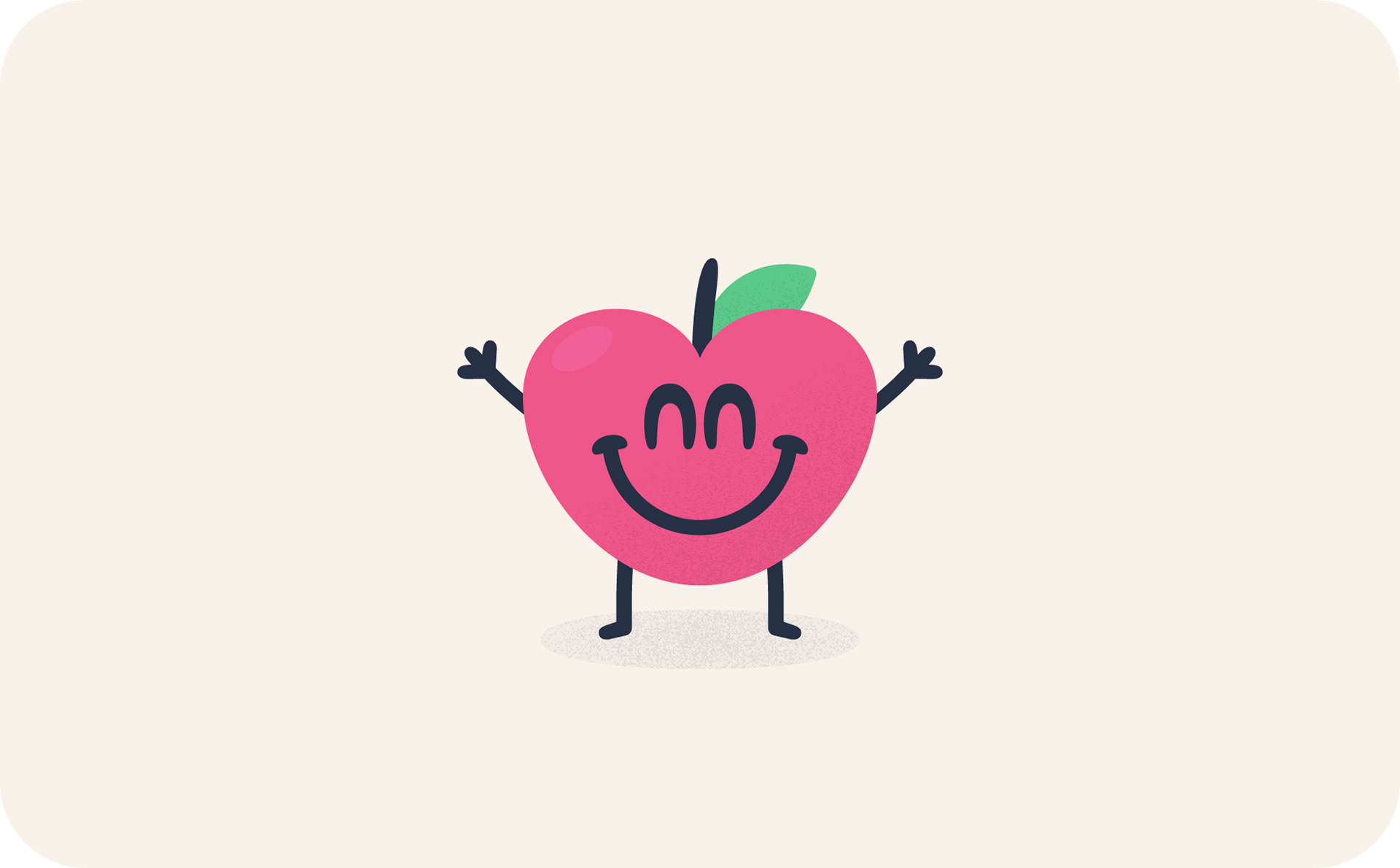
The client decided to go with the full colour version (tweaking it a bit though to match the final approved colour palette) and I rolled out the whole set. These were all predominately used in the app.
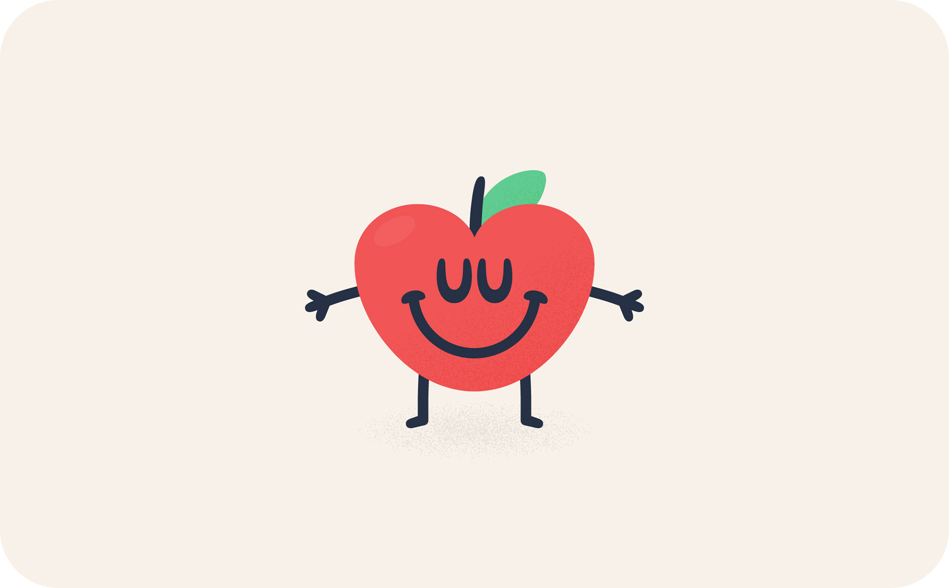
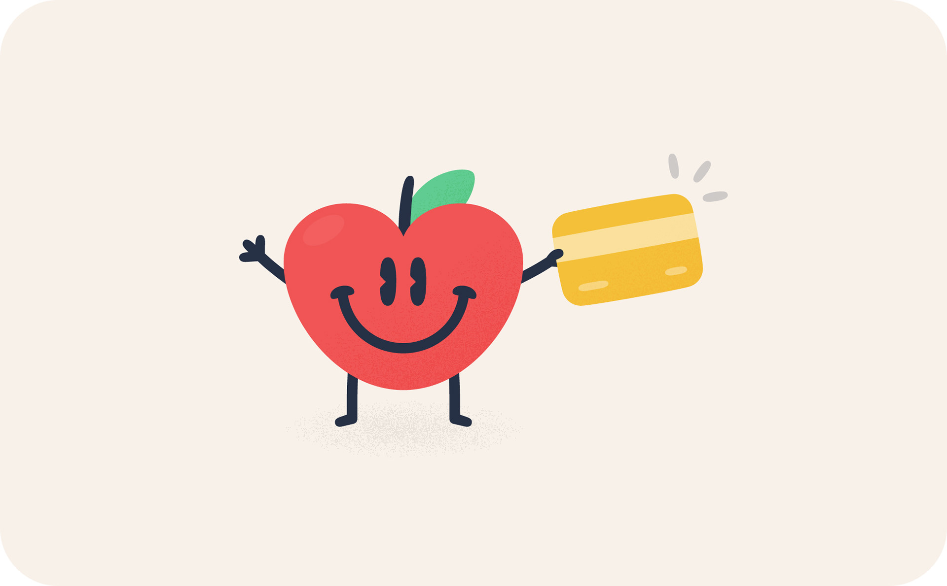
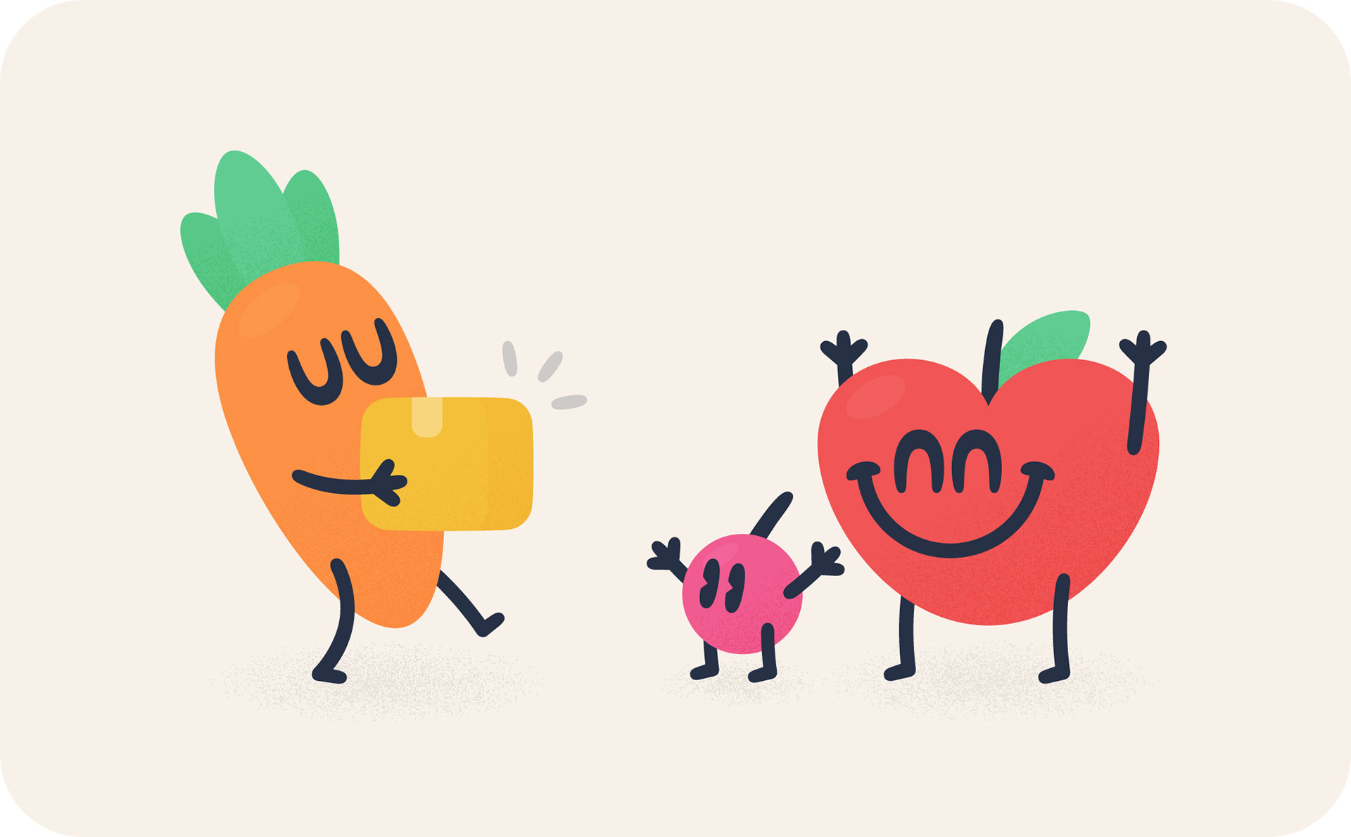
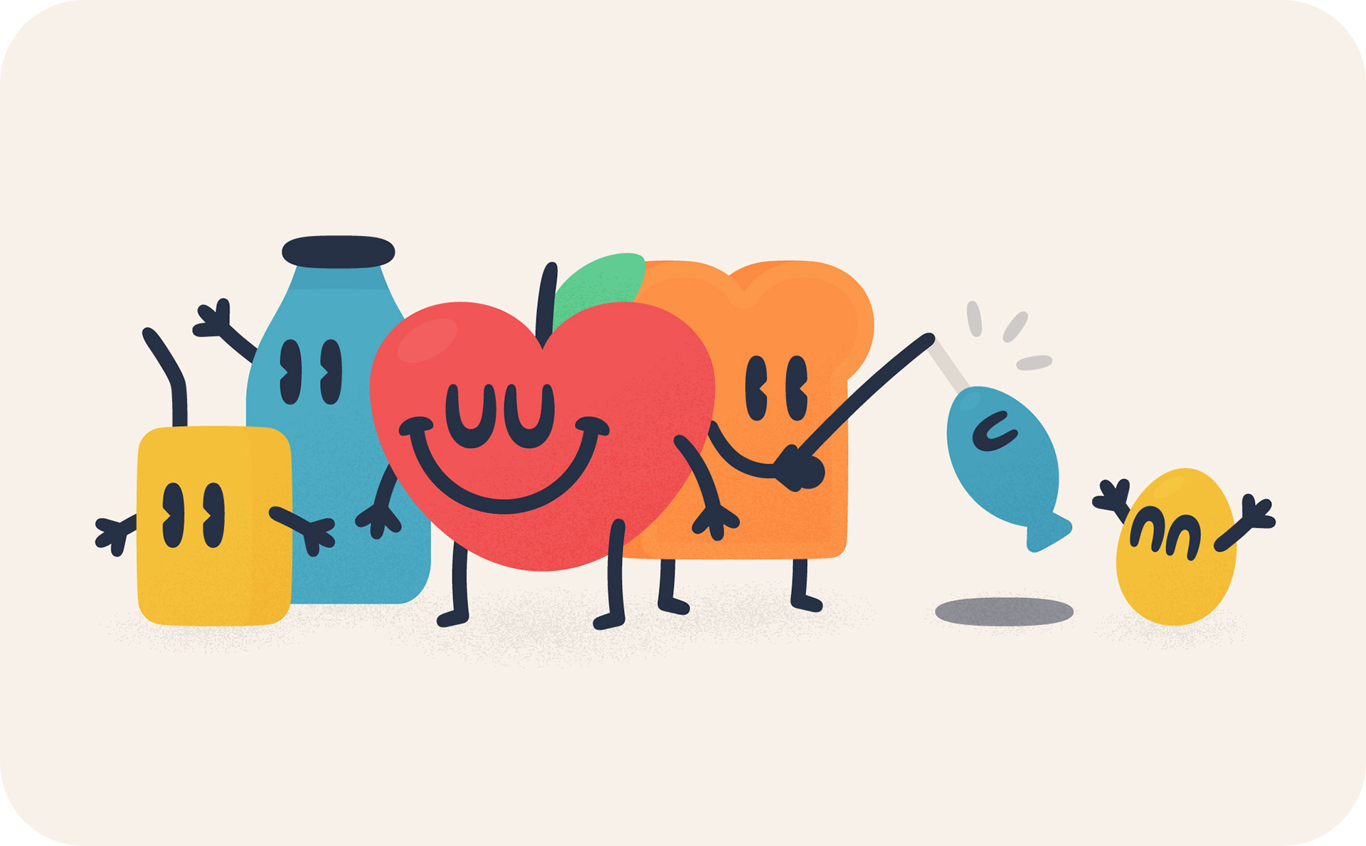
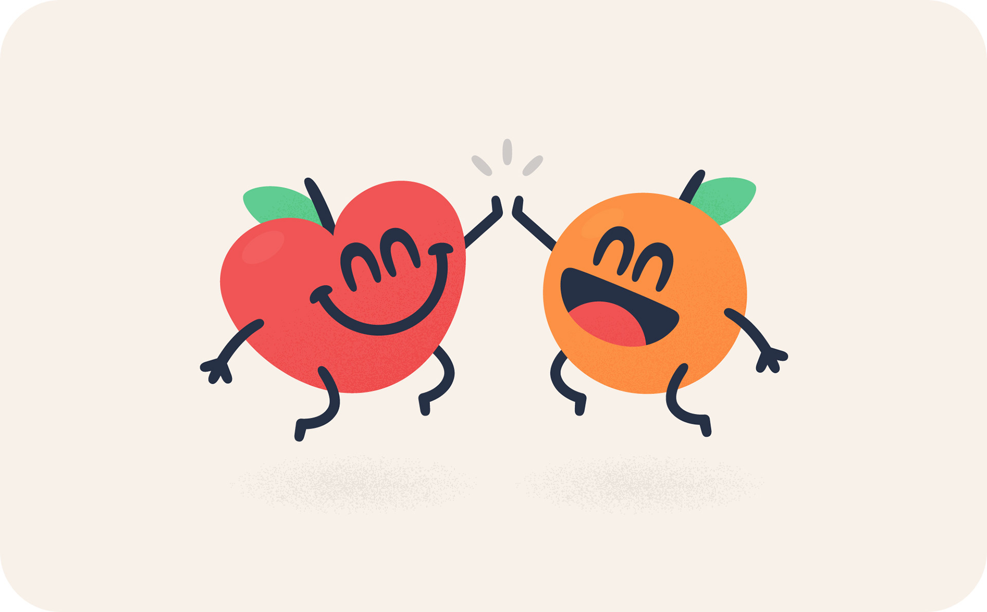
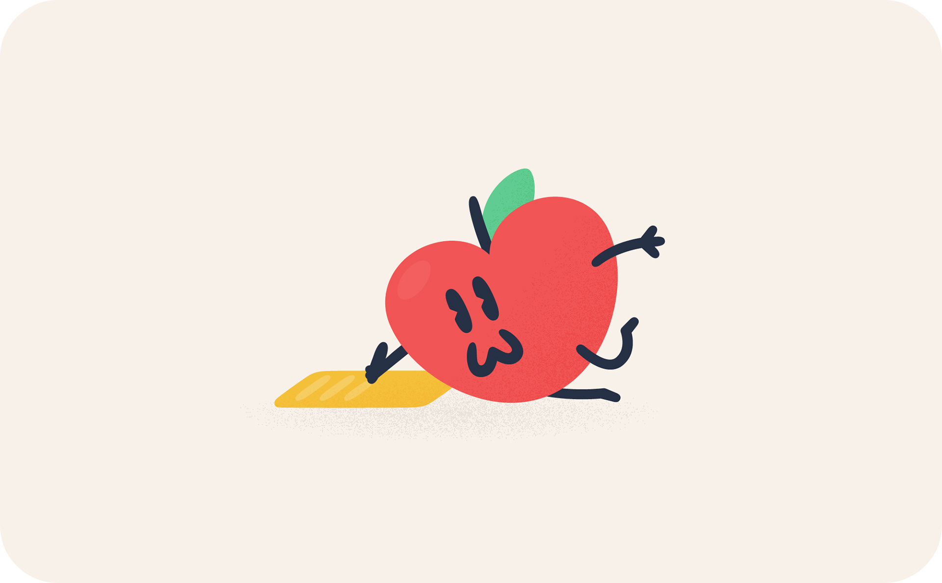
Below are a bunch of the initial sketches for some of the above illustrations.
These were the illustrations for the onboarding flow. I kept these ones on a consistent visual plain, as the user would be swiping through — it's good to have a consistent ground level so they're not jumping around. It didn't matter so much for the above ones as they were all on seperate screens.
More sketches!
I also had an idea for the account screen, where you add how many adults, kids and even pets, are in your family — with the image changing out depending on that customisation. It was a lot of work, but added a really nice touch to the app.
NEW ICONS
Extra icons
Some extra icons were done in the same style for the app and website, mainly around food categories and dietary requirements. The idea was to use similar styled faces as the stamp to make it feel like a consistent set.
NEW Illustrations
Change in direction
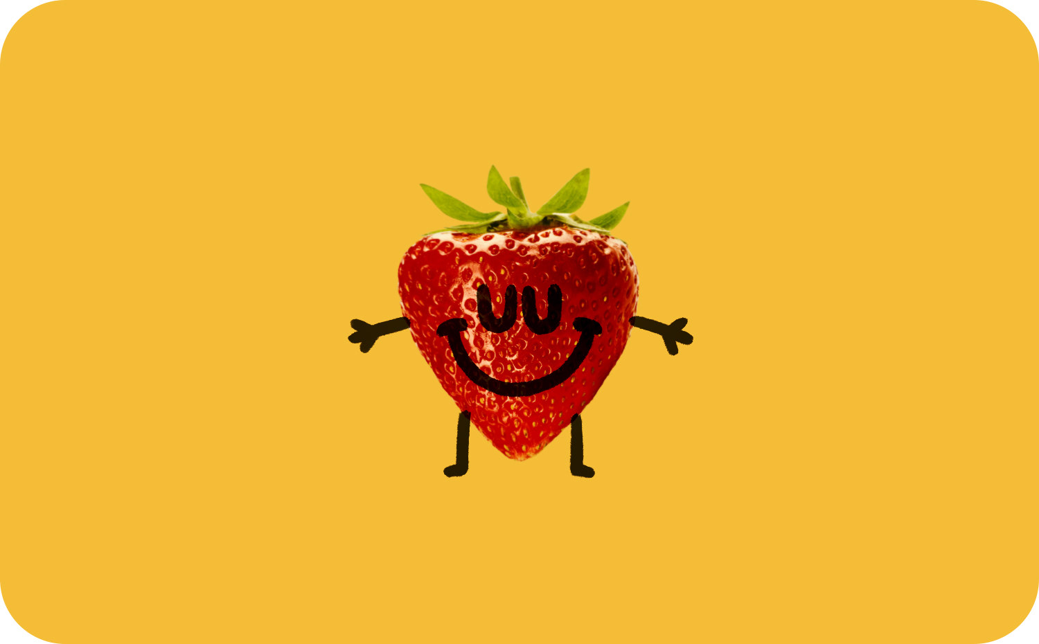
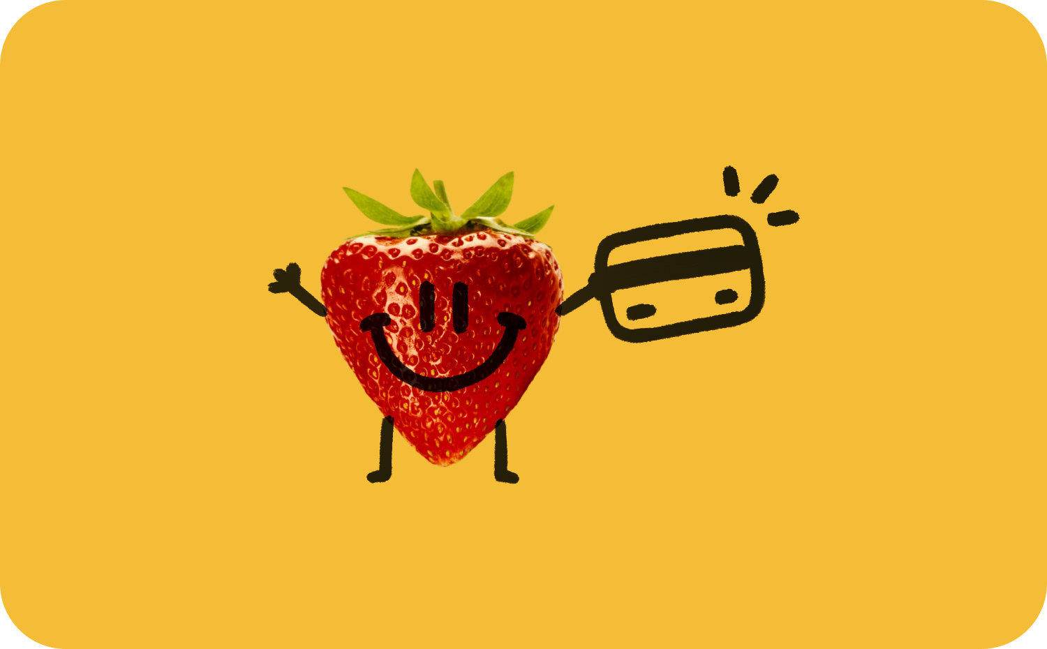
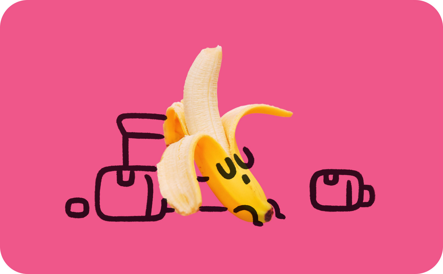
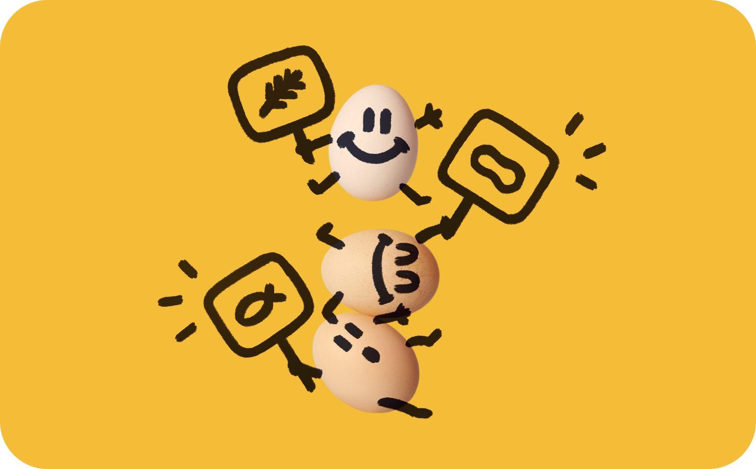
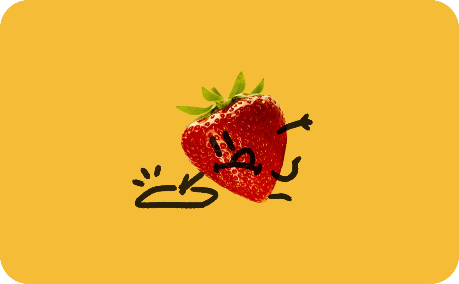
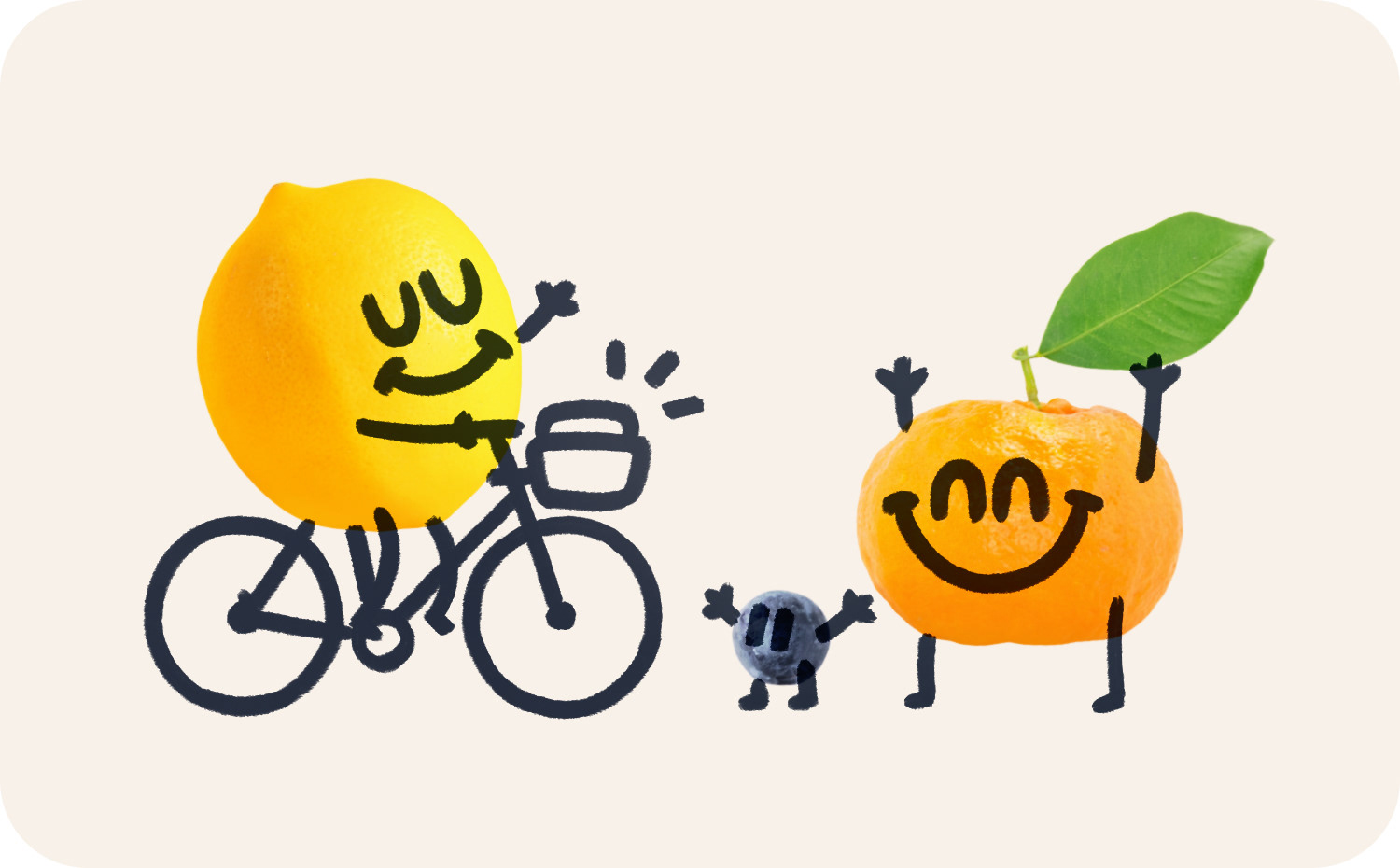
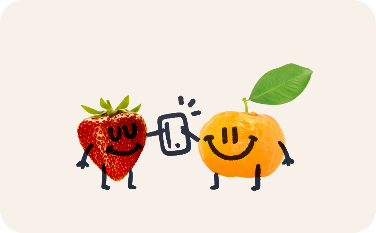
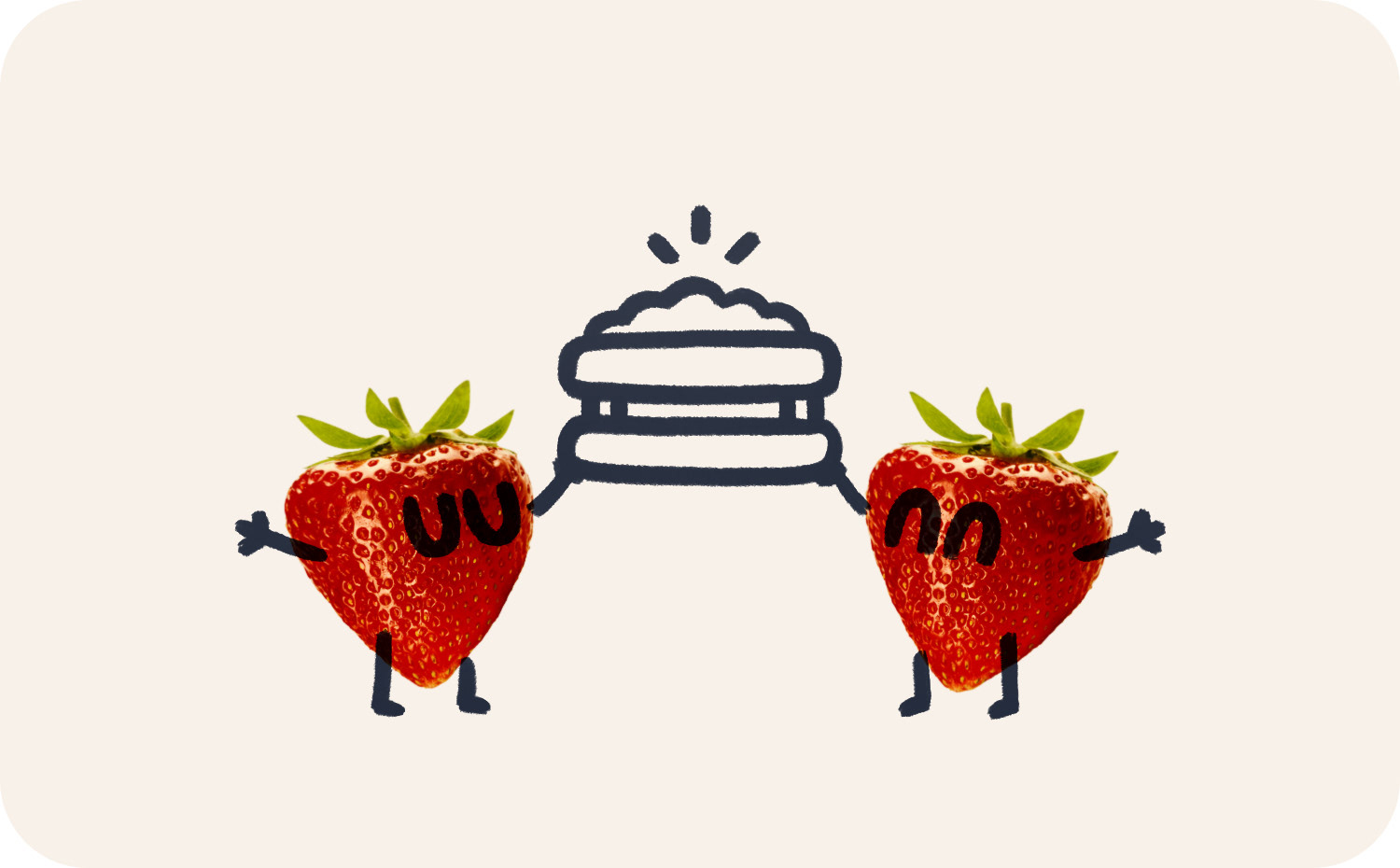
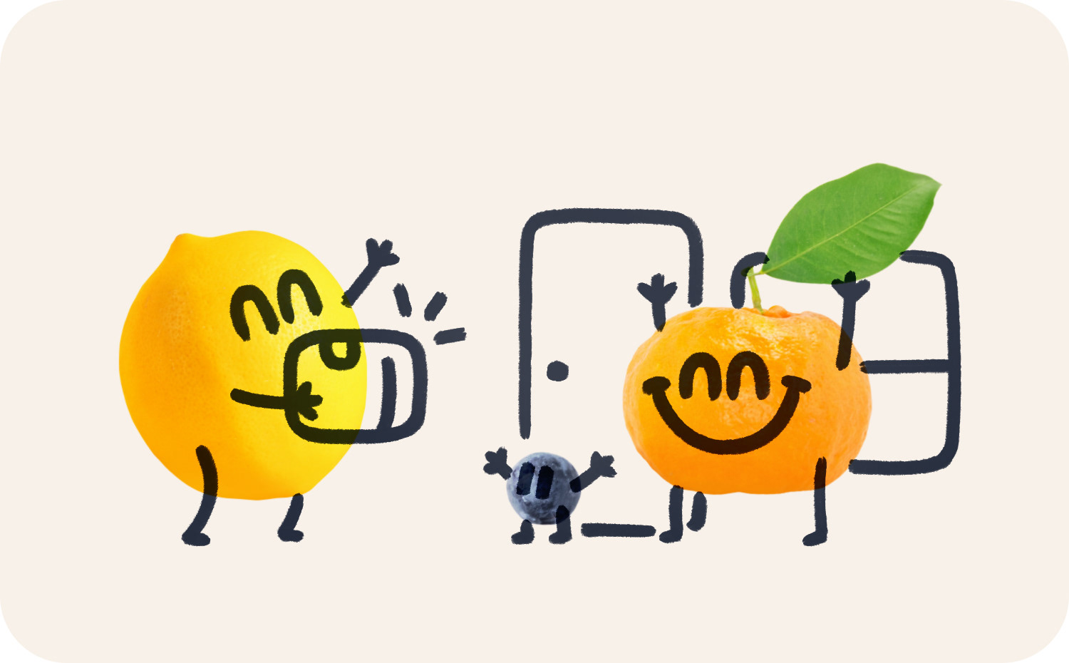
After about a year or so of the brand being live, I was asked to have another look at the illustrations used in the app. The idea was to move them further away from the icons. This led to a photo-based approach where I would draw over images of fruit. Basically, copying the same compositions as in the original illustrations, but executed in a different way.
These gelled a lot better with the direction the brand was going, which started to feature hand drawn-like type over the original all caps headers. You can see examples of it on the website. So I wanted to evoke that a bit with these new illustrations.
Below are the illustrations for things relating to a user's account, delivery, dietary requirements and other general stuff.
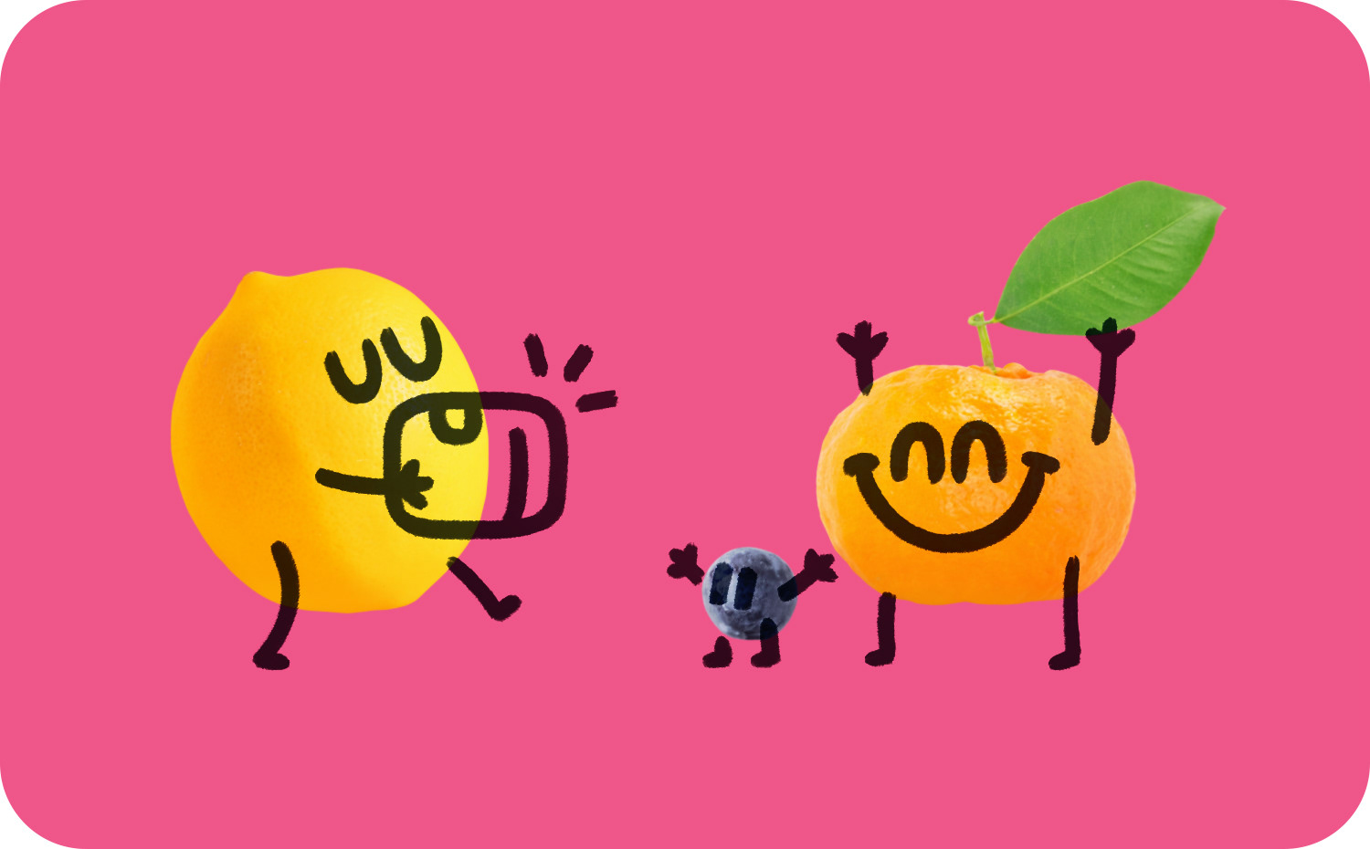
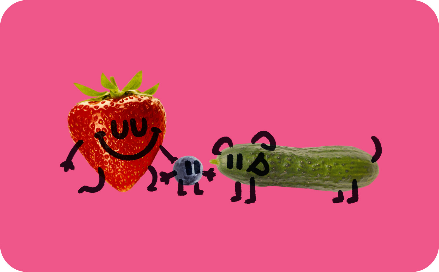
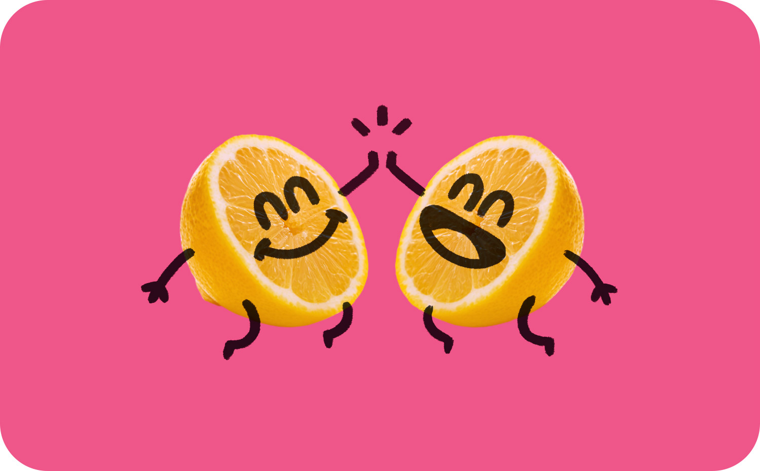
Below are the new onboarding illustrations.
That's everything. Time to reward yourself with some bougie produce.
Credits
Role: Brand Designer + Illustrator
Client: Pretty Green
Studio: Haimat · Freelance
2020
