

Life Education
Life Education is Australia's largest preventive health organisation, empowering children to make safer and healthier choices so they can live happier lives.
I got to work on the redesign of their website while I was at Chook — running workshops, defining the IA and setting a new visual design direction, all the way to the final designs. The main goals of the project were to help increase overall donations, allow easier access to resources and booking the program itself.
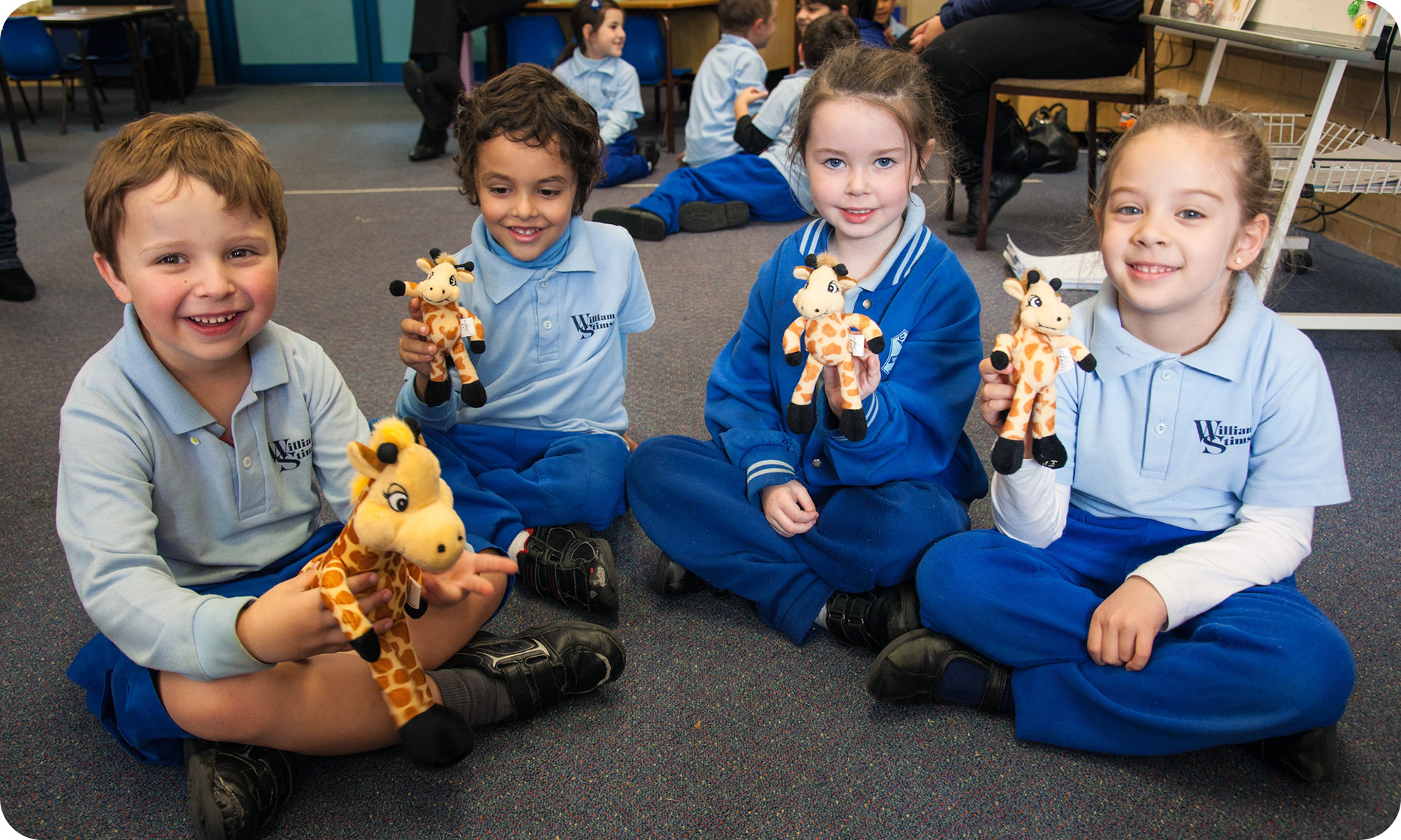
For those not familiar with Life Education and what they do, it's basically a preventive health educational program that goes around to primary schools across Australia. In their Mobile Learning Centres, specially trained educators, along with the brand's mascot Healthy Harold, teach kids about making healthier choices in life.
Design principles
Connection and empathy
Before digging into the visual design, we ran several workshops with the client and even sat in on one of the programs at a local primary school in Sydney, which was incredibly insightful.
After these workshops, I wrote up some key design principles to help guide the user experience and overall design of the website.
Human experiences
Life Education is all about human experiences, connection, empathy, and healthy and smart living. Connecting with stakeholders by sharing emotionally resonant stories, along with being transparent and real, will help support calls for sign ups, donations and volunteering.
Highlight community
Make the service feel like a community by highlighting everyone’s contributions, from educators, donors and participating schools. Show how each contributes to Life Education being a fundamental, vibrant and life-changing program.
Clear outcomes
Invite and reward action by making it easy to get involved. Whether it’s seeing the outcome of a donation or engaging with resources after a school visit.
Ongoing engagement
Provide an easy to use toolkit for stakeholders, such as state offices, educators and teachers. With consistent resources and tools to enable self-service, and promote ongoing engagement.
Custom experience
Lead users clearly on their journey, with user segmentation and customised messaging to promote key actions and ensure next steps aren't buried.
Information architecture
Supporting pillars
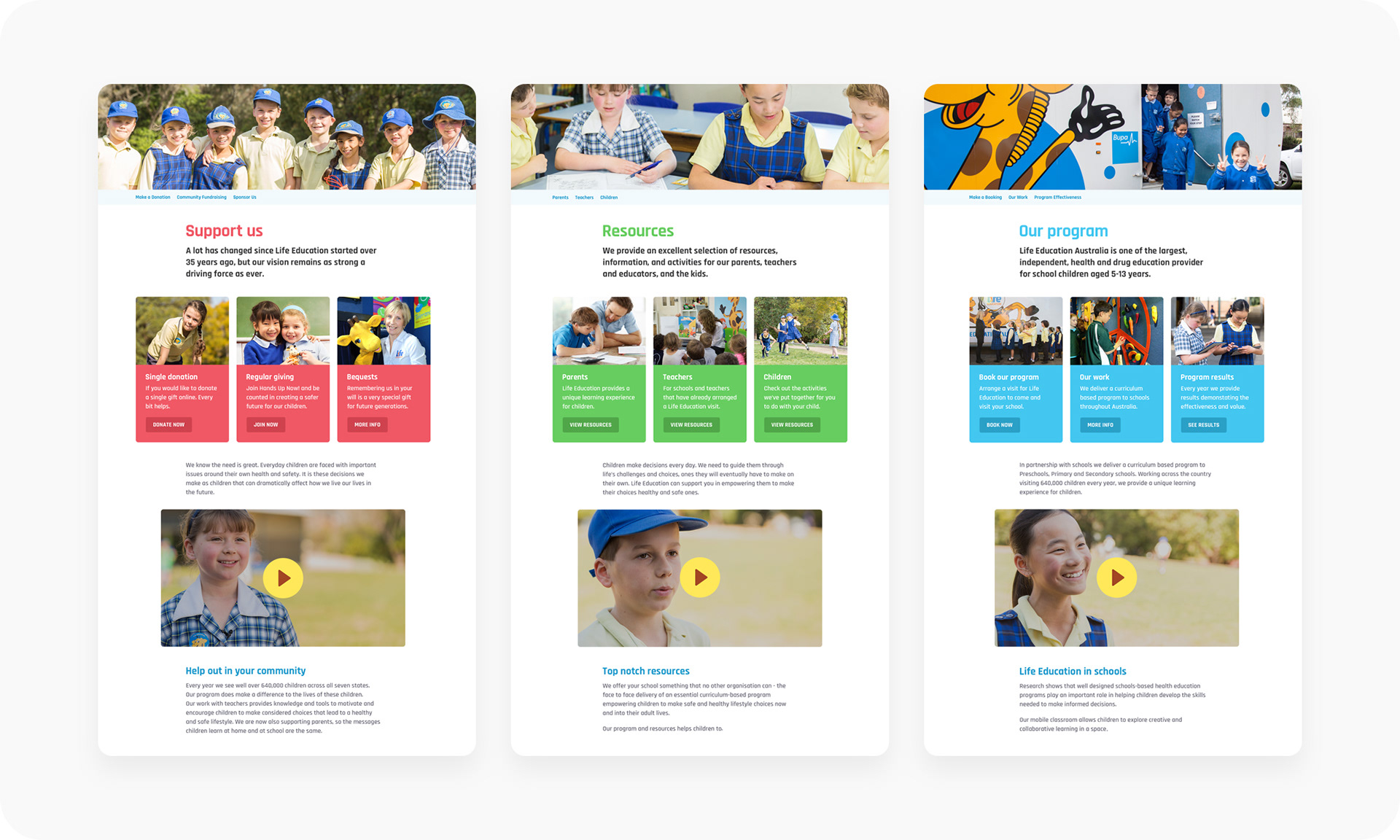
Based on the above principles, we created an IA for the website before moving onto the visual design. We defined three pillars (or sections) for the content to sit under — support, resources and the program itself. With each having it's own colour to help differentiate them from one another.
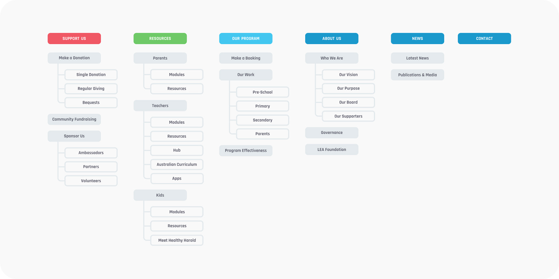
We found pretty early on that due to the size of the website and the sheer amount of internal pages, that we needed to create a system where the client could create pages themselves, using predefined content types.
Visual design
Needs and goals
Using the above design principles as a foundation and insights from interviews with stakeholders, I defined a visual design direction to address the needs and goals of each state. As each state is run independently, so they may have a different focus when it comes to the pillars.
Content
A clean and vibrant visual design — letting the content come first.

Modular
Housing content in modular pods and being able to move them around, which echoes the moving of objects on the velcro walls in the Mobile Learning Centres — the van that visits the schools.

Pillars
Reinforcing the pillars, by assigning each its own colour. This visual language makes it easy for the user to identify related content easily.
Consistency
Referencing the pillars at all times, whether it’s through the colour of content, prominent tabs in the navigation or calling them out at the bottom of each page in the footer.
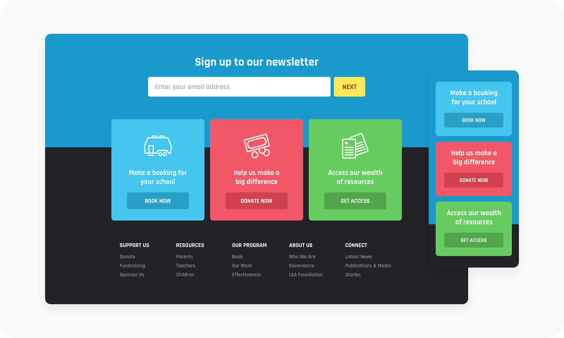
All of this, tied together with strong colours and focused content, gives the website a fresh visual design and easy to use interface. Allowing us to easily address the main goals of increasing overall donations, easier access to resources and booking the program.
Funnels
Custom experience
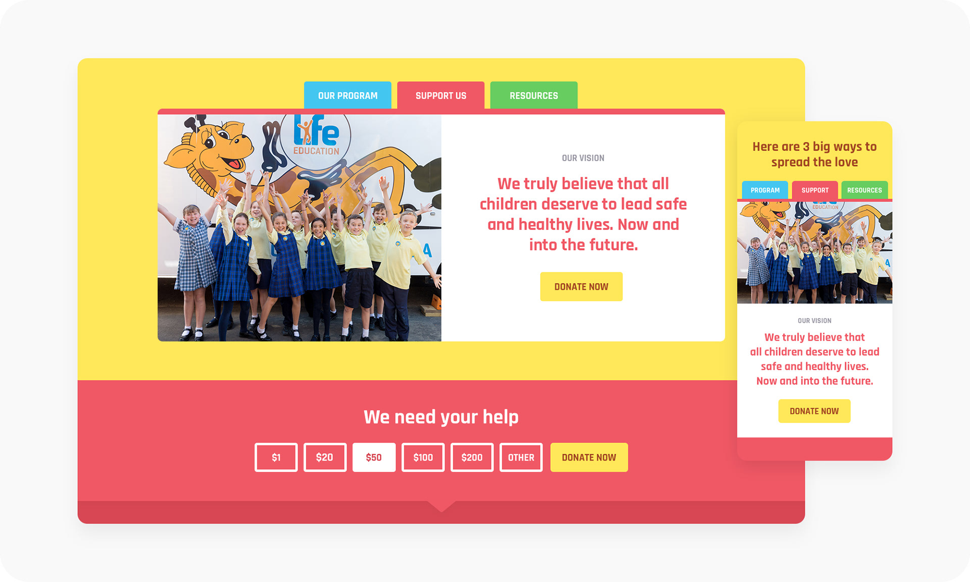
As mentioned before, the home page is designed in a way for each state to customise it, depending on their specific goals and pillar focus.
For instance, the hero image can promote the latest news, modules or even campaigns. The tabbed section can give a brief overview of Life Education and their values supported by content. A resources pod, showcasing the areas of resources (pre-school, primary, secondary and parents). The partners strip, with switcher to swap between state and national partners. And finally, a CTA field to either sign up to the newsletter or book the program.
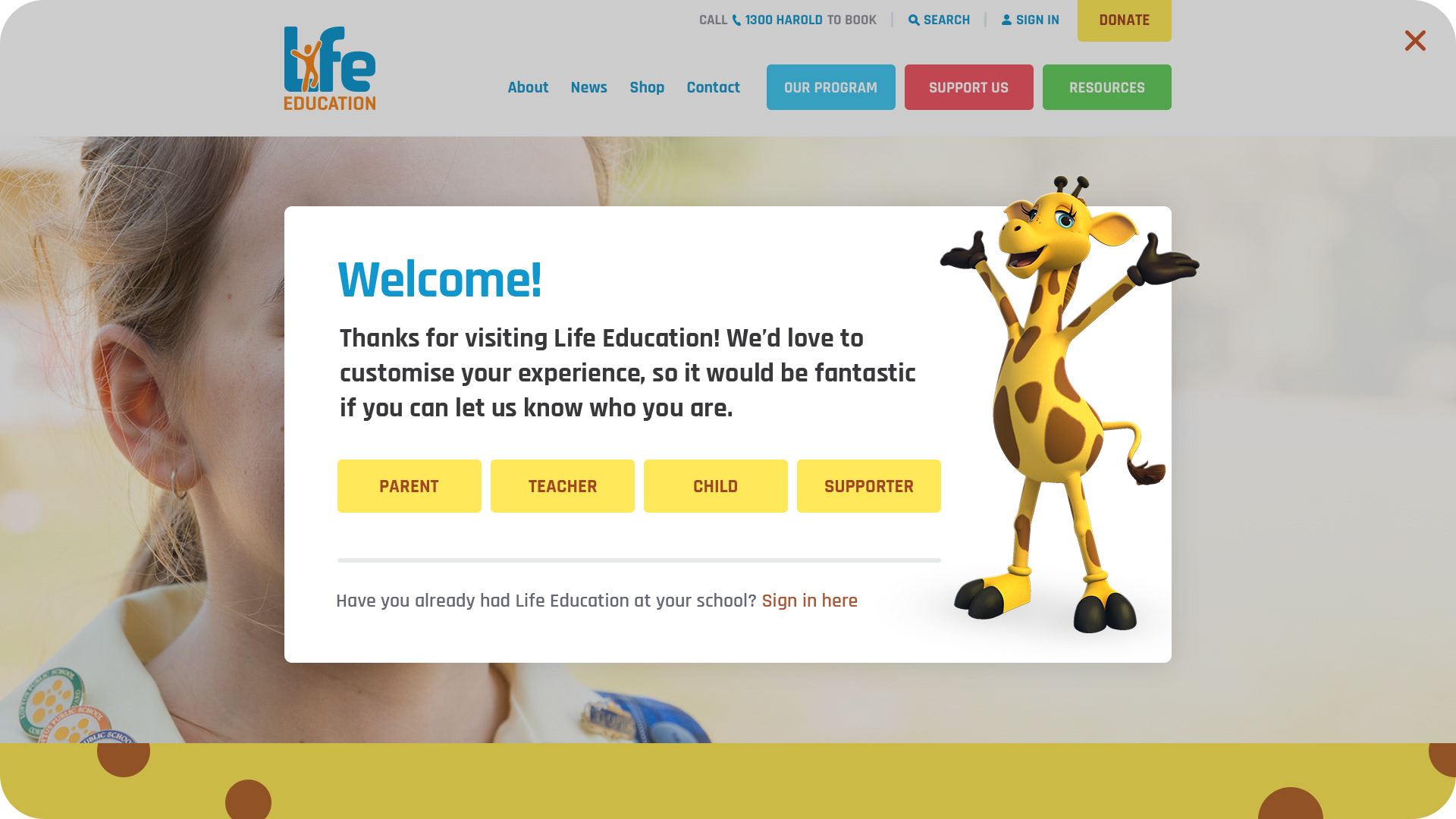
Also, when arriving to the website, the user is presented with a popup where they can pick who they are — funnelling the user into different versions of the site, with the content changing out depending if they're a parent, teacher, student or supporter.
Pillars
Landing pages
Each landing page for the pillars consists of the same initial layout to help keep everything consistent. It consists of a three tiled pod showing the top most important links for that landing page. This helps surface the content, so as the user doesn’t have to go digging for information.
What those links are can be customised by the states, as well as the content that comes below them. However, if a teacher was logged when accessing the resources page, they would see all the resources for the current module their class is doing, as well as access to all the other modules.
Customising these pages based on location and user segmentation helps users get to the information they need more efficiently and quickly.
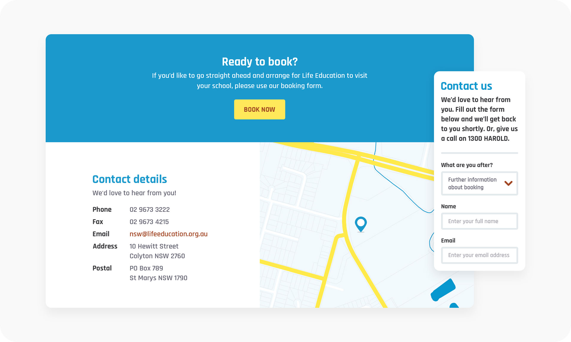
Contact
Relevant details
The contact form allows users to reach out to Life Education team, including filtering the appropriate questions through to either head office or the individual states. Also, depending on the query selected in the form fields, the CTA and map details will change out.
There's nothing worse than being presented with a tonne of irrelevant contact information.
Content types
Internal pages
From the very beginning of the project we discovered there was a need for internal pages that didn't need to be custom designed by us. So we created some content types and a page template that the client could then use to build out the rest of the website's extensive internal pages.


Other pages
More pages
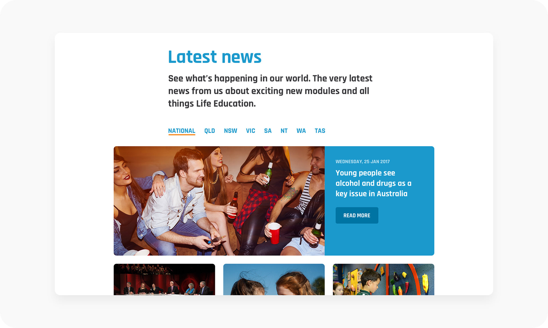
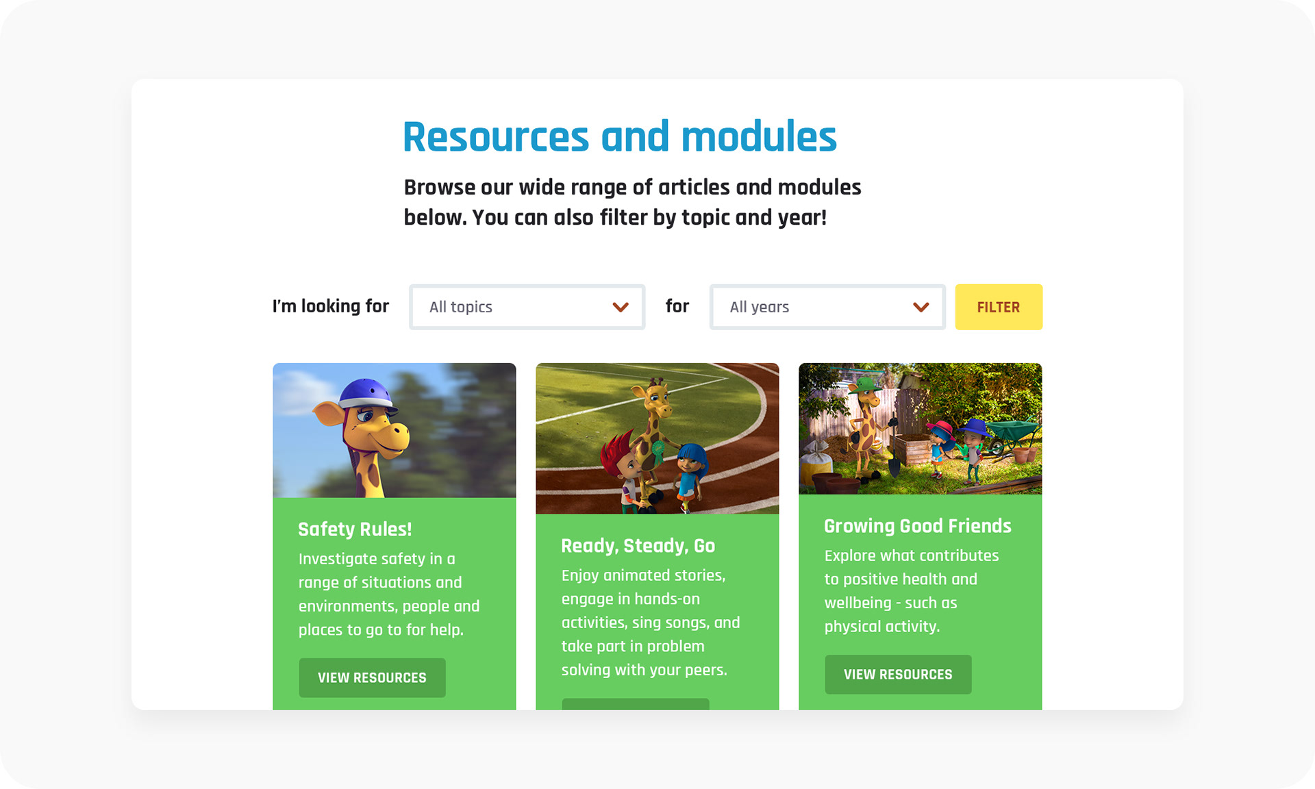
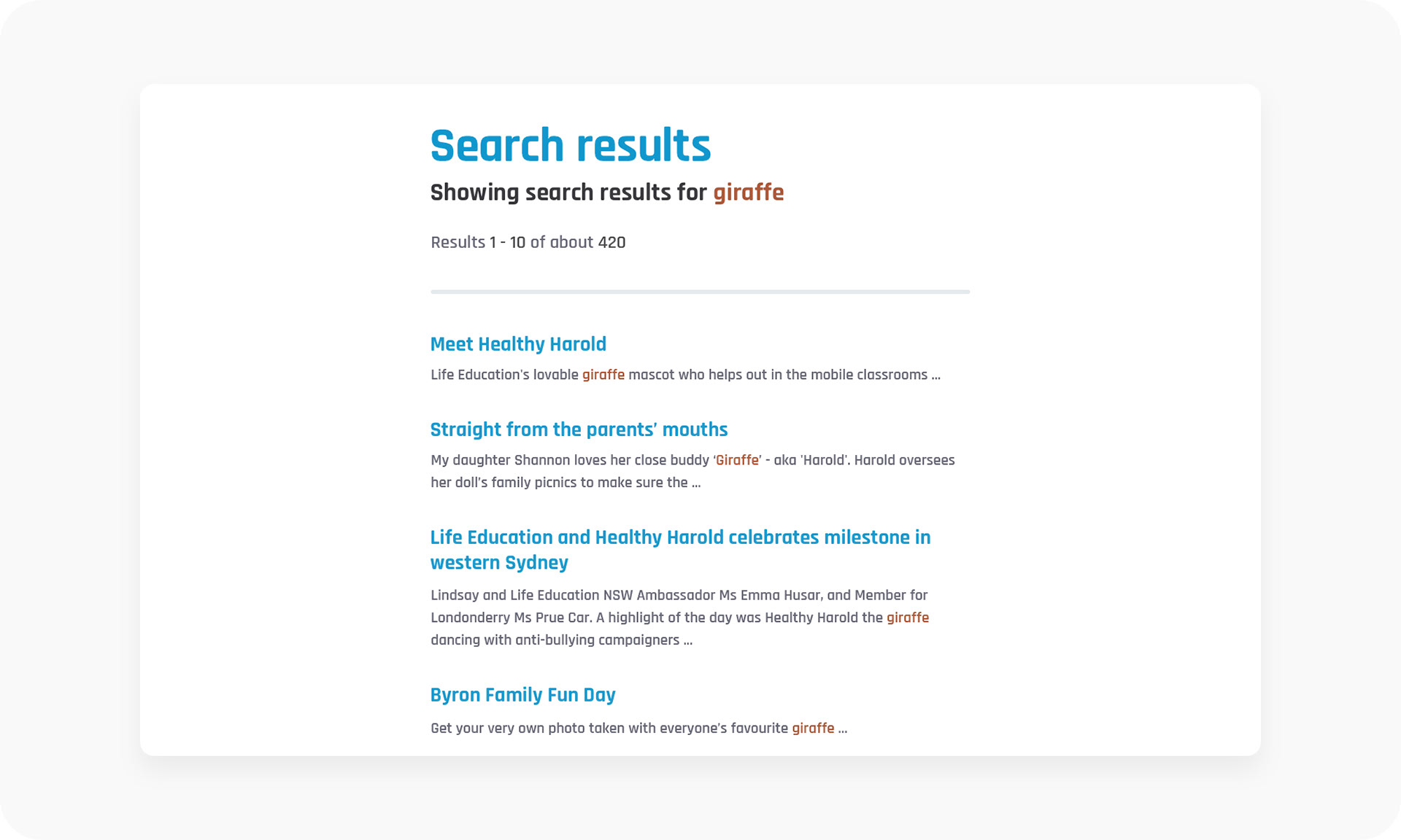
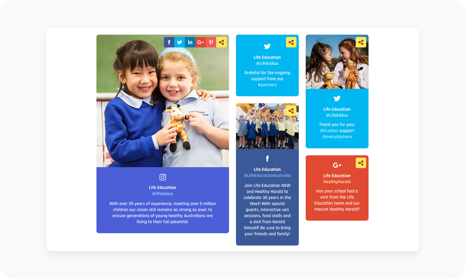
Apart from the above pages and template, which were the bulk of the website, we also created pages for news, campaigns, modules, search and a social media hub. All of these used existing content types.
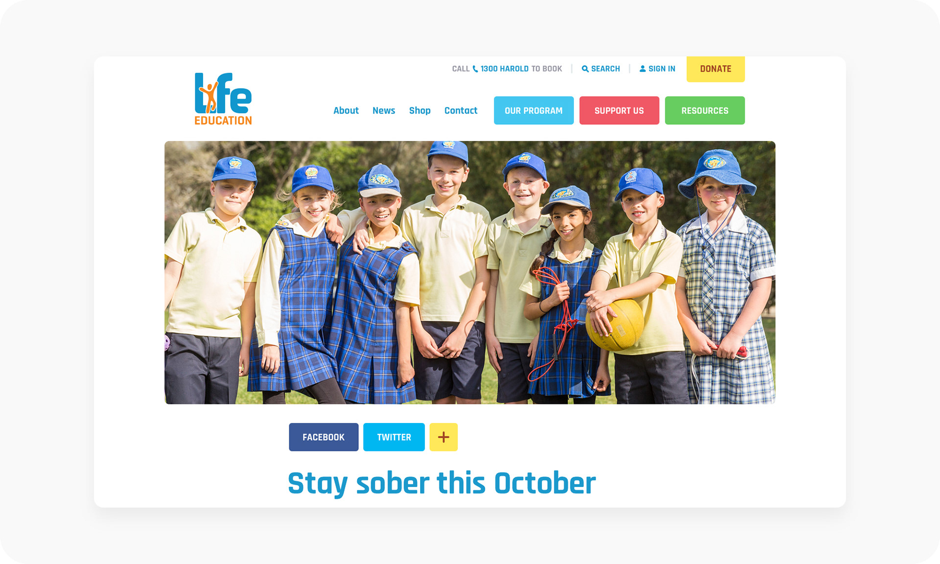
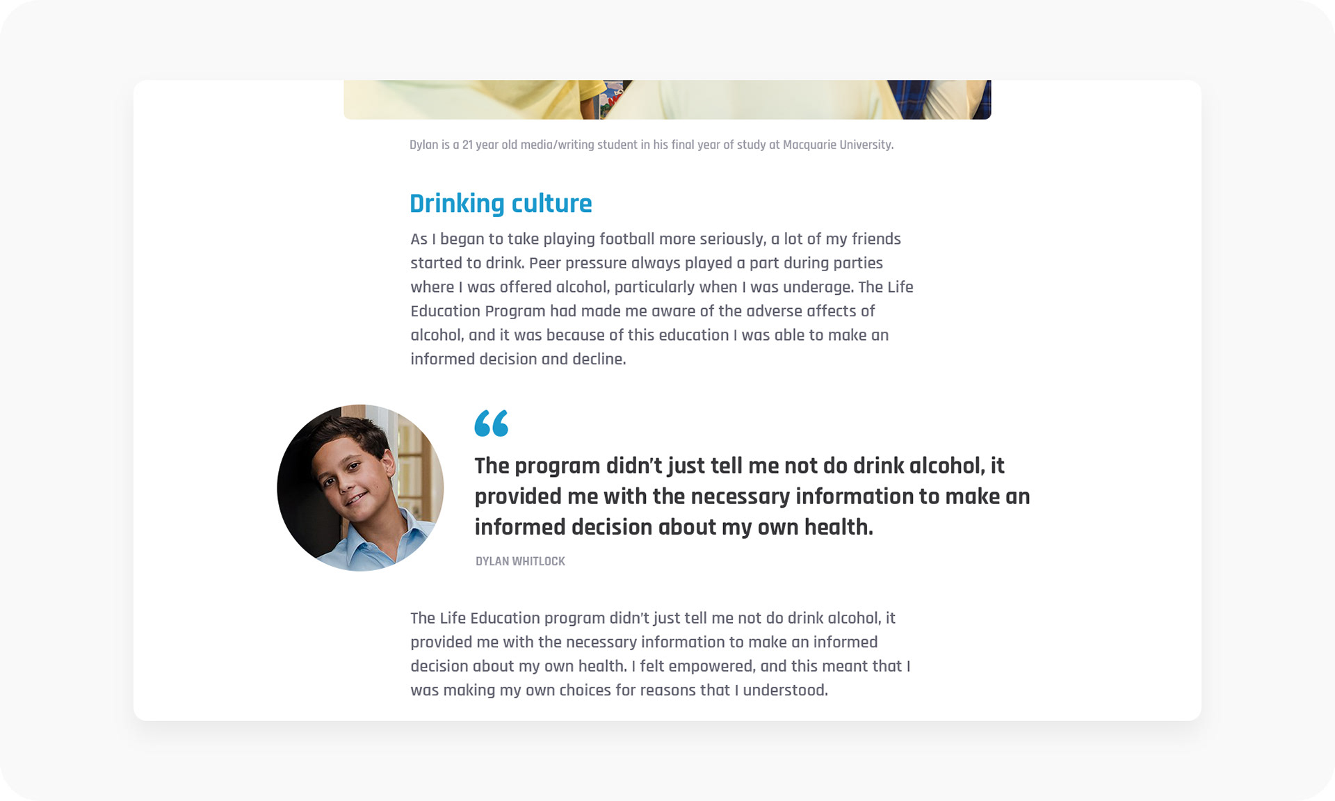
Along with stories, which was a case study-like template to hero stories about teachers, students or volunteers. It was basically a way to tug at the heart strings to get people to donate.
This was such a fun and worthwhile project, as I (and I'm sure many other kids around Australia) have very fond memories of Healthy Harold when he came to visit our school in the back of his van. But instead of trying to sell us drugs, he taught us to stay away and live healthy instead.
Note, that the current live site is now different, as it was redesigned a few years ago to address their growing needs and goals. But a lot of the basic user experience and design principles have been carried over, which is nice.
If you can spare a bit of change, please consider donating.