

Hopper
Rewards
Rewards is a referral program for the Hopper app, which allows the user to share a custom code with their friends to earn and claim in-app rewards.
While at Hopper I worked on a fair few user flows for growth related features in the app. One of those was for a rewards section in the app, with a dedicated "Friends" screen where users could share a custom code with friends, getting a certain percentage off booked trips and earning them Carrot Cash, Hopper's in-app currency.
If you read all the way to the end you might even get a little reward yourself.
Goals
Increase users
The whole aim of this project and its many iterations was to increase the MAU of the app, by getting users to refer friends and install the app.
Overall, we saw a sizeable increase in users referred and app installs:
• Over 2 million users referred
• 12% increase to app installs
• 12% increase to app installs
I spent some time doing breakdowns of existing referral programs the team liked and from there started with some basic wireframes of the core experience. Although, we already had a pretty good idea of what we wanted to do in terms of the layout and overall flow.
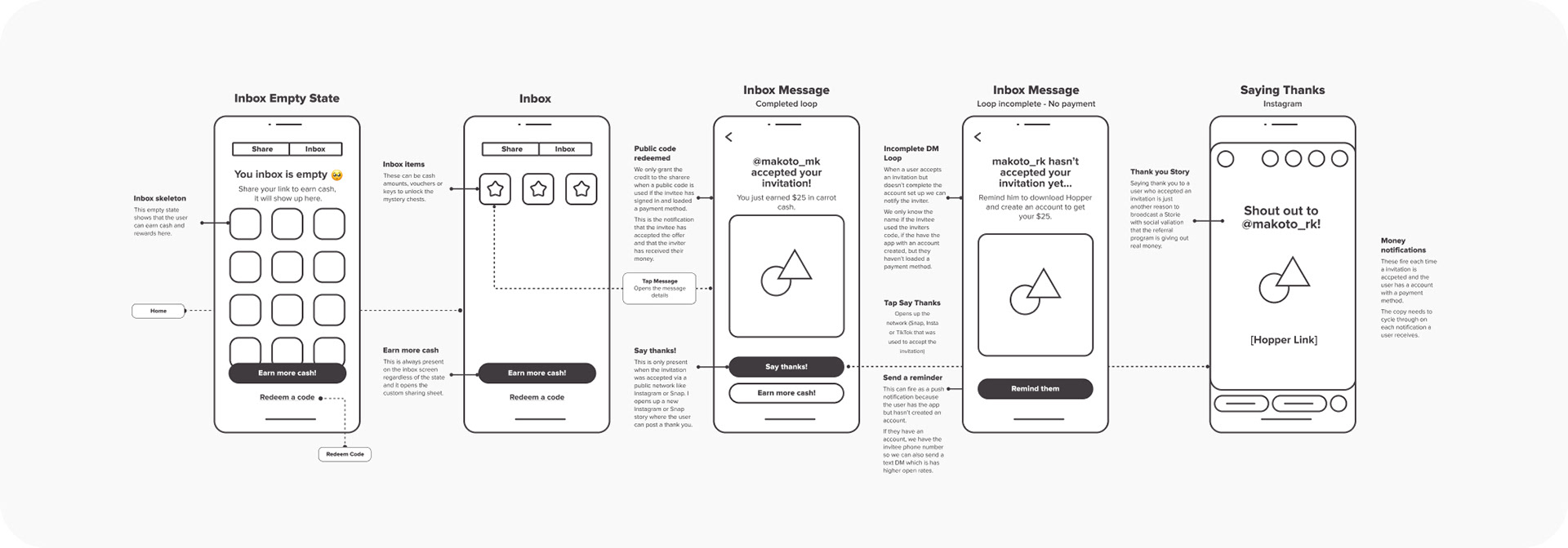
Friends
Sharing and earning
The core Friends screen could be accessed from the bottom navigation at all times, with tabs at the top to go back and forth between Share and Rewards. We also sent out some push notifications and emails making users aware of this new feature, along with testing various entry points in the app.
Below is the full user flow for people who like that sort of thing.
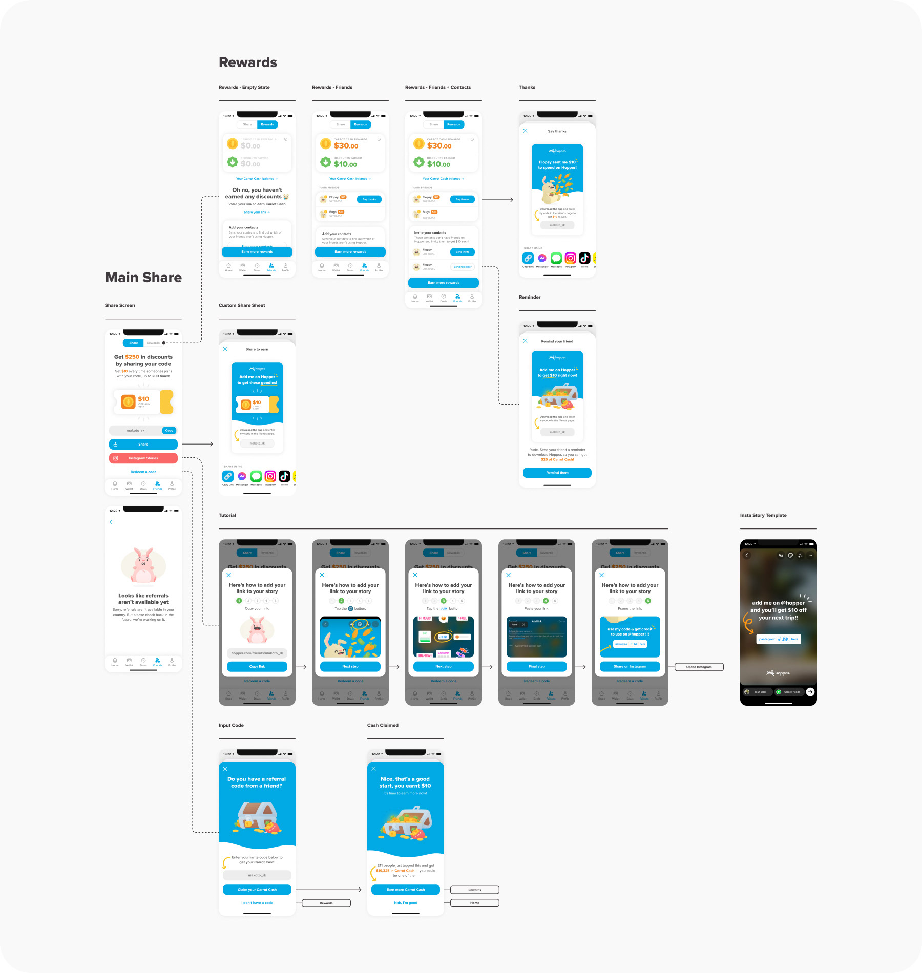
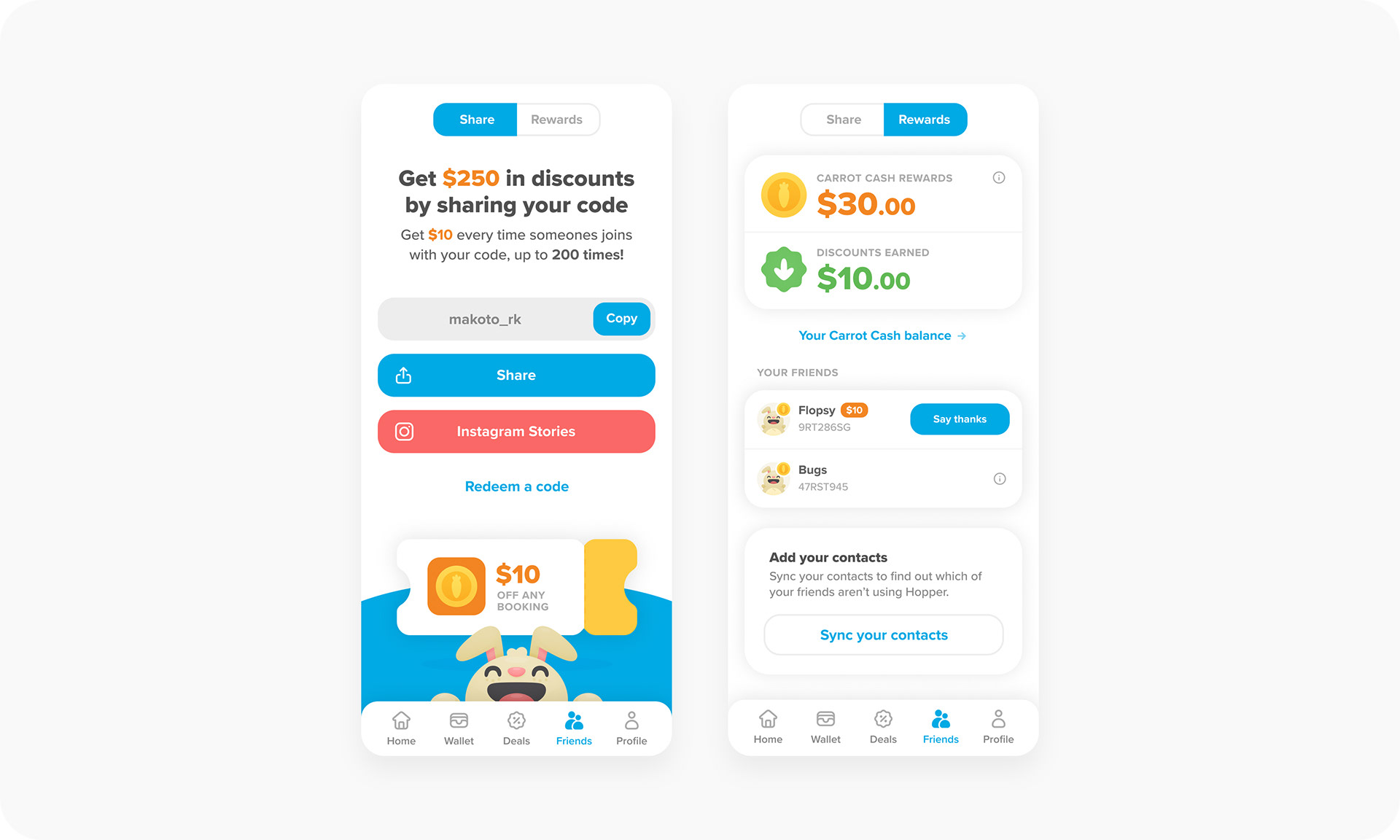
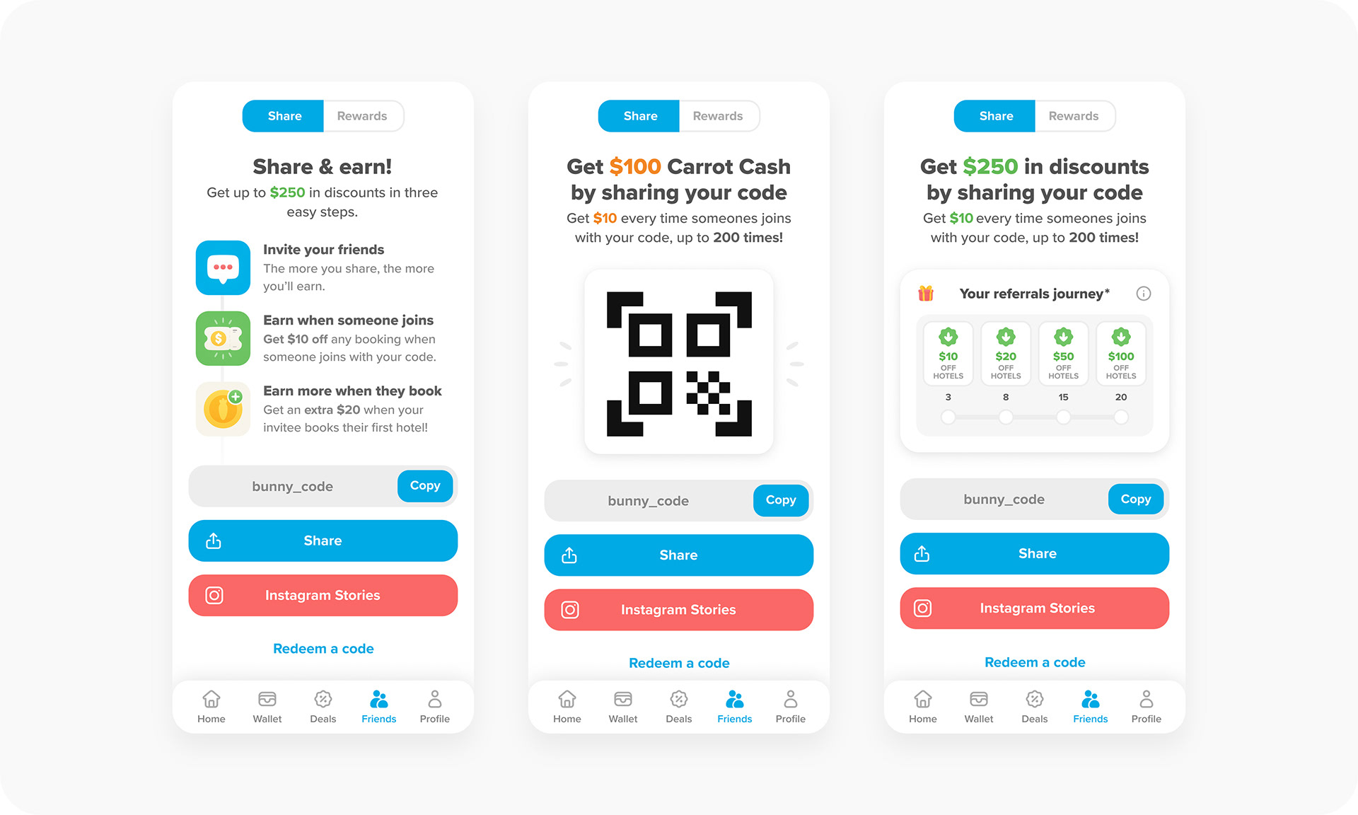
Share
Sharing is caring
From the core Share screen, the user could either copy their code and share it as text, however they like. Or by tapping the "Share" button which would bring up a share sheet of a custom image to send via various apps.
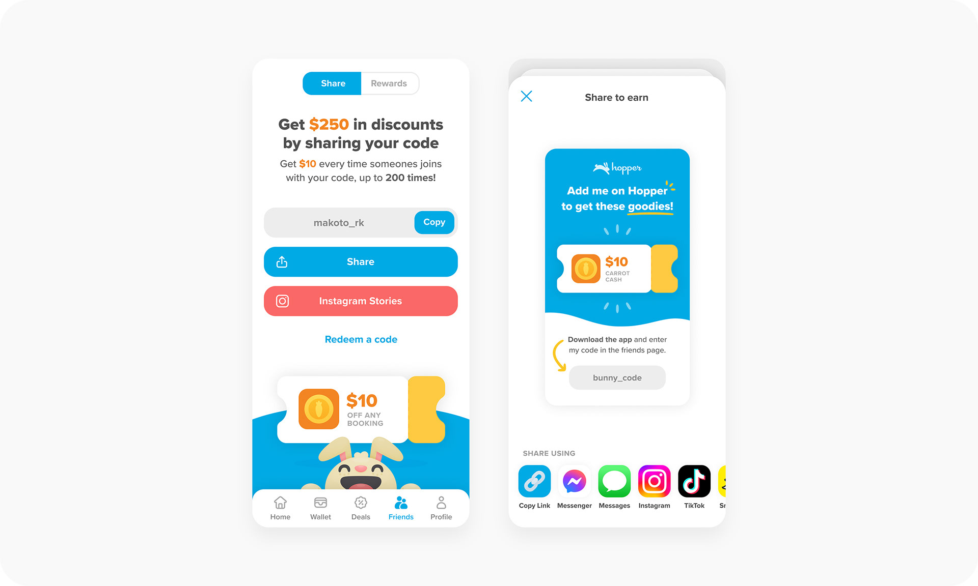
Tapping "Instagram Stories" would show a tutorial on how the user could share their code out that way.
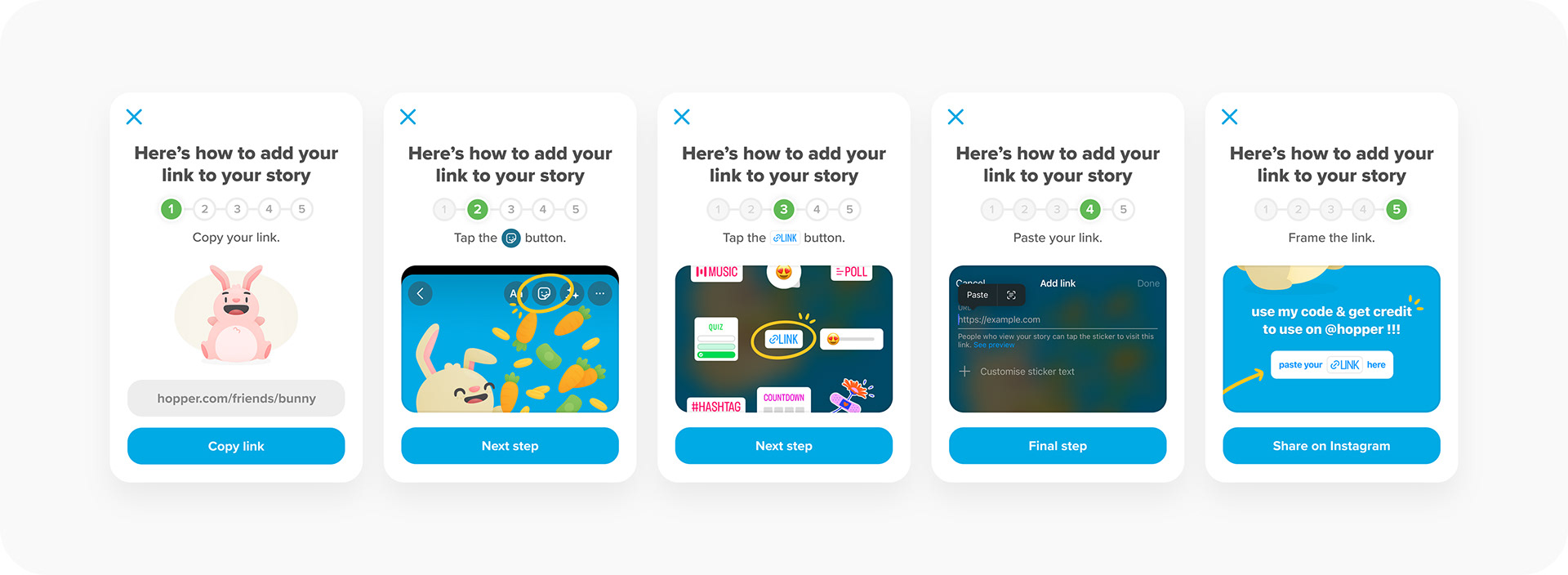
Finally, tapping "Redeem a code" would take you to, you guessed it, a screen to redeem codes from friends if they just sent you the text. Tapping a user's code link would take you directly to this screen, so this was more of a backup.

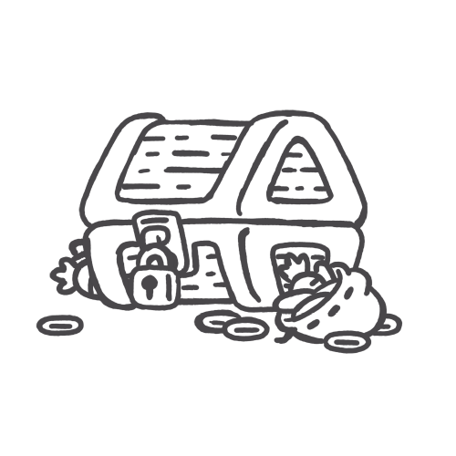
To make claiming the code a playful experience, I animated the treasure chest opening up to reveal the booty within. The illustration itself was from a previous gamification experiment where users could buy loot boxes.

Rewards
Refer and earn
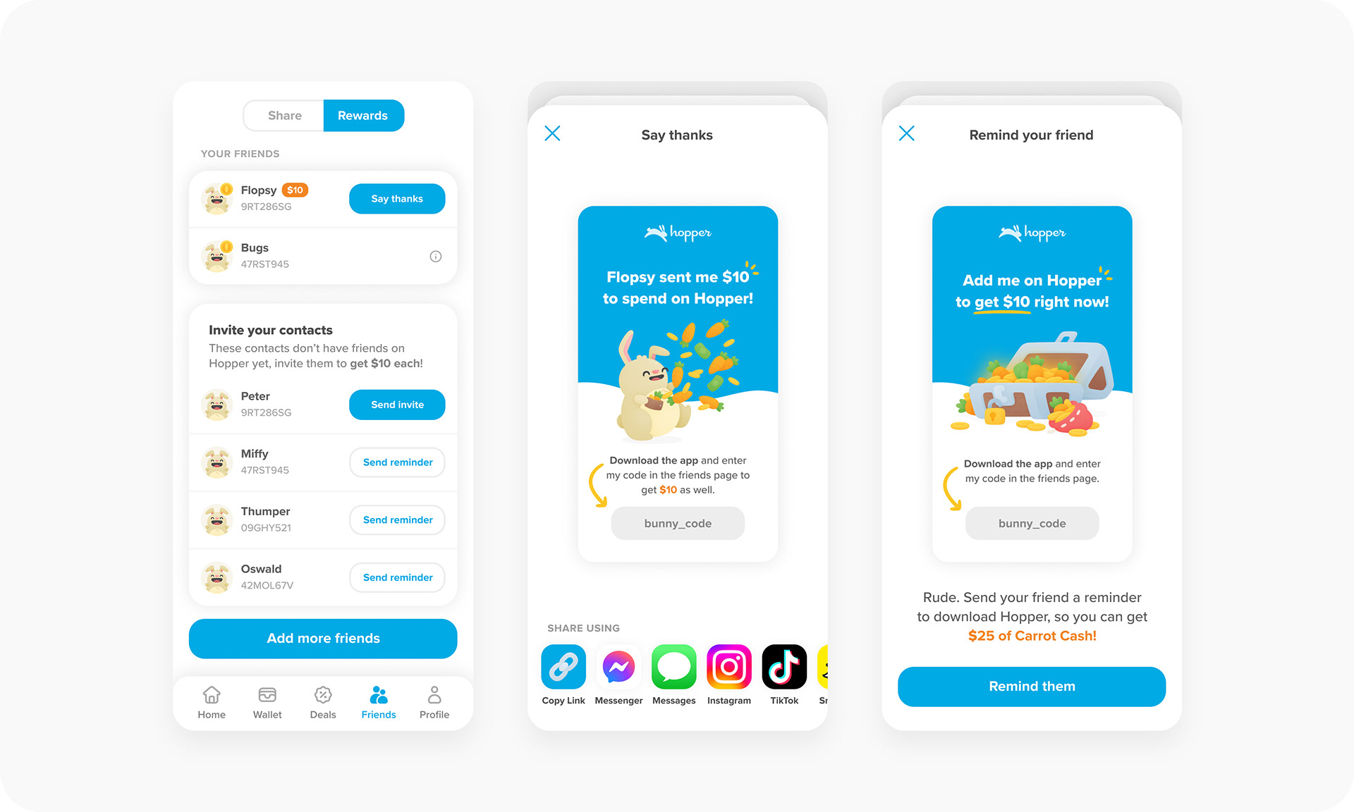
We wanted the Rewards screen to act as a sort of wallet for the users rewards, which are separated into two categories — Carrot Cash and Discounts. They also have their own icon and colour attributed to it to keep things clear.
In addition to seeing their reward amounts, users can also view their friends that have been added (with a little coin over the profile image to show the reward has been claimed), along with their contacts who they can sync and invite.
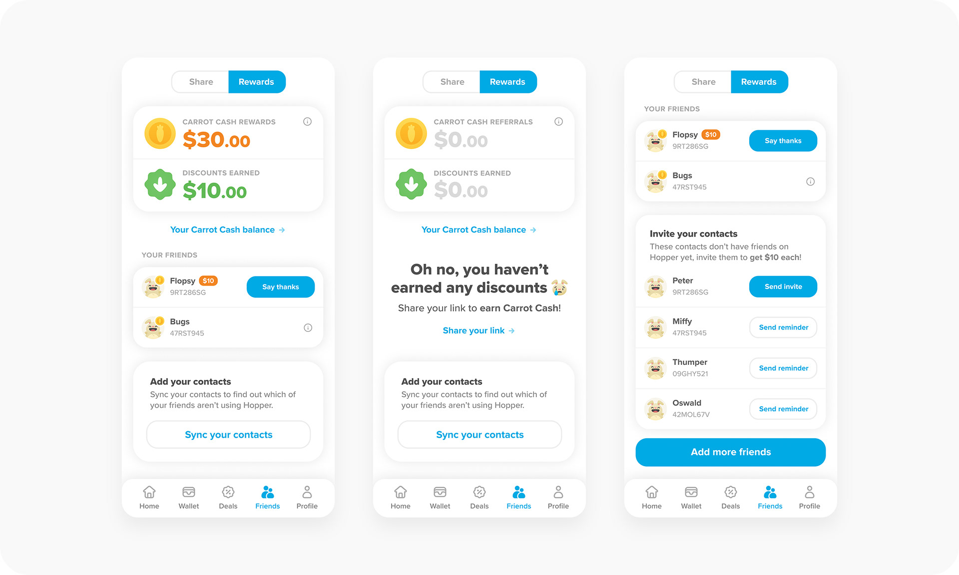
The user can also send thank you notes and reminders to friends.
Popular
Claim all and see all
It eventually got to a point where users had such a huge list of friends (must be nice) that it would take an eternity to claim the rewards manually. So we added in a "Claim all" button to make things much easier for the user.
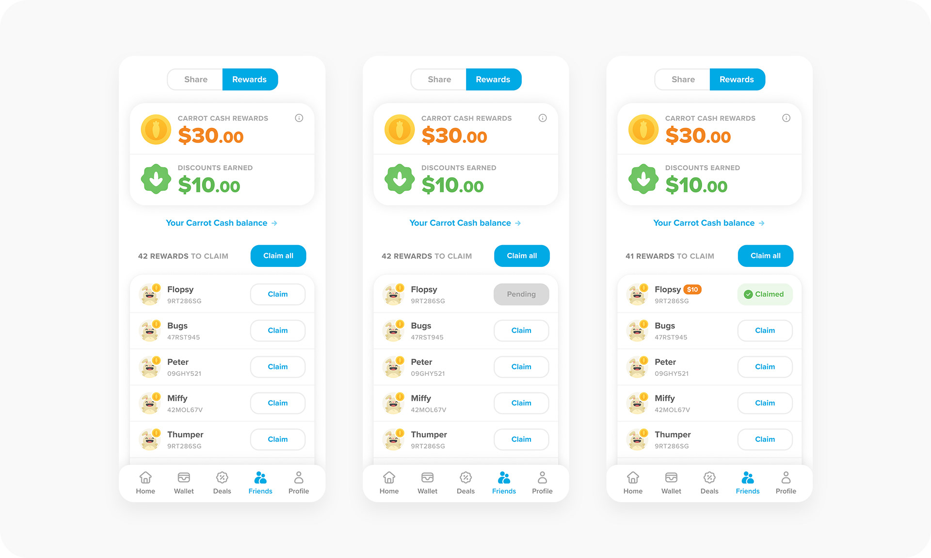
We also eventually added a new screen where the user could see their full list of referrals. Within that, I added a search bar, along with tabs to filter the status of the reward, with claimable referrals at the very top at all times.
Milestones
Rewards journey
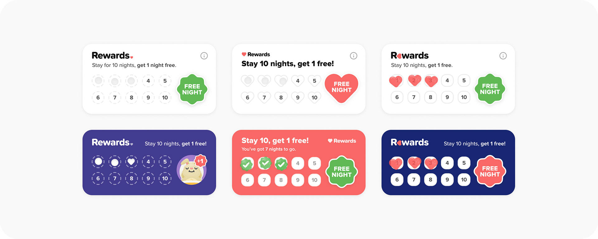
Over the course of about a year or so, many variations and iterations were tested for this referral program, but one of the larger experiments introduced milestone-based rewards — where a user has to complete certain tasks to unlock said rewards. Almost like earning trophies in a video game.
I chose to keep the interaction in one component, so we could easily move it around and test different placements on either the Share or Rewards screens. Below is the core flow for this user journey.
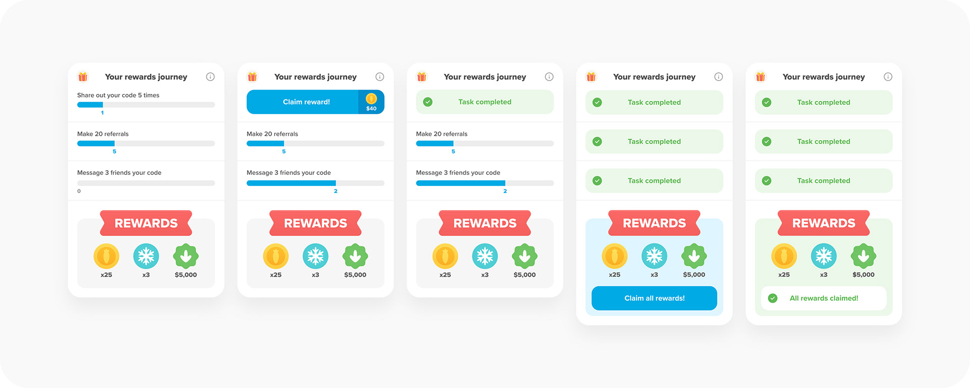
I also tried a few simpler approaches, some of which ended up being used for the Streaks experiment. But in the end, I felt the above worked best as it was the most engaging and satisfying for the user because of the constant feedback (dopamine hits) that they're getting with completing each task.
Variants
Iterating and testing
We iterated and tested the Share screen graphic extensively — from having steps explaining how it all works, to something as basic as a QR code and even a simplified version of the milestone-based rewards component.
We even tried testing some more interactive elements, like a spinning prize wheel, to give it a slight bit of gamification.
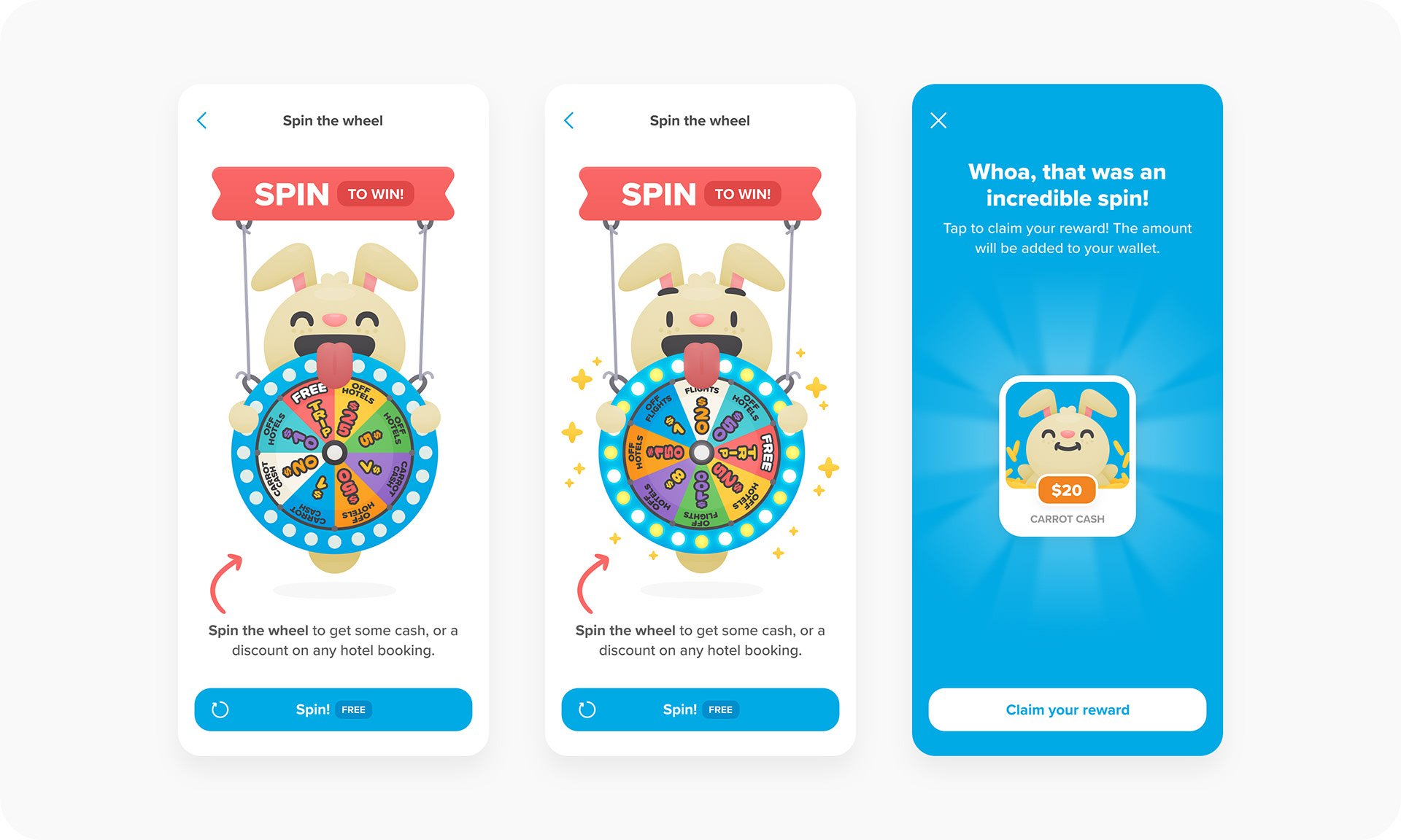
At the end of the day though, the variant that performed best was the simplified version of the milestone-based referrals.
Brand
Rewards
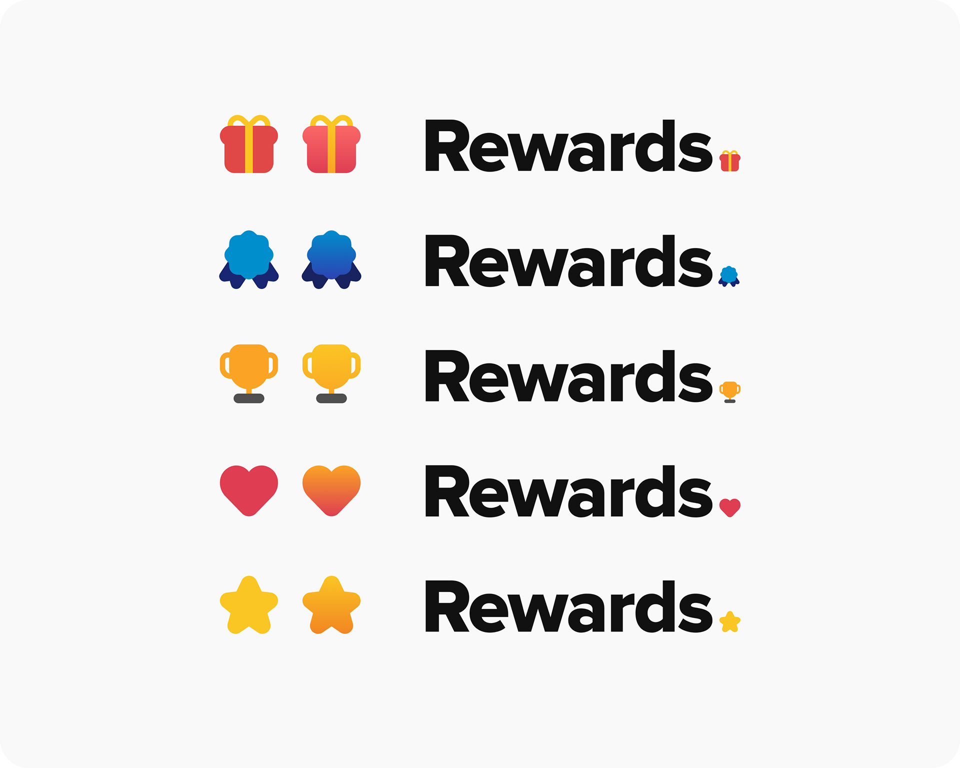
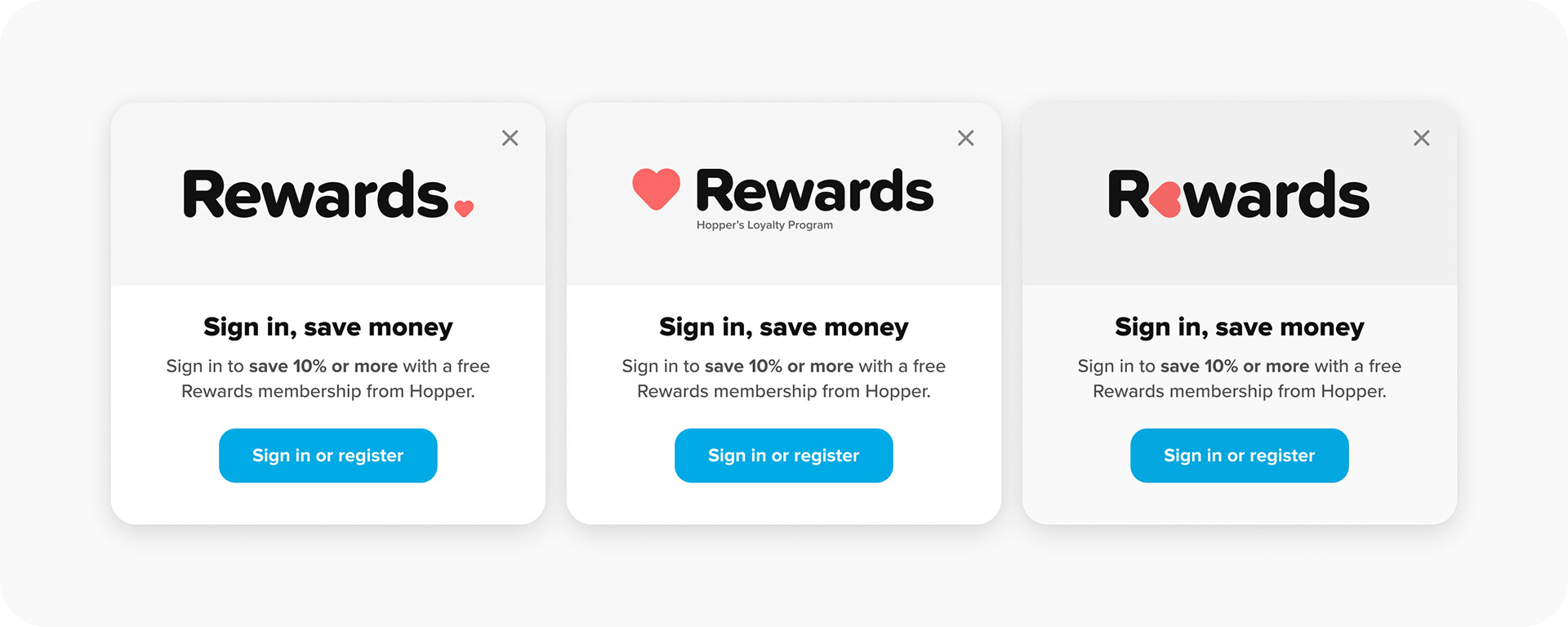
A year or so after testing the above experiments and variants was done, it was decided to give an identity to the program. I chose to keep it nice and simple by calling it "Rewards" — the user would be seeing this on the website or in the app, so it seemed unnecessary to also have "Hopper" in there. But I also made a version with a little tagline for some extra context.


Myself and the team decided on moving forward with the heart symbol for the logomark, as apart from giving it some character, we felt it made the most sense with the rebranding of it as a loyalty program.
However, I did play around with a few other symbols and treatments.
I also played around with some different names, such as "Perks" and "Carrot". Out of all of them I liked Carrot the most purely from a visual perspective — as there was a lot of fun to be had with the logomark and how that is incorporated into the typography.
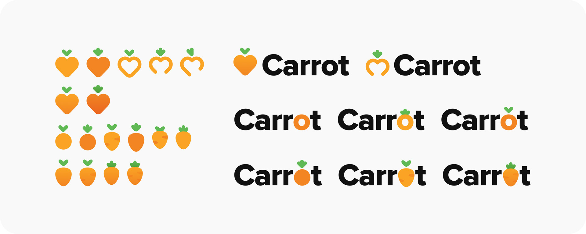
It could have been really playful. In slang, Carrot means reward, as in “carrot or stick” and it ties into the bunny-led, playful side of the brand nicely. It doesn’t necessarily clash with Carrot Cash, as you’re usually rewarded with said cash. So in that sense it ties things together — everything “carrot” is a gift from Hopper.
But at the end of the day Rewards and the heart logomark felt the cleanest and clearest. Especially when placed into components such as sign-in modals and stamp cards, which was an evolution of the milestone-based referrals.
You made it! Here's the reward, a simple thank you from me — thank you.
Credits
Role: Designer (Brand + Product) + Illustrator
Studio: Hopper
Client: Hopper
Studio: Hopper
Client: Hopper
2022 - 2024