Hopper
Hopper finds you the best deals and most flexible options on flights, hotels, homes and rental cars.
For the better part of a decade I worked at Hopper, a travel booking app — overseeing the brand's art direction and drawing lots of cute bunnies.
The illustration style is cartoony, colourful and friendly — just like the happy little bunnies, and the various landscapes and scenes, which are done in a rounded, simplified style. The combo of cute characters in these stylised, real-world settings, helps give Hopper a point of difference in imagery to other similar travel brands and apps.
The buns
Happy happy, hoy joy
The bunnies are the happy, joyous (potentially high) face of the brand. As such, they are consistently present throughout the app and other materials. Below is the bun from sketch to final.
Since the very first iteration, the bunny has always been a fun and emotive character. A bit silly, and at times clumsy, they always like to have a good time and wear their heart on their sleeve — making them very sookie. These personality traits help in endearing the buns to the users, as hopefully they will see something of themselves in them.
I make an effort to show diversity in the illustrations. So I try and get a few different coloured buns in each scene.
We also always show them being affectionate (lots of cuddles and kisses) and generally being helpful, supportive, kind, and a bit trolly towards one another. This helps in giving them a lot of character and a bit of story — to what could be a simple or even somewhat arbitrary illustration.
The bear
Fair & friendly
The sidekick to the bun, is the Fair Bear. He's the more helpful one, appearing throughout the booking experience with a friendly "Hi there!" to give users helpful and important info. He's such a sweetheart.
Fair Bear also represents Hopper's support team. He appears sometimes with a sweet smile, offering help via live chat. He’s super keen to help and just a big loveable fluff — even when he's rendered as a chat bot.
ICONOGRAPHY
All of the icons
One of my main tasks at Hopper was supporting the product designers, creating new assets for any new features or products. This usually involved creating a set of illustrations, consisting of a hero with full background, a scene made up of a few buns on a transparent background, a single bunny and a thumbnail (one of a bunny and one of an object).
In addition to those were icons, which I designed and managed in the design system. These included an extensive set for amenities.
Along with a set that we just called "System" that included all of the product icons, general app icons (like checks, arrows and so on), along with other bits and pieces.
Product design
Flights, hotels and car rentals
Below are the home screens I designed for the both the app and the website.
I also regularly designed emails, creating a few templates.
I worked with a great team here at Hopper and we're always pushing to do better work and bring delight into the app. Below, are some of the bigger, or just plain fun projects, I've art directed at Hopper over the last few years.
Animated ad
Explainer video
We don't do too many videos, or animated ones at that, but it was getting about time we had a flagship video that basically tells you how the app works and why you should totes download it. To help us with this, we worked with Wonderlust.
To kick things off, I did a storyboard, then a quick and dirty animatic with my mumbling Australian accent.
I kept everything pretty minimal, so it consists mainly of illustrations on plain backgrounds, with the occasional full scene to break things up. This helped us easily cut it down into shorter versions for ads.
We also use a lot of abstracted UI elements from the app itself — to give an idea of what the interactions will feel like. They’re made to look a bit more cartoony and bubbly than their app counterpart, to fit in with the style of the video.
One of the things we really wanted to do with this, was have seamless transitions and no hard cuts (well, we broke this rule once, but it funny) so that the whole thing flows nicely from one scene to the next. We also use "wave" shapes as framing devices in the illustrations, and here they helped us transition into full scenes.
Hopper Trees
Planting trees
Recently, we launched a new carbon offset program — Hopper Trees. Now with every booking, Hopper will plant up to four trees for free. I lead the art direction for this initiative, illustrating some buns, as well as designing the website, in-app components and screens.
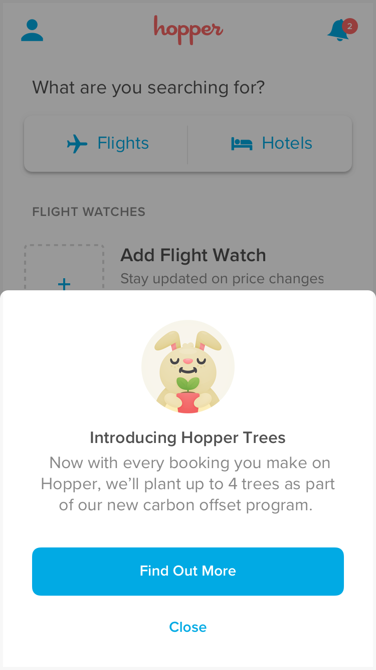
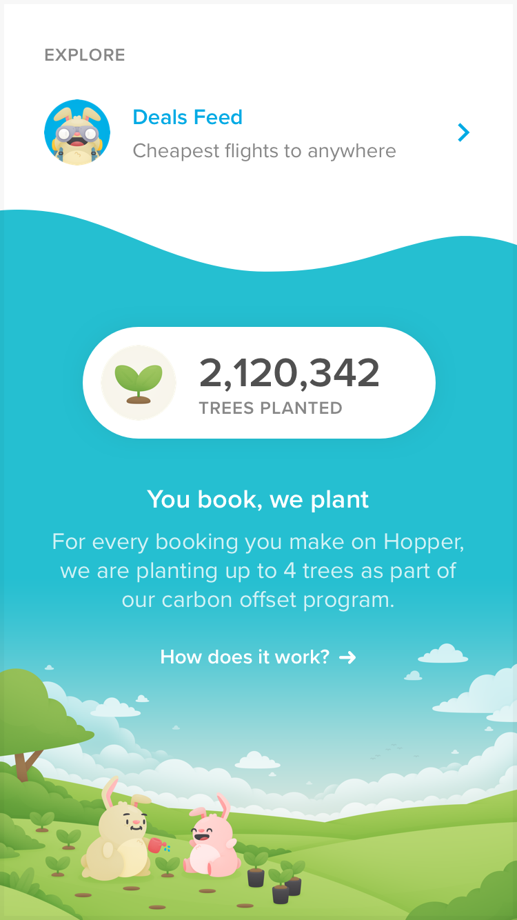
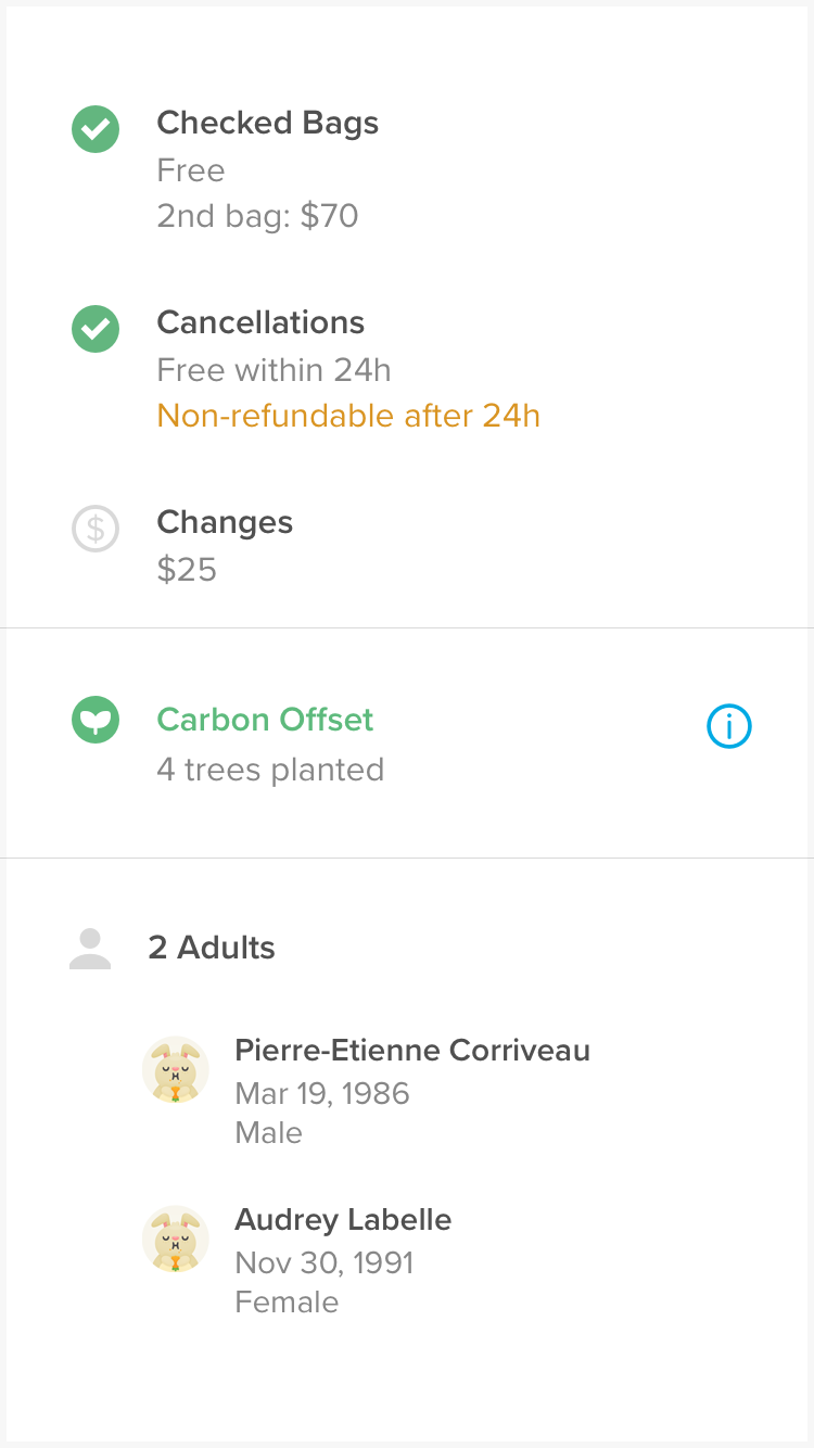
I'm really proud of the team with this one. However, we should be under no illusion that carbon offsets make air travel sustainable. But the smallest of actions can make a big impact, and this is definitely a step in the right direction — you can't have a go at planting a shit tonne of trees.
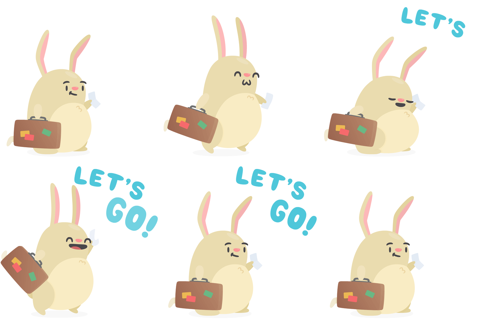
I love animation, but I'm not the best at it. So this was a really good opportunity for me to have some more practice.
Emoji
Emoji, or bunmoji?
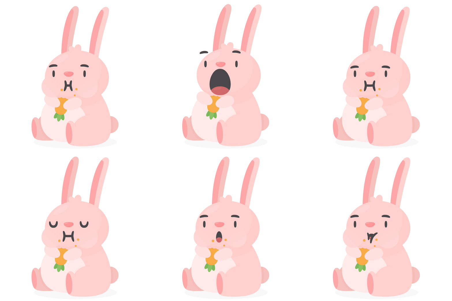
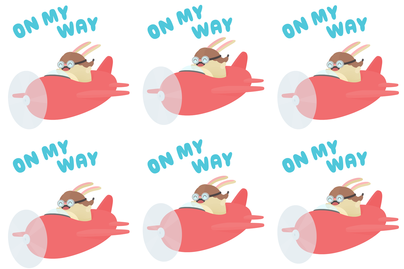
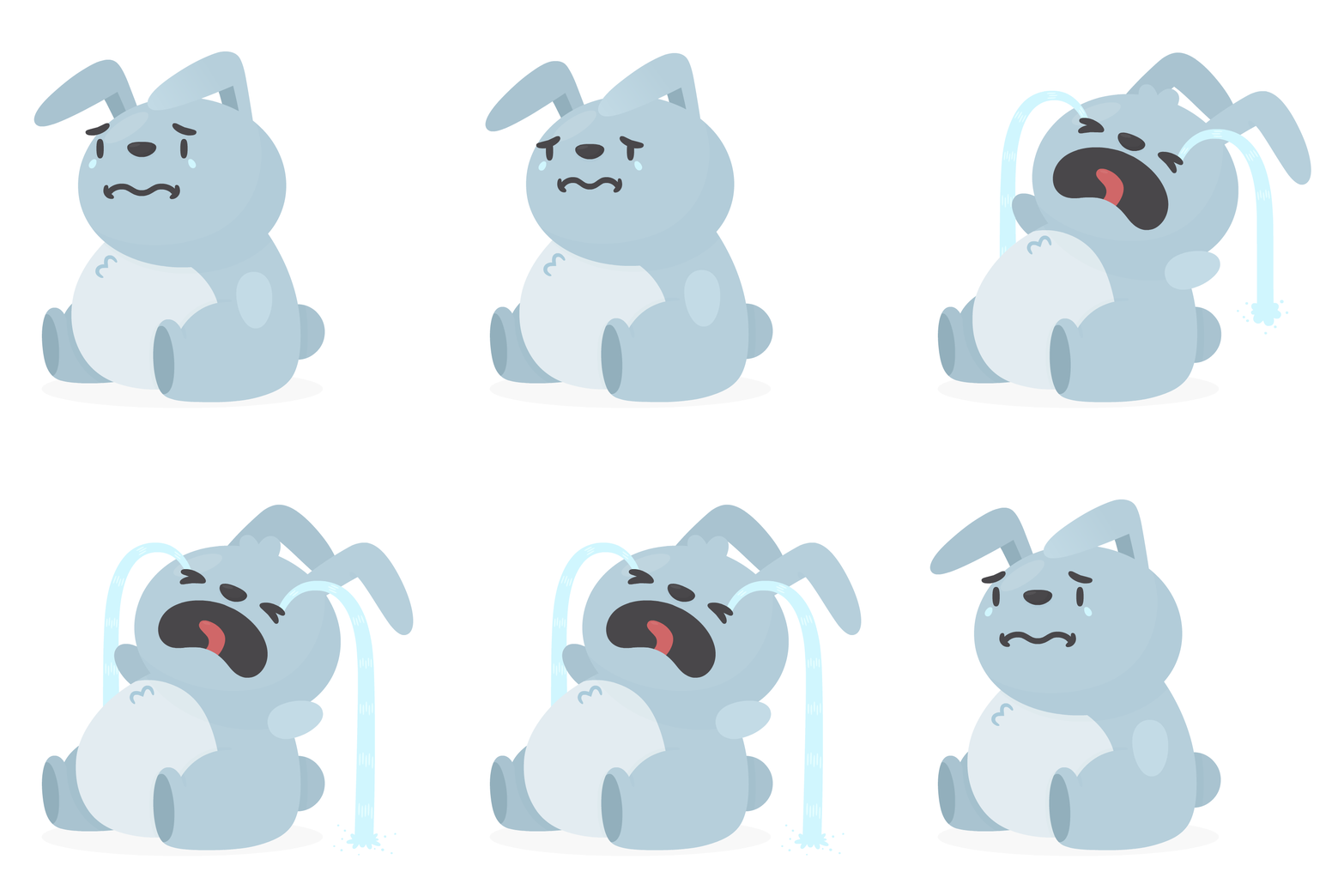
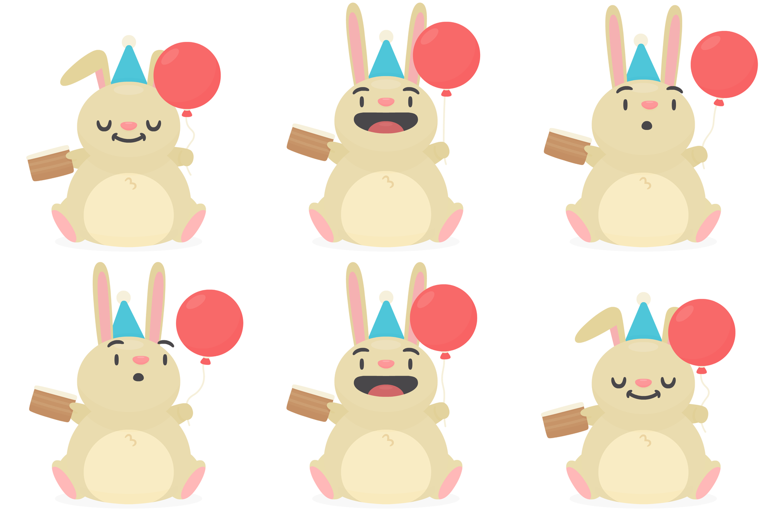
This is a great little side project that I love to work on whenever I get a bit of spare time — Hopper's very own emoji (bunmoji) set.
minIgames
Space Bunnies
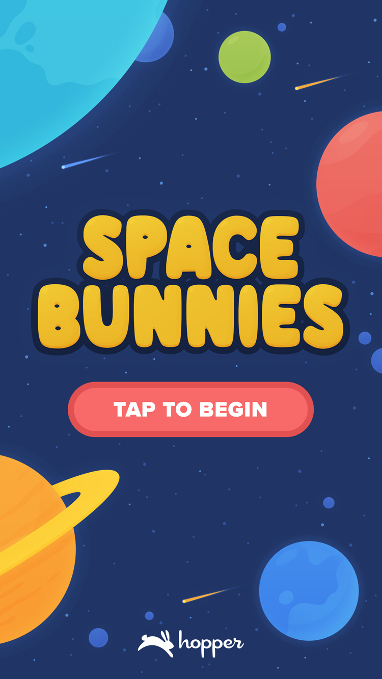
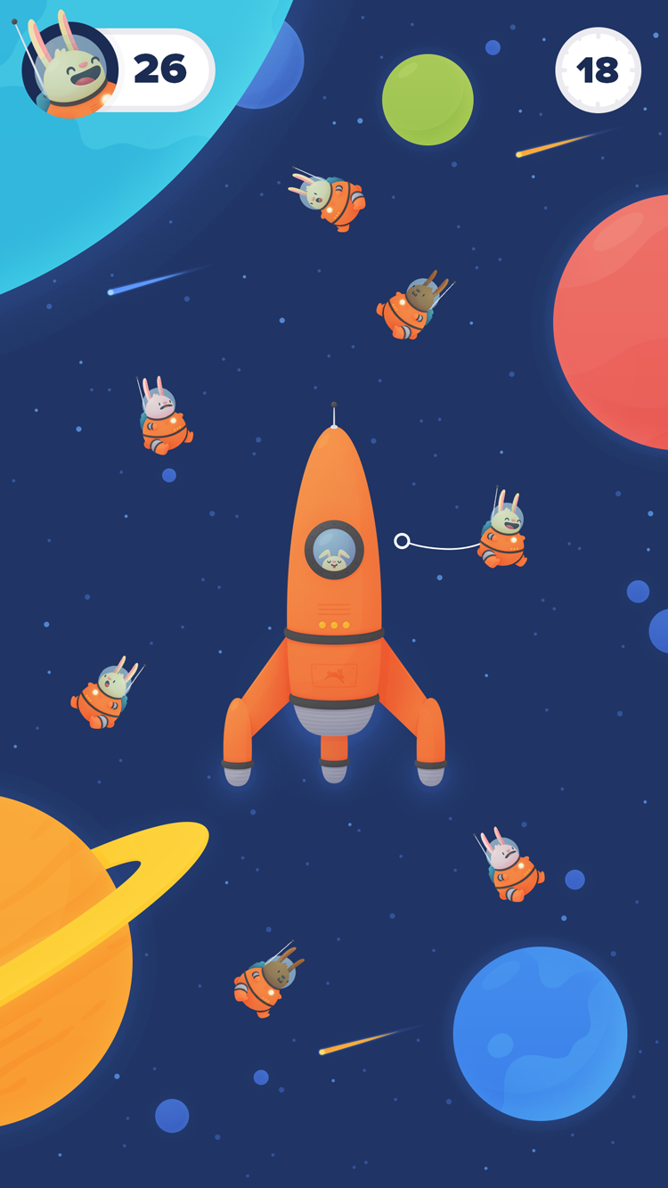
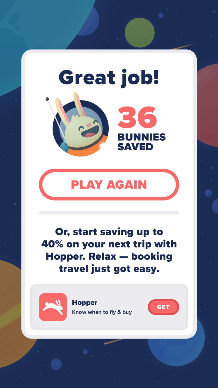
A personal favourite project of mine was this playable ad, Space Bunnies. These ad units are usually for mobile games, but we thought it would be fun to make a cute little game with the buns.The aim of which, is to save as many buns floating about in space, before the time runs out.
App Store
App screenshots
We recently revamped the App Store screenshots. We wanted to do something a little different. So, instead of showing full screens, we pulled out UI elements and have some fresh new buns interacting with them, with each illustration flowing into the next. It's a bit playful and far more representative of our brand.
Swag
I do the odd illustration for swag every now and again — mainly lots of stickers, but sometimes the odd tee and that. Here be some country specific stickers that I'm quite fond of.
Landscapes
Idealic destinations
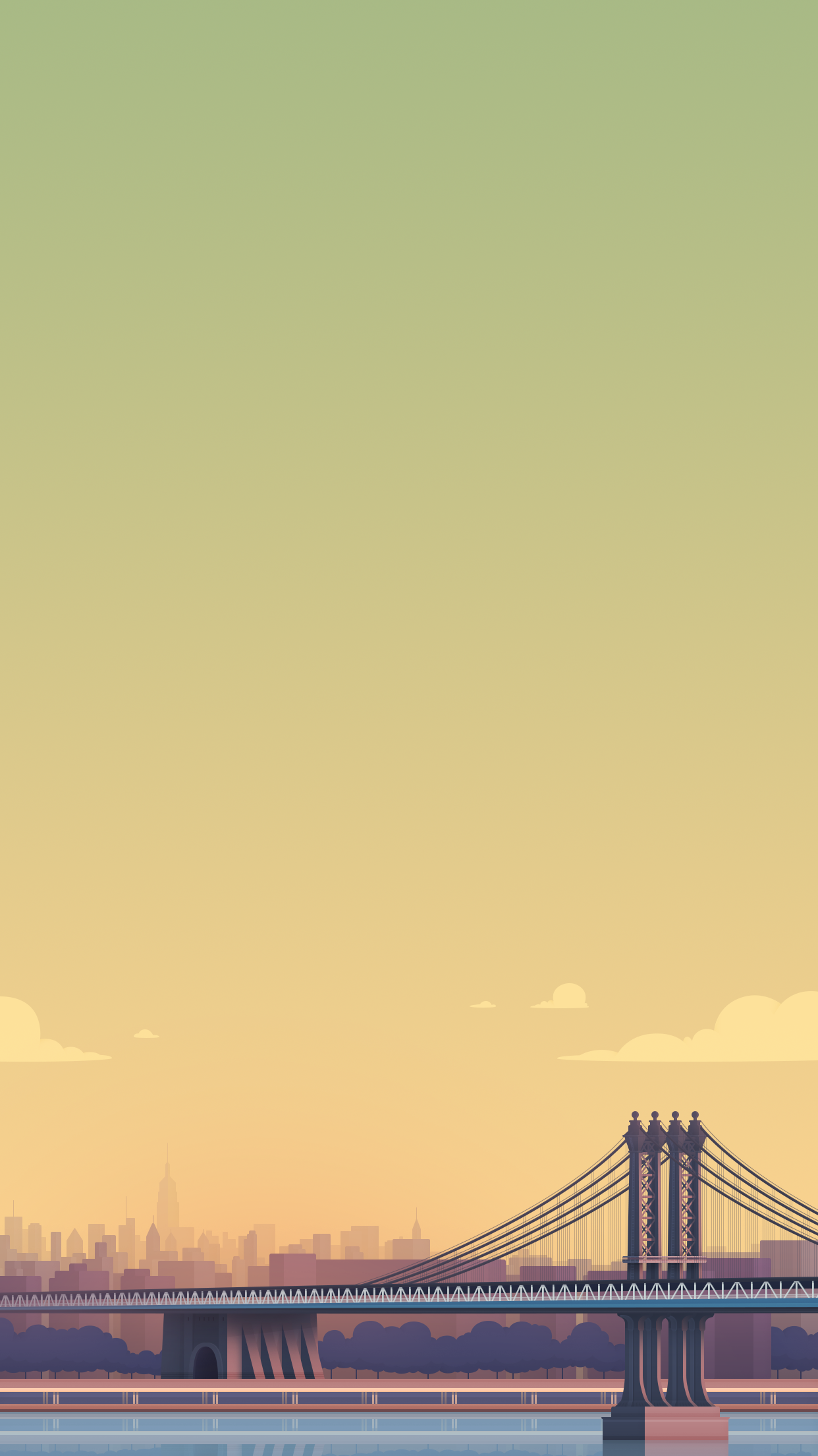
Cities and landscapes use to make up a huge part of the brand, but they're not used as much anymore. Over the years I have illustrated a large number of cities and neighbourhoods from across the world, as well as more generic scenes. But not once have the buggers sent me on a "research" trip.




Faves
Random illos
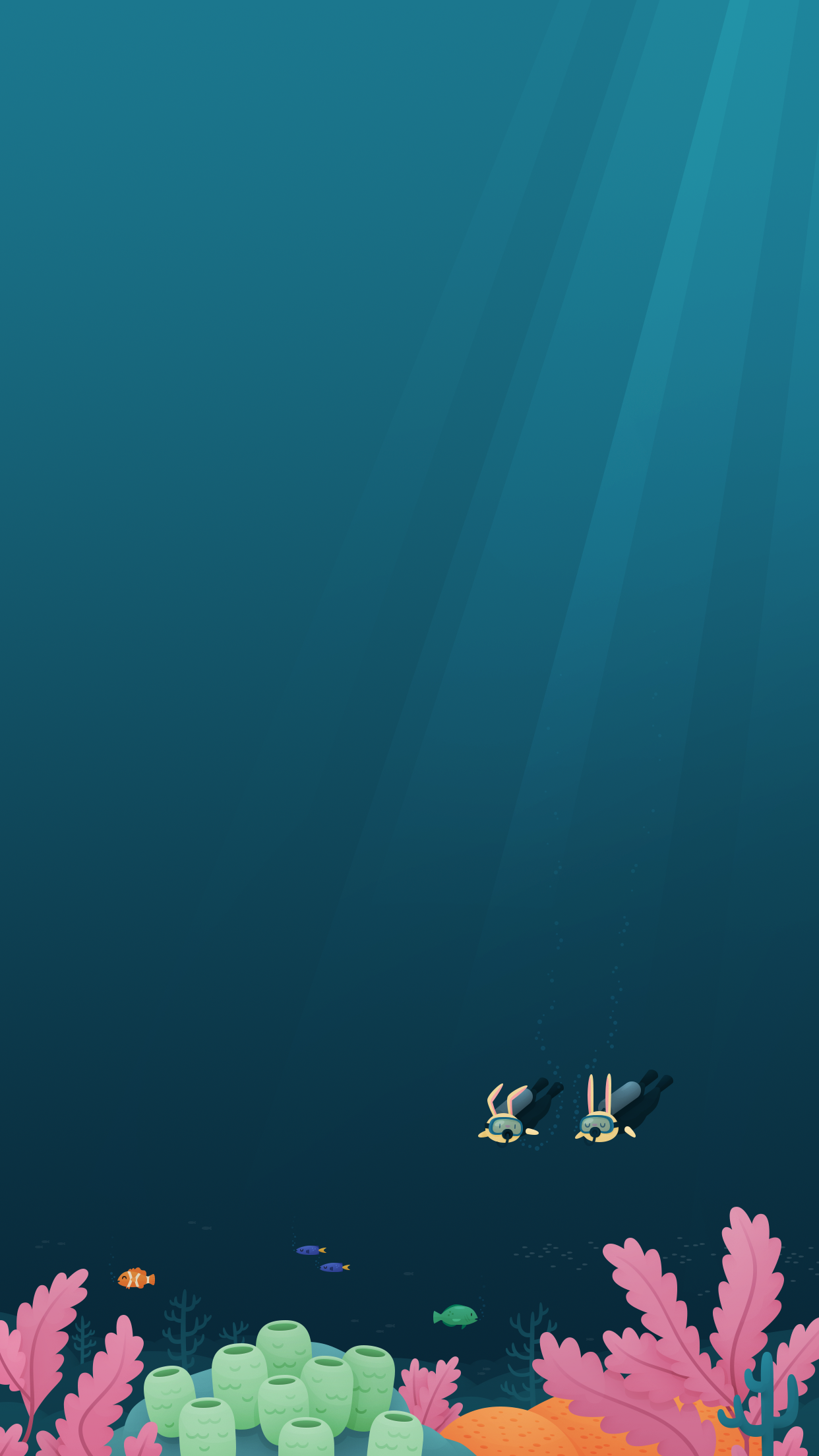
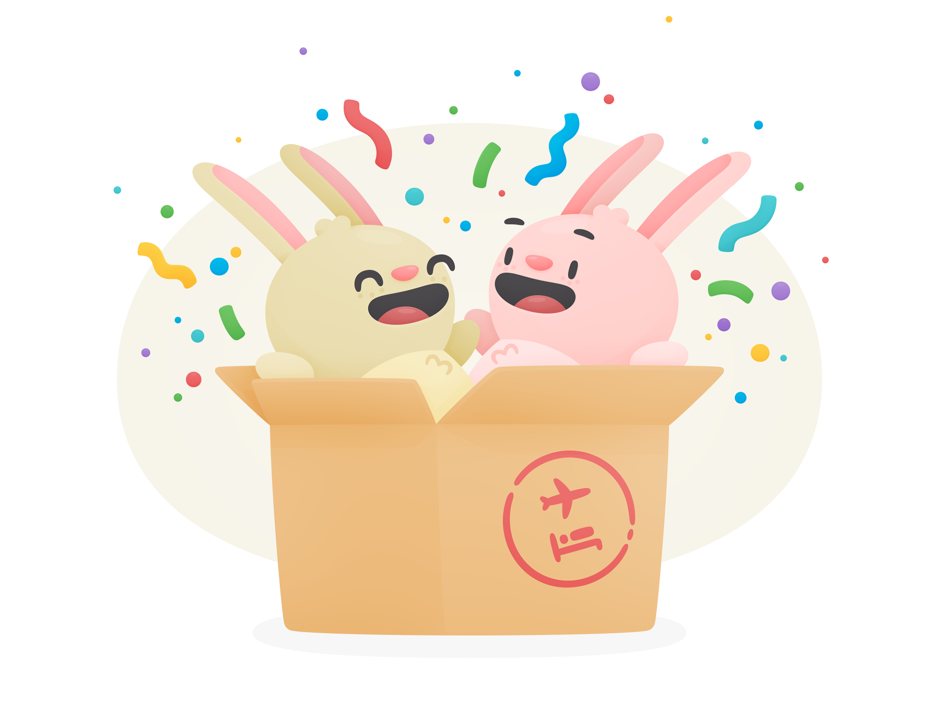
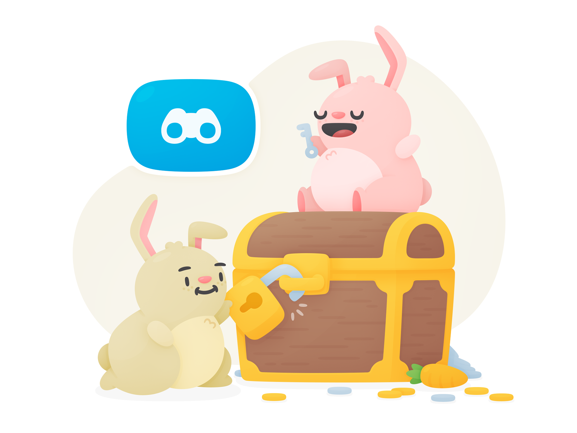
Finally, here are some random illustrations that tickle my fancy, which were done for smaller projects, or for fun.
CREDITS
Role: Art Director + Designer (Brand, UI, UX) + Illustrator
Client: Hopper
Studio: Hopper
2017 - 2024
