
Dendy Cinemas
For decades, Dendy Cinemas has shown the latest and greatest movies on offer for all cinema lovers.
This project was a website redesign and brand refresh for Dendy Cinemas, which is an iconic cinema chain here in Australia. The main goals of the project were to make booking online easier, make signing in and signing up simpler, along with being friendlier to use on mobile.
Refresh
A new look and feel
One of the other reasons for the refresh (apart from the overall simplification and mobile-first approach), was to move away from the old boutique feel that it had previously, which was also very similar to its main competitor Palace Cinemas. Think lots of black and gold.
The client wanted something bold and colourful — moving closer towards other big blockbuster cinema chains, like Event and Hoyts. So to move away from the dark and dusty feel of the old website, we went bright and light, using a hot pink as the primary colour along with a new all caps font, which felt decidedly epic.
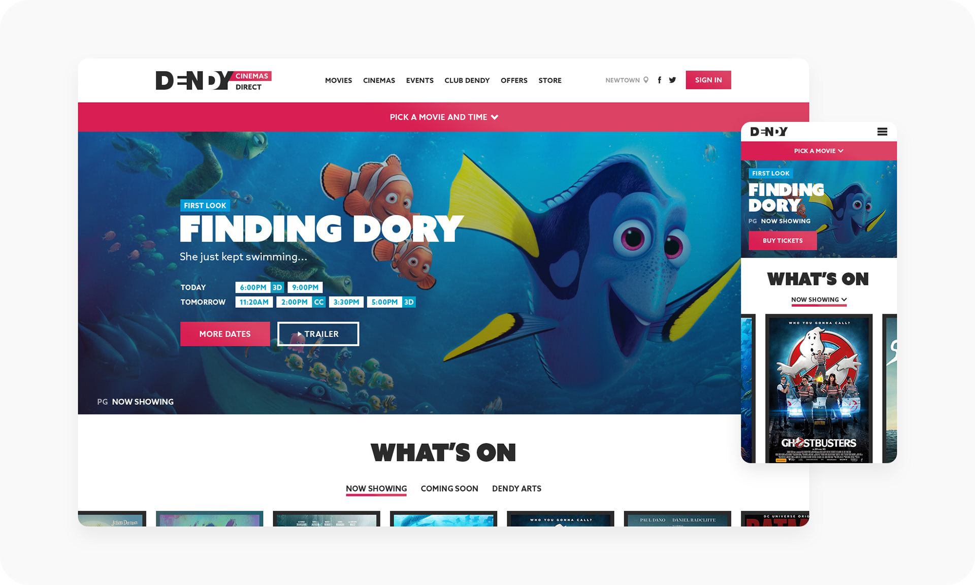
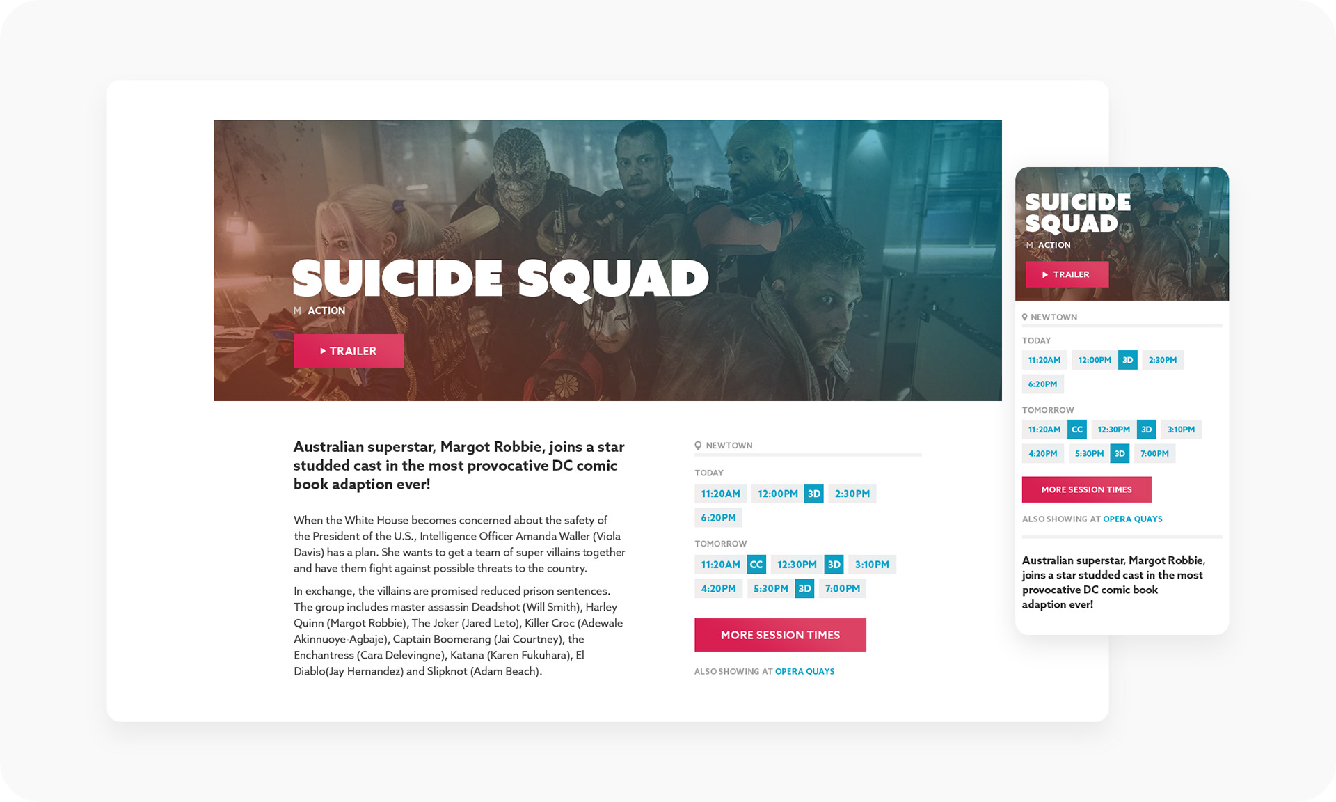
For the home screen we increased the size of the hero to make it bold and engaging and to help showcase key art, with clear sessions times and carousel of all the films showing.
As with every cinema website, the user can book by either viewing just movies or sessions. For movies, we even added the option to filter by grid or list, in case the user wants to see more info or session times.
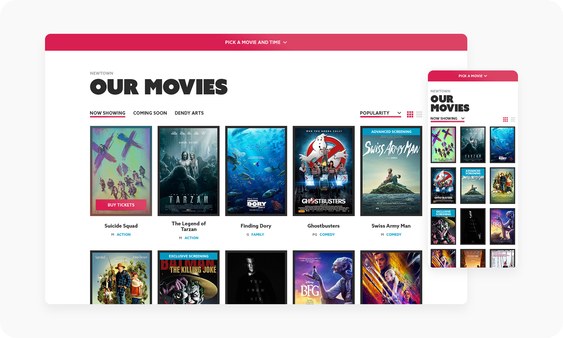
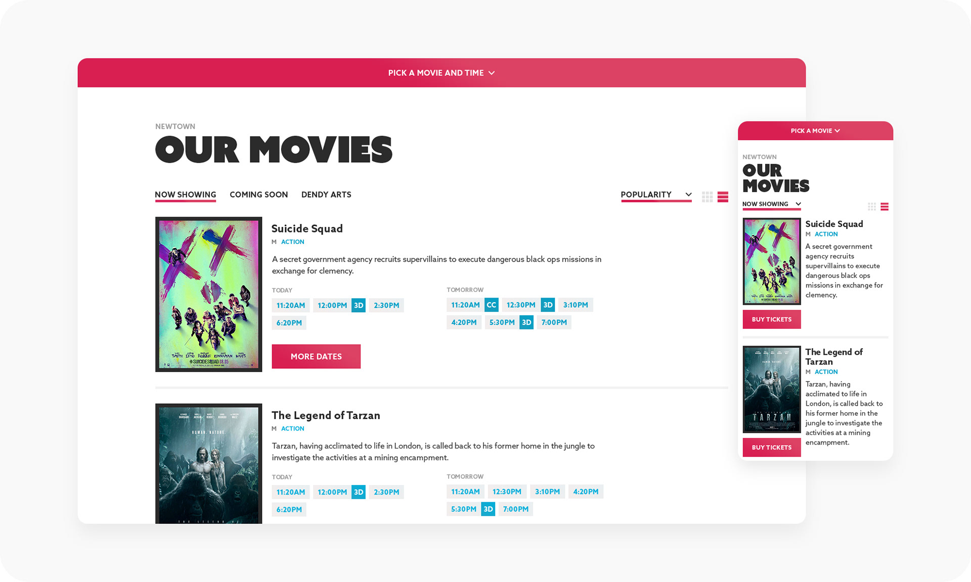
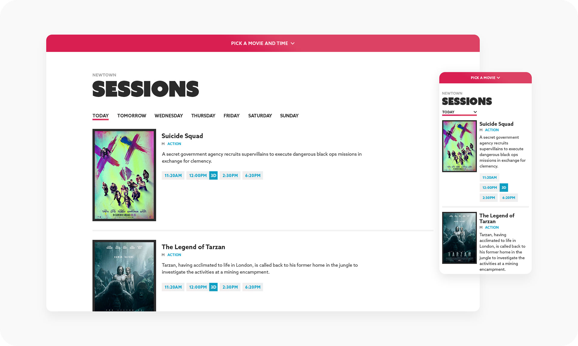
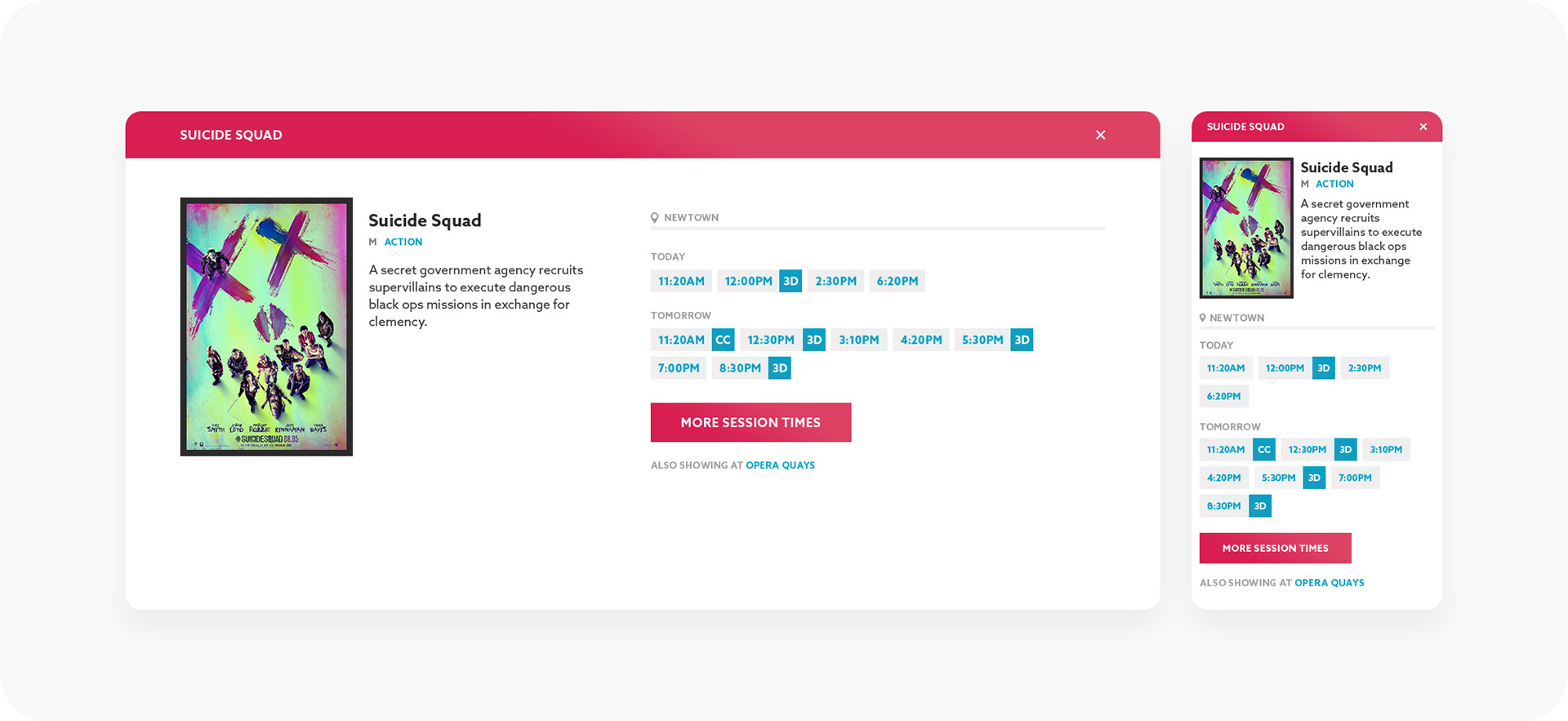
Each movie also has its own page, with a full synopsis, trailer, image gallery and of course, session times. Along with a carousel at the bottom to help the user find a movie they like, in case the one they're viewing isn't their cup of tea.
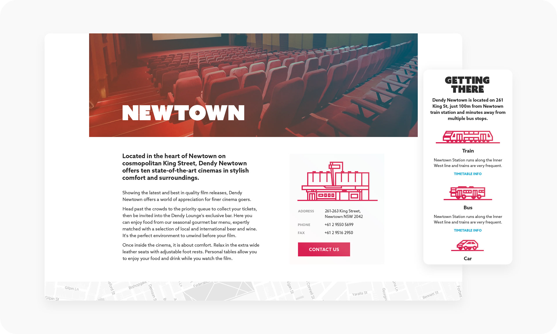
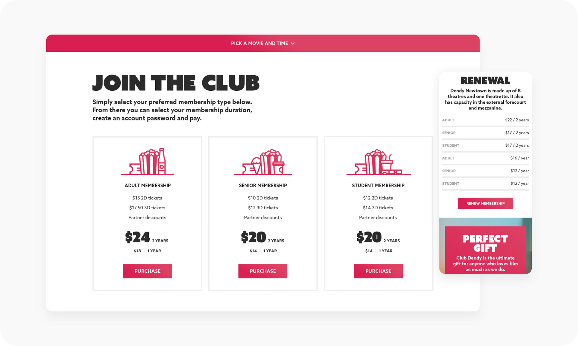
Those are pretty much the main pages for the website. The others are the Club Dendy pages, which is the cinema's membership program, along with pages for the cinemas themselves, events and their contact page.
Booking FLOW
Book anywhere, anytime
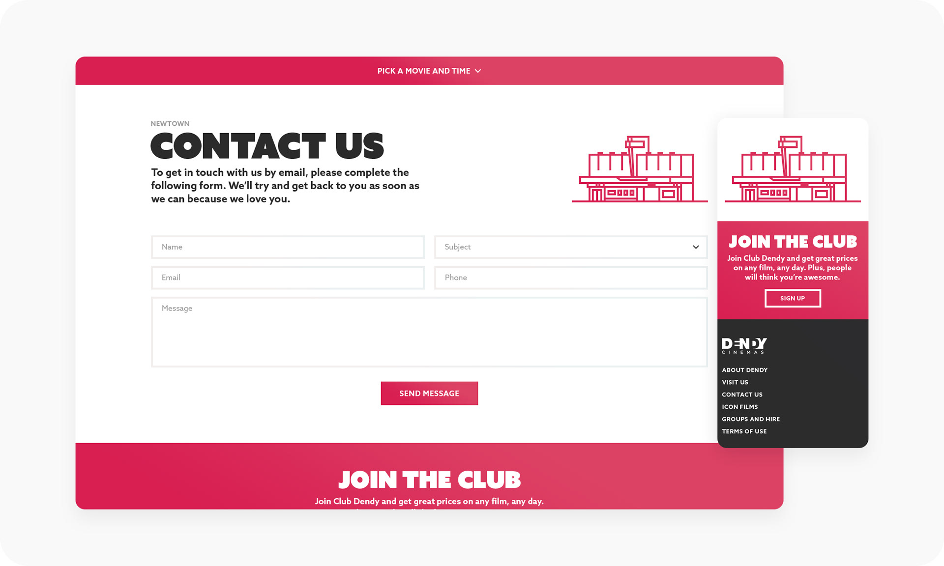
One of the main goals for the new website was to make booking as easy as possible. To help with this, we added a consistent CTA at the top of every page where a user could quickly view or search for movies.
As the user hits the dropdown, they're presented with a grid of popular movies, along with an alphabetical list of other movies showing.

But the user can also type in the name of a movie they're searching for, or even an actor or directors name, which will filter out the results in real time.
Customise
Content types
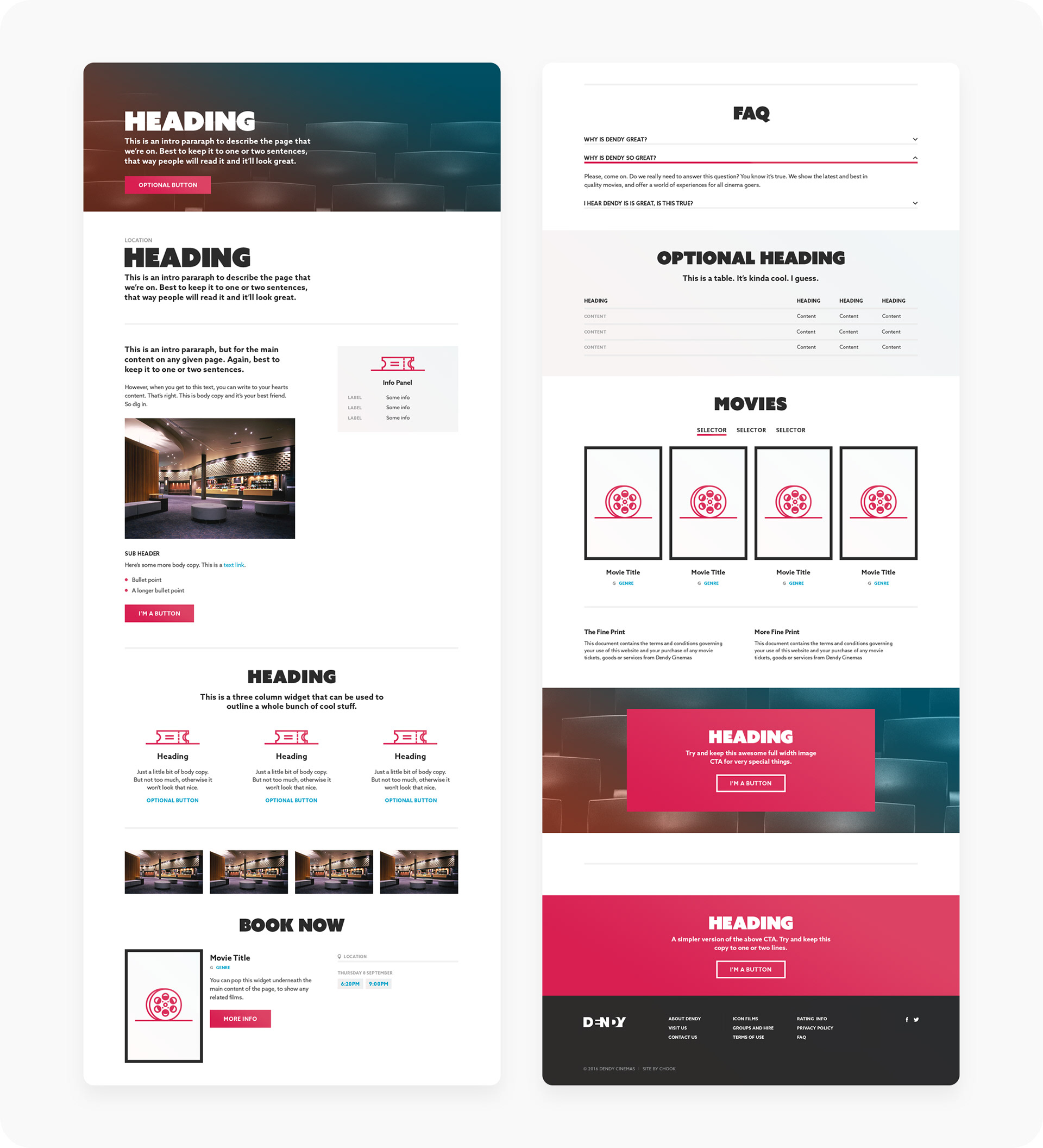
During our initial workshops and research with the client it became apparent that there was going to be a need for a lot of custom pages, such as for events and competitions. To address this we created a whole bunch of content types and a template system, where the client could put together whatever their heart desired. They didn't need us designing full custom pages each time they wanted to add a page.
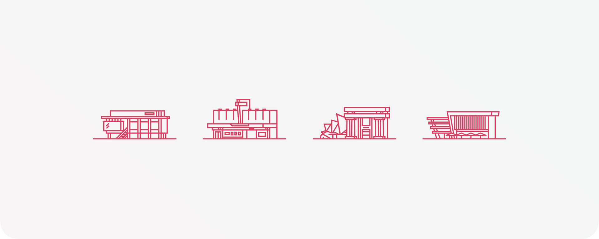
Illustration
Big and blocky
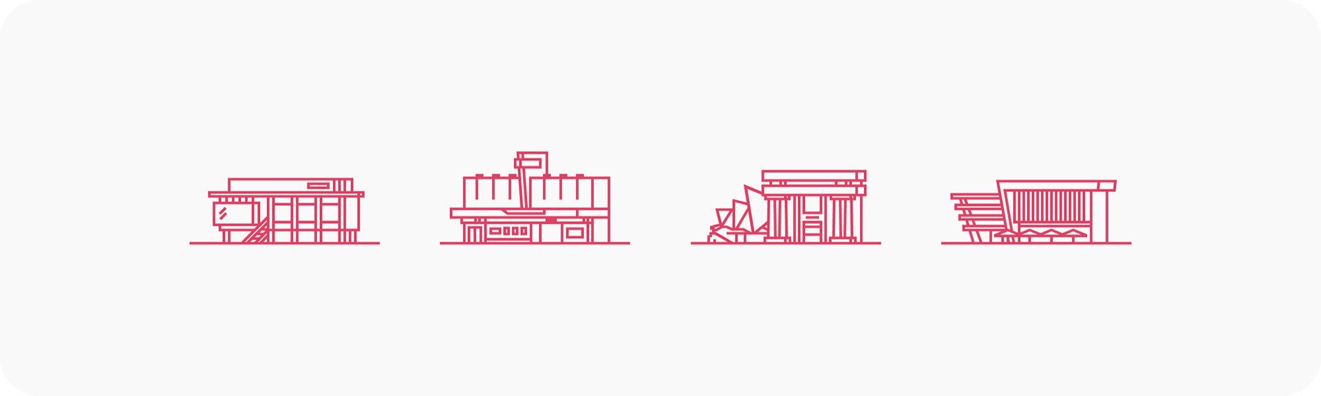
As part of the overall brand refresh, I included more illustrations, defining a new style. I made the style blocky, to help fit in with this new visual direction and evoke the logo a touch. I pretty much had free reign. I wanted to give them a bit of depth, despite being flat and outlined, so they're tilt shifted.
First off, I made illustrations for their locations across Australia.
Plus, an illustration for each mode of transport — car, bus and train. I also did a plane for some reason, which I think may have been a joke, but it was so long ago I can't remember. These were used in the "Getting There" section on each cinemas page.
The last set was for their Club Dendy membership program, to represent the various perks you get as a member.
Note, the website has changed quite a bit since I worked on it. But the primary pink, fonts and illustration style are still being used, which is nice to see.
Time to see a movie.
Credits
Role: Designer (UI, UX)
Client: Dendy Cinemas
Studio: Chook
2016